|
|
Critique By:
Paul N (K:188)
3/7/2005 4:02:24 AM
crystal clear great tones wonderful work
|
| Photo By: Rebecca Raybon
(K:26654)
|
|
|
Critique By:
Paul N (K:188)
8/28/2004 6:14:10 PM
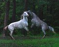
Thank You Stephan. I do like the effect of the softening and I wonder what playing around with a few additional filters would produce. It does come out very much like a painting this way. I will check out Neat Image and I plan to shoot this scene over and over till I get exactly what I want. I have seen these guys almost verticle with all 8 feet off the ground. They are awesome and only about 50 feet away from my backdoor so catching them in the act is easy. Keep watching I will have more like this in the future.
Paul
|
| Photo By: Paul N
(K:188)
|
|
|
Critique By:
Paul N (K:188)
8/28/2004 1:08:44 AM
Rory Love the perspective and match of title to composition. You know me from a long time ago. Good to see yer still shooting and submitting.
|
| Photo By: Aurore Lynch
(K:1687)
|
|
|
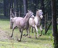
Critique By:
Paul N (K:188)
7/6/2004 2:08:18 PM
The masks are to keep the flies out of their eyes on hot humid afternoons.
|
| Photo By: Paul N
(K:188)
|
|
|
Critique By:
Paul N (K:188)
7/5/2004 6:16:41 AM
Too close? NOT this is excellent work I guess you did your homework. The depth on this almost makes it seam like a field of open flowers. I love it.
|
| Photo By: Andy Pollard
(K:1359)
|
|
|
Critique By:
Paul N (K:188)
7/5/2004 6:08:49 AM
excellent capture I know how difficult this kind of shot can be. The trails of the starburst are perfect.
|
| Photo By: Rodney Steele
(K:1841)
|
|
|
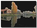
Critique By:
Paul N (K:188)
12/2/2003 11:52:58 PM
Interesting concept. I think you are on the right track, but I feel you could do a lot more with this. Clone out the noise at the bottom and if possible crop it to have a perfect reflection. The tall orange trees should not be cut off. Also clone out the trees that have no reflection (above the roofline of the building and the white tree at the extreem right. Cool idea. Work with it.
|
| Photo By: Michelini Gianpaolo
(K:360)
|
|
|
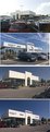
Critique By:
Paul N (K:188)
10/25/2003 10:35:31 PM
Nice panorama work. I too would love to see a larger view of this. perhaps you could post it at or near size on a hosting site and give us a link to it. Curious too if you did this manually in photoshop or another editor or if you used a stitching program.
|
| Photo By: Cathy Barrows
(K:1897)
|
|
|
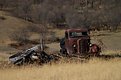
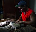
Critique By:
Paul N (K:188)
10/23/2003 2:29:16 PM
This is an excellent example of how a photograph can take one context of life and suggest another. The toning and framing of this shot scream loneliness. Finding the personality in machines and other manmade items is a pursuit I hope to someday accomplish. I have seen perhaps 3 photos this year that do this perfectly and this is one of them.
|
| Photo By: Brian Schneider
(K:313)
|
|
|
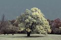
Critique By:
Paul N (K:188)
10/21/2003 10:24:10 PM
Thanks to all for the kind comments for those who might be interested I created the infrared by going to Channel mixer.green channel> green +200 red -50 blue -50. then click monochrome and lighten or darken to taste and play with the contrast till you get the effect you want. I am gunna continue working on this with the Hue slider to see what other color effects I can get with it. Thanks again, Paul
|
| Photo By: Paul N
(K:188)
|
|
|
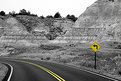
Critique By:
Paul N (K:188)
9/27/2003 7:37:33 PM
Nice touch to a simple scene. These lttle color tricks can add so much to a basic image.
|
| Photo By: Alex Ruiz
(K:234)
|
|
|
Critique By:
Paul N (K:188)
9/24/2003 9:06:04 PM
wonderful composition using simple elements. Great detail. It looks a bit green but this could be my monitor. Lighting a bit harsh, but overall, you have a solid photo here.
|
| Photo By: Shane Gilbert
(K:251)
|
|
|
Critique By:
Paul N (K:188)
9/24/2003 9:00:31 PM
Not bad at all. I have been working with perspective tools in PS like this awhile and I know how difficult it is to get a believable angle. Had you not explained your steps, i would have assumjed this was a straight shot.
|
| Photo By: Joe McCary
(K:3235)
|
|
|
Critique By:
Paul N (K:188)
9/24/2003 8:53:53 PM
very nice perspective. I have never seen Zion photographed with this angle. I am afraid the lighting is poor but in all fairness i have to say this would be a very very tough shot to get. Nice to see your awareness tho.
|
| Photo By: Liz Chaffin
(K:546)
|
|
|
Critique By:
Paul N (K:188)
9/22/2003 8:41:56 PM
I love the composition and the image is like nothing I have ever seen before. The lightingis wonderful, but I am afraid the shirt is just a little too saturated. If this was worked in photoshop and I am assuming it was a simple desaturation on the shirt would make this perfect.
|
| Photo By: Marion Luijten
(K:6141)
|
|
|
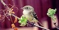
Critique By:
Paul N (K:188)
9/14/2003 8:52:35 PM
I really like the perspective on this. The wide and short ratio works very well giving this little guys a real sense of the outdoors, Too often bird shots that are cropped to standard width/height look like they are in a cage
|
| Photo By: Robert McDonald
(K:511)
|
|