|
|
Critique By:
Matej Maceas (K:24381)

5/12/2005 5:40:22 PM
The ivory whites are most likely due to the paper, but the warmth of the blacks does indeed sound like selenium :-) An additional nice effect is that the midtones tend to turn slightly purplish.
I wouldn't mind trying out the cameras you mention, but I have to control myself - I already have too many cameras, given the (small) amount of rolls I shoot.
|
| Photo By: Matej Maceas
(K:24381)
|
|
|
Critique By:
Matej Maceas (K:24381)
5/11/2005 3:22:18 PM
Selenium toned, yes. I wonder what that typical look looks like on your monitor, because on mine it differs significantly from the actual print :-)
I know about the contaxg site, but since the camera isn't mine but my mum's (I just borrowed it for one afternoon; I'll see about its future use, it has some nice features, especially the small size is convenient, but there are also some things about it which I don't like so much), I'm not going to join there ;-)
|
| Photo By: Matej Maceas
(K:24381)
|
|
|
Critique By:
Matej Maceas (K:24381)
5/8/2005 2:12:44 PM
Looks like a case of the camera's meter being fooled by the snow causing considerable underexposure.
|
| Photo By: Flemming Rasmussen
(K:1736)
|
|
|
Critique By:
Matej Maceas (K:24381)
5/8/2005 1:48:31 PM
Ah, yes, the hand... I'm not even sure whether she did that by herself or whether I asked to do it... anyway, the purpose must have been to bring some fun and dynamism into the photo. Both the setting and the light were quite improper for a "standard" portrait, so I decided to turn it into something else. But what exactly that "something else" is (including what the outstretched hand is actually supposed to mean), that's up to the viewer to decide.
|
| Photo By: Matej Maceas
(K:24381)
|
|
|
Critique By:
Matej Maceas (K:24381)
5/8/2005 1:25:06 PM
I hope one day you'll take these negs to a fully-equipped darkroom and make enlargements - medium format holds so much detail and it's a pity that some of might get lost due to the small size of the contact print. MF is great to work with when enlarging, I'm sure you would enjoy it.
The composition here is too centralised for my taste given the subject, its size in the frame and the nature of the surroundings.
|
| Photo By: Elangovan S
(K:10675)
|
|
|
Critique By:
Matej Maceas (K:24381)
5/8/2005 12:52:02 PM
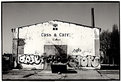
Is the light fall-off so strong or do you actually have multi-hued curtains?
|
| Photo By: Kostas Tzanetos
(K:22012)
|
|
|
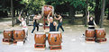
Critique By:
Matej Maceas (K:24381)
5/8/2005 12:46:50 PM
I like the combination of angles used here and in part II. They provide good complete documentary value by showing the band from the crowd's point of view and vice-versa. I find the behind-the-scenes feel of part II especially interesting. The two photos work well together and in fact you could perhaps settle for a diptych; part III does not fit in so well (the angle used there does not reveal much relevant additional information, the format is different and there also seems to be a slight focus issue with the foremost drummer's face).
|
| Photo By: Roger Williams
(K:86139)
|
|
|
Critique By:
Matej Maceas (K:24381)
5/5/2005 5:29:27 PM
So is this a contact print of the paper negative?
What speed did you rate the paper at?
|
| Photo By: Tyler Robbins
(K:904)
|
|
|
Critique By:
Matej Maceas (K:24381)
4/30/2005 5:53:41 PM
Congratulations on the scanner, enjoy, and post for us to see :-)
|
| Photo By: Matej Maceas
(K:24381)
|
|
|
Critique By:
Matej Maceas (K:24381)
4/28/2005 5:22:22 PM
For some reason, sunsets seem to be a very popular subject (personally I tend to abide by David Goldfarb's "put on the lenscap and enjoy the moment"). With so many sunset photos being taken, it's difficult to come up with something that stands out from the crowd. This particular one kind of lacks a point of interest. The photo is divided 1:1 between a big empty shadow and a rather non-dramatic sky. The sky reflected in the water and the tiny bit of yellow on the horizon liven things up, but for me they are not sufficient to carry the whole image.
|
| Photo By: chris deuel
(K:94)
|
|
|
Critique By:
Matej Maceas (K:24381)
4/28/2005 5:22:07 PM
Once again you may want to go for slightly deeper blacks, but otherwise it looks good. I don't mind bits of the environment showing in the photo; environmental portraits (whether of people or pets) tell a more complete story about the portraitee than zero-backround ones. So instead of eliminating those surrounding elements, I would encourage you to look for angles that do the opposite (of couse while using selective focus and throughtful composition to avoid chaos).
|
| Photo By: chris deuel
(K:94)
|
|
|
Critique By:
Matej Maceas (K:24381)
4/28/2005 5:21:50 PM
This is more interesting than a lot of flower photos I've seen but I'd say there's room for improvement.
1) Composition. I agree with Mary Sue. Having the top of the flower so close to the top of the frame and so much empty space underneath makes the photo look unbalanced. In principle I have nothing against non-standard compositions that do not abide by 'rules', but here I do not see a strong reason to compose things the way they are.
2) Tonality. I appreciate that you've retained highlight details, especially given the harsh light (judging by the shadow inside the flower; I think diffused light would have been better). Deeper tones in the background probably would not have hurt; the flower's dominance as the main subject would be reinforced. A red filter (along with a polarizer to eliminate reflections) might do the job, or, using the existing negative, you could try to at least burn in the brightest leaf on the right.
3) Choice of film. I think the delicate nature of flowers can be retained more easily using a delicate film like Fuji Acros. The extra speed of HP5 probably wasn't needed here.
|
| Photo By: chris deuel
(K:94)
|
|
|
Critique By:
Matej Maceas (K:24381)
4/28/2005 3:51:15 PM
Go right ahead, Kievs are fun and a great bargain as well, and of course as you well know from using your panoramic cameras, MF has so much more quality compared to 35mm that it's practically a must-have :-)
|
| Photo By: Roger Williams
(K:86139)
|
|
|
Critique By:
Matej Maceas (K:24381)
4/26/2005 6:39:18 PM
The neutral colours were the first thing that struck me in this photo. Without being consciously aware of it, I must have come to associate your style with sunny weather and vivid documentation in terms of colour of the places you visit (which is somewhat strange, because looking at your portfolio page, there are quite a few photos taken in similar lighting conditions).
|
| Photo By: Roger Williams
(K:86139)
|
|
|
Critique By:
Matej Maceas (K:24381)
4/26/2005 6:15:39 PM
I suppose getting the centre bit sharply in focus is the obvious way to do this shot, but how about doing it the other way round - getting it as much out of focus as possible? The background is already forming an interesting abstract, and perhaps the whole photo could work well that way...
|
| Photo By: Bjorn Beheydt
(K:12096)
|
|
|
Critique By:
Matej Maceas (K:24381)
4/4/2005 4:35:27 PM
The hotness of the vertical highlight lines distracts me to a noticable degree (the high tones don't seem to fit well with the more subtle edges), but otherwise I quite like the photo.
|
| Photo By: Paul's Photos
(K:35235)
|
|
|
Critique By:
Matej Maceas (K:24381)
3/28/2005 5:21:34 PM
I think the presentation of this rather nice photo will be much improved if you get rid of that terrible border.
|
| Photo By: Paula Grenside
(K:2811)
|
|
|
Critique By:
Matej Maceas (K:24381)
3/15/2005 5:31:49 PM
I like your reflection series very much, please let me know if you'd be interested in a print exchange.
|
| Photo By: Leah Kahn
(K:878)
|
|
|
Critique By:
Matej Maceas (K:24381)
3/10/2005 6:52:56 PM
Thanks Chuck. Please feel free to e-mail me if you find any specific photos in my portfolio or on my website that you would be interested in.
|
| Photo By: Matej Maceas
(K:24381)
|
|
|
Critique By:
Matej Maceas (K:24381)
3/10/2005 6:41:02 PM
Thank you Matthew, what you wrote is very interesting feedback for me.
|
| Photo By: Matej Maceas
(K:24381)
|
|
|
Critique By:
Matej Maceas (K:24381)
3/3/2005 6:14:19 PM
Kostas, you periodically come up with photographs that fascinate me.
|
| Photo By: Kostas Tzanetos
(K:22012)
|
|
|
Critique By:
Matej Maceas (K:24381)
3/3/2005 5:44:10 PM
I disagree with the others about the tonality being so good. You'll notice the highlights on the side of the model's forehead and nose; they hold no details at all and the change in values is sudden rather than gradual. Surely B&W film would have handled the contrast much better with a more natural result.
|
| Photo By: t marie
(K:302)
|
|
|
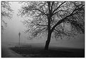
Critique By:
Matej Maceas (K:24381)
2/26/2005 8:07:00 AM
What I really like here is the intricate pattern of the dark branches and twigs standing out against the foggy sky, especially in the left half of the photo.
|
| Photo By: Dubravko Grakalic
(K:25235)
|
|
|
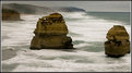
Critique By:
Matej Maceas (K:24381)
2/21/2005 8:43:32 PM
Is this somewhere along the Great Ocean Road?
|
| Photo By: Karen Sutherland
(K:423)
|
|
|
Critique By:
Matej Maceas (K:24381)
2/19/2005 11:43:51 PM
That's some serious overexposure, try reshooting this at a different time of day so that you don't have to shoot against the sun while having to retain detail in the shaded parts of the rock. Digital can't cope with that sort of contrast.
|
| Photo By: Mohamed Khalil
(K:121)
|
|
|
Critique By:
Matej Maceas (K:24381)
2/19/2005 11:36:41 PM
Nice and simple but seems to be strongly lacking in terms of sharpness.
|
| Photo By: Marian Coman
(K:132)
|
|
|
Critique By:
Matej Maceas (K:24381)
2/19/2005 11:30:46 PM
What do you think about this:
|
| Photo By: Barry Kapke
(K:55)
|
|
|
Critique By:
Matej Maceas (K:24381)
2/19/2005 11:29:03 PM
I don't know whether it's a printing problem or a scanning problem but I'd say this photo as well as some others in your portfolio would benefit from higher contrast, especially deeper blacks.
|
| Photo By: Barry Kapke
(K:55)
|
|
|
Critique By:
Matej Maceas (K:24381)
2/19/2005 10:58:33 PM
I'm not surprised this site attracts you. The structure seems to be from another planet. The only element that identifies it as being on Earth is the ordinary-looking house in the left corner.
What I find noteworthy here is the similarity and at the same time the contrast between the structure of the sphere and the trees growing in front of it. Similarity, because without leaves (and maybe that is why it attracts you at this particular time of year), the intertwining lines of the branches are not unlike the steel shafts of the structure. Contrast, because we see a strictly regular high-tech looking object placed right next to the decidedly 'low-tech' trees.
|
| Photo By: Christian Barrette
(K:21125)
|
|
|
Critique By:
Matej Maceas (K:24381)
2/18/2005 1:44:04 PM
I very much enjoy viewing your photographs.
|
| Photo By: Oliver Dienst
(K:452)
|
|