|
|
Critique By:
michaelle . (K:3807)
8/7/2003 10:05:08 PM
Alisa,
This image is like a dream - you have captured the essence of the emotion with this. I would expect no less from you - absolutely wonderful!
Michaelle
|
Photo By: Alisa Mudge
(K:7511)

|
|
|
Critique By:
michaelle . (K:3807)
7/9/2003 2:50:17 PM
Ameet,
If you are serious - the link is here: http://www.cafeshops.com/mlw_photo.6638630
michaelle
|
| Photo By: michaelle .
(K:3807)
|
|
|
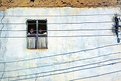
Critique By:
michaelle . (K:3807)
7/5/2003 9:57:56 PM
Alisa,
The composition on this is wonderful! I love the 50/50 split that you have created. It gives a wonderful tension across the image with the darkness on one side and light on the other... The textures are what really give this image life... the details like the pitted walls and the chipped plaster are very nice. Well seen as always!
michaelle
|
| Photo By: Alisa Mudge
(K:7511)
|
|
|
Critique By:
michaelle . (K:3807)
7/5/2003 9:09:08 PM
Bjorn,
Now your cookin! Very pretty, I wish it were a bit sharper, but possibly that is the scan? I like the composition, simple and straight forward, and the lighting is very nice. It's amazing what one can do with a camera that has a working light meter 
Well seen!
michaelle
|
| Photo By: Bjorn Beheydt
(K:12096)
|
|
|
Critique By:
michaelle . (K:3807)
7/5/2003 9:02:41 PM
Alisa,
What a wonderful catch! You metered this spot on, especially considering what looks to be a strong sidelight. The textures in the clothing, his wiskers and his hand really came out well. I kind of wish he was looking up (not necessarily at the camera) so that I could identify with his eyes, and the guy in the background "growing out of the main subject's shoulder" is a little bit distracting - but alas, when shooting on the street, things are not in our control. Very well done!
michaelle
|
| Photo By: Alisa Mudge
(K:7511)
|
|
|
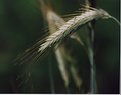
Critique By:
michaelle . (K:3807)
7/5/2003 8:54:13 PM
This is a very pretty flower, and the color is wonderful. However, it seems very soft, and I'm wondering if increasing the saturation in the image caused the loss of detail in the petals? The green in the background complements the red very nicely, but the darker areas and the brown patch in the left frame are somewhat distracting. This is a lovely subject, and I hope you have the opportunity to go and experiment more with lighting and composition. Have fun!
|
| Photo By: Tiago Silva
(K:3)
|
|
|
Critique By:
michaelle . (K:3807)
7/5/2003 8:33:14 PM
This is a neat subject... I really like the texture of the bud. The focus is a little soft, and while your choice of DOF was right on, the strong vertical lines caused by the plants in the background distract from the subject. Possibly shooting at a different time of day would help to darken the background sufficiently. Again, I like the subject very much and look forward to more posts.
|
| Photo By: Partha Majumder
(K:73)
|
|
|
Critique By:
michaelle . (K:3807)
6/23/2003 9:48:15 PM
Bjorn,
This could be such and interesting image. You received some wonderful critiques on this one and they are spot on! I agree with all that was said, and can't wait until you get the elan II so that you have a working light meter so that you can really play!!!
I hope you don't mind, but I took the liberty of playing around a little... it's not perfect by any means... but they do look a bit "juicier"
michaelle
|
| Photo By: Bjorn Beheydt
(K:12096)
|
|
|
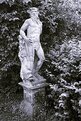
Critique By:
michaelle . (K:3807)
6/23/2003 9:14:06 PM
Andreas,
This is definately an interesting piece of art, but the composition and lighting do not show it off... Possibly going for a more dramatic composition where you shoot from much closer and from a lower angle up at the statue would help. Be really bold and try angling the camera slightly for a tilted composition... and as for light... wait until the light causes deep shadows in the textures of the statue... and then adjust your exposure to just start to pick up the detail in the shadow... Shooting statues can be awsome to do because you have model that doesn't talk back... but you also have a model that doesn't take directions either, so it is up to you to make the image interesting... most of all, just have fun!
michaelle
|
| Photo By: Andreas Schroeder
(K:221)
|
|
|
Critique By:
michaelle . (K:3807)
6/23/2003 9:04:46 PM
Beautiful composition! I love how the boats are arranged in anticipation of the water... The light seems just a little flat, so the textures in the boats is not as obvious as I'm sure it was... this might also have been caused by the scan as it is easy to block up the shadows when scanning if you are not careful. Additionally, I think that a little bit of (or more of) unsharp mask would greatly bring out the textures in the boats and in the sand and help the whole image "pop" just a little more.
Very well seen!
Michaelle
|
| Photo By: Ian Kirton
(K:0)
|
|
|
Critique By:
michaelle . (K:3807)
6/23/2003 2:29:29 PM
David,
Actually, I believe your policy for not reading the previous comments before you critique is absolutely wonderful... It prevents your view from being biased in any way by the previous critiques, and lets you concentrate on the image without alot of "external chatter". Thank you for taking the time to write up your wonderful critique, and of course I would never take such a well thought out critique as anything but constructive.
Thank you, again,
Michaelle
|
| Photo By: michaelle .
(K:3807)
|
|
|
Critique By:
michaelle . (K:3807)
6/21/2003 7:41:15 PM
I like the feel of this image, lonely, cold, almost brutal in it's harshness. The high contrast of the image adds to this feel, and the angle it was shot at gives it a slight surreallistic feeling. I'm not so fond of the grain that is very evident in the sky, and I would have liked to see just a bit more detail in the snow in the front left frame to balance out the darker sky opposite it. Overall, a really interesting image.
|
| Photo By: Inokenty Kastorkin
(K:28)
|
|
|
Critique By:
michaelle . (K:3807)
6/21/2003 7:27:23 PM
The exposure on this is great, but it looks to me as if it was either hand held or not on a very sturdy tripod. The shake in the longer exposure is very evident. I love the idea of the bridge and wish that you would have focused more on it in your composition. I looked through your portfolio and you have many lovely images... looking forward to your next post.
Michaelle
|
| Photo By: David Grundy
(K:1571)
|
|
|
Critique By:
michaelle . (K:3807)
6/19/2003 10:25:03 PM
I really like the textures you were able to produce in the leaves... the verical lines are lovely, especially in the leaf in the left frame. The overall composition does not give the viewer any one thing to focus on... it might do well to crop to the leaf in the left frame and focus on it. Also, the tones are a little grey... some more contrast would definately pump up the image some. I hope you don't mind, but I have attached and example so that you can see what I was talking about... you may or may not like it, but please take it as only a suggestion.
Michaelle
|
| Photo By: Kim Taylor
(K:2816)
|
|
|
Critique By:
michaelle . (K:3807)
6/19/2003 9:59:02 PM
Wonderful image... the eyes are just fantastic! I would have liked to see a little more DOF so that the whole bill was sharp (I like the blurred head feathers, though). But, I suppose it is very hard to concentrate on DOF when one is being attacked by this fellow. Very well done under the (distressing) circumstances.
|
| Photo By: Thomas Rauers
(K:17)
|
|
|
Critique By:
michaelle . (K:3807)
6/19/2003 9:51:34 PM
Hmmm - I don't know no one has commented on this yet... The crispness of the rope and the patterns they make are wonderful. Exposure was dead on, the viewer can even see the turns in the darkest hidden parts of the rope. I'm not so crazy about the background, but your DOF blurs it well and to move in further would have lost the diagonal of the rope coming into the frame. Well done!
|
| Photo By: Al Ungar
(K:4626)
|
|
|
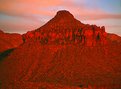
Critique By:
michaelle . (K:3807)
6/18/2003 3:06:05 AM
Robert,
The colors and textures in this image are phenomenal... what a gorgeous red! The composition is a little static with the mountain dead center in the image. Maybe pulling back a little so that the surroundings are more revealed and not centering the mountain so much would give a little more flow to the image. You definately picked the right time of day to shoot this as the shadow textures are perfect... I would alos love to see some shots that focused on the "interesting" testures and the top of the mountain. Looking forward to more!
Michaelle
|
| Photo By: ROBERT G. DAVIS
(K:708)
|
|
|
Critique By:
michaelle . (K:3807)
6/14/2003 6:53:19 AM
Alisa...
Wonderful textures, lines and tones in this image! The layering is perfect with how the edges of the roof tops come together centerframe (but I'm sure you already knew that )My one nit would be the chimney thingy on the front roof - while it blends in pretty well, it does break up the lines a little and I'm dying to see the window behind it (hope that makes sense)... Very well seen and executed - you rock!
mickey
|
| Photo By: Alisa Mudge
(K:7511)
|
|
|
Critique By:
michaelle . (K:3807)
6/14/2003 6:39:40 AM
Stephen,
The texture in this image is yummy! and I really like the higher contrast black and white, but the highlights on some of the flowers seem to be a bit bright and so some of that fabulous texture is missing. The background feels slightly busy to me and hides the lines of the flower stems - not sure how that could have been avoided though as natural photography is natural photography and you obviously did as much with the DOF as possible to isolate the flower. Well done.
michaelle
|
| Photo By: Stephen Hickel
(K:90)
|
|
|
Critique By:
michaelle . (K:3807)
6/14/2003 6:27:40 AM
I have always thought cityscapes were awesome, and this particular image is very nice. I really like how the arches cut across the frame, although it would be nice to see them go almost frame edge to frame edge. Possibly croping the image on the left side of the frame all the way over to where the first arch starts, and the bottom and top to just where the diagonals of the handrail (i think that's what it is) and the ceiling meet the corners of the frame would help to eliminate some of the very heavy dark areas in the left and bottom of the frame, as well as pull the arches across the frame more. The exposure on this had to be tough! but you managed to keep most of the in both the darker area of the building and also in the light spaces outside of the building. Waiting until the person was not behind the light post would have been a bonus Very well seen and looking forward to more of your posts.
|
| Photo By: Allan Lineker
(K:37)
|
|
|
Critique By:
michaelle . (K:3807)
6/12/2003 4:36:51 AM
Michelle,
I really like the style in your portfolio... you have a wonderful eye for the artistic! This is a really nice high-key image, and while some people might not agree, the subject is wonderful and graceful (not all flowers have to be brimming with life in order to be beautiful - just look at Joyce Tenneson's work). The highlights are just a tad bit blown in the upper right portion of the flower, and so some important detail seem to be missing. Was this taken with a scanner? It has a great 3d feel to it, but the limited DOF (focus is only on a small portion of the petals right in front) gives an overall feeling of not being in focus. I am looking forward to more of your images.
Michaelle
|
| Photo By: michelle m. alphonso
(K:105)
|
|
|
Critique By:
michaelle . (K:3807)
6/12/2003 4:21:06 AM
Michelle,
This seems like a very interesting subject... however, the pixelation in the image makes it very hard to critique. Was this originally a large image that was severly cropped? Ok, well for what I can see, the light seems very good, and the exposure seems to be right there. There is true black in the flower as well as hightlights which is not an easy thing to accomplish. The muted green in the center of the flower is lovely, as well. The composition is very nice, however, the background is distracting, and I would suggest an even tighter crop (not of this image, a re-shoot would be needed) to eliminate the darker "rocks" and the "line" rising out of the top of the flower. This is such a unique subject (one does not usually see black flowers), please try to re-shoot. Set the camera on macro mode, set the camera 10 or so inches away from the flower on a tripod and let it rip... but most of all... have fun!
|
| Photo By: Michelle Lo
(K:59)
|
|
|
Critique By:
michaelle . (K:3807)
6/11/2003 5:56:10 PM
Jake,
I so impressed with your growth as a photographer over the last year... one look at your portfolio demonstrates the amazing leaps you have made and shows your dedication to this art. Congratulations! For this specific image... the composition is wonderful... I really like how the white water fans out from the upper center of the frame. The lighting and the colors are a little bland, probably due to the overall light of the day and the film choice (Kodak 400 is not know for it's spectacular color), and the focus needs to be sharper. I look forward to seeing more of your images.
Michaelle
|
| Photo By: Jake Sieg
(K:673)
|
|
|
Critique By:
michaelle . (K:3807)
6/11/2003 5:44:32 PM
The expression on the nun's face is wonderful... however, it looks as if the camera's focus chose the front priority subject, so her face is not as sharp as it could be (I have a 5700 and know that it's auto focus can be baffling at times, try the non-auto selection for AF area to help with this). The tones are wonderful with a nice range from white to black, but the overexposed area right behind her ear blows out the full tonality of the image. I like the dichotomy between the "natural" look of the the nun and the "modern" Star Wars sign behind her, but the sign's prominence in the frame pulls the viewer's eyes away from her face and is not as subtle as it could be. Overall, very well seen... if you have a chance, doing a natural light black and white portrait of Ani with a much subtler background would be a wonderful study.
Michaelle
|
| Photo By: Uldra Johnson
(K:683)
|
|
|
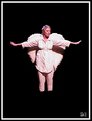
Critique By:
michaelle . (K:3807)
6/11/2003 5:14:47 PM
I wish there were more details on this image, it would help to understand a little more of what you had in mind. That being said, I am working blind, so please take these comments lightly... I like the idea very much, but the lighting is very harsh... (again, this is where comments would have helped). The dark shadows and bright highlights do not give the ethereal feel I would expect with an "angel". A tighter crop would also help to bring out her expression and would also mask the fact that her feet are missing (?). The skin tones are very pink... and working this into a black and white would possibly help with the more ethereal feel as mentioned below. I hope I have not missed the mark too much with what you were trying to accomplish.
Michaelle
|
| Photo By: Uldra Johnson
(K:683)
|
|
|
Critique By:
michaelle . (K:3807)
6/11/2003 4:36:41 PM
The landscape is fabulous... i wish the posted picture was a bit larger to see the detail. You did a great job of exposing the sky and the foreground together and the sky color is beautiful. The brush in the left frame helps to give depth to the image, but it intrudes a little more into the frame than necessary and causes a slight distraction. Very well seen...
|
| Photo By: Pablo Yorlano
(K:10)
|
|
|
Critique By:
michaelle . (K:3807)
5/25/2003 1:49:41 PM
There is such expression in his eyes! You can feel the happiness in them. I am always amazed at the way you are able to capture not only the image, but the spirit of the person with your wonderful portraits. As always, beautiful.
|
| Photo By: Aiman Nassar
(K:11961)
|
|
|
Critique By:
michaelle . (K:3807)
5/10/2003 7:11:48 PM
Thank you everyone for your comments... I have been pretty bummed out lately because, while the event gigs have helped to pay for my "habit", they have not really given me much of a creative outlet. The fact that I was able to combine the two in this picture, and that you all took the time to appreciate it really lifted my spirits, Thank you, again.
|
| Photo By: michaelle .
(K:3807)
|
|
|
Critique By:
michaelle . (K:3807)
5/10/2003 3:02:44 PM
What a catch! The tones are wonderful, and the theme says so much.
|
| Photo By: Aiman Nassar
(K:11961)
|
|
|
Critique By:
michaelle . (K:3807)
5/10/2003 2:54:58 PM
Alisa,
The feel of these three images together is wonderful... they flow into each other and let the viewer into what seems to be a private moment. Very well done!
Michaelle
|
| Photo By: Alisa Mudge
(K:7511)
|
|