|
|
|
ricardo longhi-frantz
{K:9628} 8/20/2005
|
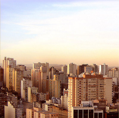
hey! this time i disagree! hehehehehe! that wide "empty" space is the source of the power of this picture. cut it out and you will have an ordinary view. here the tension between the very differently weighted areas is the focus of the composition. anyway thanks for your opinion!
|
|
|
|
|
Carsten Ranke
{K:14476} 8/20/2005
|
Here I would agree with the statement above, a crop @ the top for a panoramic would not hurt IMO.
Regards
Carsten
|
|
|
|
 Gilberto Simon
{K:556} 8/18/2005
Gilberto Simon
{K:556} 8/18/2005
|
Ótima, ótima!
Os tons estão sensacionais.
Parabéns!!!
|
|
|
|
|
Bruce Harper
{K:5305} 8/18/2005
|
I agree with Pat, too much sky - or at least too much uninteresting sky. If it had some dramatic clouds then you could get away with it but a tighter crop would improve the image because it does have good sharpness and coulurs.
|
|
|
|
 Patrick Ziegler
{K:21797} 8/17/2005
Patrick Ziegler
{K:21797} 8/17/2005
|
Nice tones and good clarity, Too much sky for my taste
|
|