|
|
 Fadel J
{K:13974} 7/24/2005
Fadel J
{K:13974} 7/24/2005
|
Amazing tones and mood Angelo, with a fantastic composition in the first place that is perfect for this kind of work!
|
|
|
|
 Rui Filipe Rebelo Prego
{K:1213} 6/20/2005
Rui Filipe Rebelo Prego
{K:1213} 6/20/2005
|
Fantastic foreground contrast, I prefer this one ! Great Portfolio !
Outra muito boa fotografia!
Rui Filipe
|
|
|
|
|
arwa abdullah
{K:34415} 6/11/2005
|
The darker higher in contrast appeals more to me! It brings out the texture and moodiness of the landscape!
Thank you so much for your continuing support and help
Im a big fan although I have only commented on few of your work!
From now on I wont miss an image!
added you to my friends list :)
|
|
|
|
 Thilo Bayer
{K:50358} 6/8/2005
Thilo Bayer
{K:50358} 6/8/2005
|
Hey Angelo,
I try to take my UF mission seriously ;-)
But you're right: Time is a precious thing, especially at UF with the massive amount of new images every day.
Thilo
|
|
|
|
 Angelo Villaschi
{K:49617} 6/8/2005
Angelo Villaschi
{K:49617} 6/8/2005
|
Yes, Thilo. I think this is more eye-catching, even in a thumbnail.
But the original tells a more complete story, with more detail.
Maybe it says something about the Internet age. Most people (me included) only have a limited time and only spend a few seconds to look and evaluate a photo. Some spend even less commenting on it! (A couple of words and we're done...)
I am happy to please with impactful eye-candy, but I also like telling a more gentle story. So gotta upload both versions :)
Thanks for all your support, Thilo!
|
|
|
|
|
Thilo Bayer
{K:50358} 6/8/2005
|
Hi Angelo,
looking at the comments and the overall interest, it seems you've made a great job with the rework.
best wishes,
Thilo
|
|
|
|
|
Gaja Snover
{K:4462} 6/8/2005
|
oh, this one is much nicer; such a great dramatic mood!
|
|
|
|
 Peter De Rycke
 {K:41212} 6/4/2005
|
Beautiful b&w work, lots of contrasts !
Peter
|
|
|
|
|
Mary Brown
{K:71879} 6/4/2005
|
Tbis is a definate improvement over the lighter version. This is quite dramatic and crisp. The darker frame emphaizes well. Wonderful.
MAry
|
|
|
|
|
Romeo Victor Sierra
{K:325} 6/3/2005
|
a great BW
Very good contrasts and composition
cheers
|
|
|
|
|
Maria Luisa Vial
{K:36017} 6/3/2005
|
It looks sssoooo... dramatic... Love what you've done with this one... Definetly a great improvement... You are demanding too Angelo... but I love you sincere critcism... It makes one want to do a lot better....Well done my friend...
Cheers,
MaLuisa
|
|
|
|
|
sherif hussein
{K:13815} 6/2/2005
|
Very nice tones and composition
Sherif
|
|
|
|
|
Angelo Villaschi
{K:49617} 6/2/2005
|
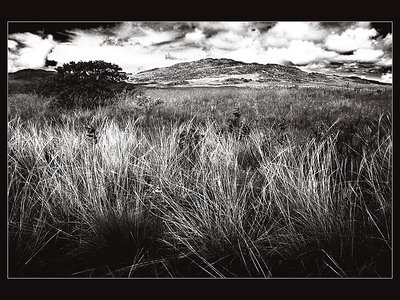
Marcio,
O "filtro" digital que utilizei foi o Channel mixer: R +140, G +20, B -60, Monochrome. Simula um filtro vermelho na frente da lente, escurecendo os azuis.
Adicionei, abaixo dessa, uma layer "Solid Colour" com blending "Colour Burn" e a cor foi um azul, valores RGB (100, 100, 200)
Isso aumentou o azul do céu e, colateralmente, o efeito do filtro.
Tem ainda uma curva nova, com contraste bem acirrado, que utilizo aqui pela primeira vez.
Que legal que você gostou!
|
|
|
|
|
Thilo Bayer
{K:50358} 6/2/2005
|
Hi Angelo,
first of all: Don't take me too serious ;-)
second: WOW! Especially the foreground and the middle parts rock the hell. bold as bold can be. this is so different to the first upload... and definitely a cool one. the sky is a bit blown out, I have to check your orignal picture... check... ah okay, the sky is kind of blown out in the original one, but not to a point u cannot restore it... starting PS... okay, I just did some minimal work here, but the sky has some more detail. this is the only thing I would think about an enhancement. some masking is needed but you don't loose the detail in the sky.
Anyway, I'm really proud that you mentioned me and that you took my opinion so seriously. thanks a lot mate.
best wishes,
Thilo
|

|
|
|
|
|
Angelo Villaschi
{K:49617} 6/2/2005
|
Thank you for your comment, Bryan. You make a great point. Let me see if I can elaborate on my point of view.
To be honest, I like both versions. A big part of what I get out of UF is learning what can be done (what I can do), what my options are, from exchanging ideas with fellow photographers.
The first version is an "I was there with a film camera, stuck a filter in front and this is what I got from a straight print" kind of image.
The second version (this one here) is more, "I came home, spent a lot of time in the darkroom using different grade printing, lots of dodging and burning and this is what came out" kind of image.
My interpretation of the scene is that I wanted to show a beautiful, rugged and yet delicate place. I honestly think both versions are valid intrepretations of this.
I am still fairly early in the journey of developing my own personal style, and I find this type of play and experimentation is very enjoyable.
Hope that cleared it up a little.
Thanks again for your comment!
|
|
|
|
|
Bryan Miller
{K:3395} 6/2/2005
|
Angelo,
I think it is more important to interpret the scene in your mind and then try to realize this interpretation through a final print. so the question is 'what was your original interpretation of this scene?' Were you trying to communicate a harsh environment, a dry environment, an environment full of light... what? the tones should serve to communicate this interpretation.
personally I find that the first version has MUCH more detail in the sky/clouds as well as the grass and shadow areas. this version may be dramatic but the quality of tones is not so good -- the subtle highlights are completely gone and the shadows are nearly all blocked up now.
bryan
|
|
|
|
|
Guga guga
{K:173} 6/2/2005
|
Very good, I like it a lot - this is a real eyecatcher!
|
|
|
|
|
Danny Brannigan
{K:19523} 6/2/2005
|
Much more pleasurable. It now has a bit of bite.
|
|
|
|
 Jeanette Hägglund
{K:59855} 6/2/2005
Jeanette Hägglund
{K:59855} 6/2/2005
|
Yes it?s dramatic and moody but also surreal! The hard contrast make it also a little scary... For me the hard contrast works well with the grass and the darkness around it higlights it perfectly..... i?m not sure about the clouds.... ut thats a peersonal taste thing.
Jeanette
|
|
|
|
 Linda Imagefree
{K:72276} 6/2/2005
Linda Imagefree
{K:72276} 6/2/2005
|
Angelo wonderful tones and composition here...and a nice perspective too, very enjoyable to watch your work...:):)Linda
|
|
|
|
 Paolo Corradini
{K:59552} 6/2/2005
Paolo Corradini
{K:59552} 6/2/2005
|
It's better than previous version with this darK tones! good job
|
|
|
|
 Marcio Janousek
{K:32538} 6/2/2005
Marcio Janousek
{K:32538} 6/2/2005
|
oi Angelo , belo contraste e perspectiva . E essas nuvens , utilizou algum filtro especial ?
explica por favor.
|
|
|
|
|
Roberto Okamura
{K:22851} 6/2/2005
|
Bela versão Angelo! Escurecida ela apresenta melhor contraste.
Parabéns pelo trabalho.
Roberto.
|
|
|
|
 ictenbey / Emrah ICTEN
{K:16316} 6/2/2005
ictenbey / Emrah ICTEN
{K:16316} 6/2/2005
|
NICE ..
|
|
|
|
|
Mark Drago
{K:10902} 6/2/2005
|
excellent result
|
|
|
|
 luisa vassallo
{K:28230} 6/2/2005
luisa vassallo
{K:28230} 6/2/2005
|
7! fantastica!
|
|


")
