I think part of what makes this photograph interesting is the layers of soft colors. Starting at the bottom, you have green, then some gold, then brown, then gray, and then dark blue. Cool, literally and figuratively. :-)
michael, i love this composition. very nice dof turning the background into texture. i like that it's not a simple, static texture but a more interesting visual varying in color and form. very well done!
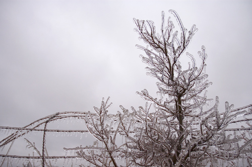
Hi Michael, could also work, it's nearly monochromatic as well, but the brownish tone makes the atmosphere a bit warmer too... The B&W one is still my favourite... (Yeay! Love those comparison thingies...:)
Yep - the other one is better, I asked my wife and she liked this one better too. But when you are a donor, you have the option of dropping both versions and getting a lot of good opinions.
Here is the color version of the other photograph for anyone who wants to play the comparison game.
Hi Michael, I had seen this one before I commented on the b&w one, and my remarks on the limited view and the atmosphere being emphasised by the use of b&w were partially based on my preview of this photo.
In essence, this one is much more "common", if you know what I mean. The approach to the b&w one is more creative, and im my lingo therefore more refreshing, so I'd go for that one as "my favourite".
Still, this one also has a lot of merit, as it shows more of the actual scene and tells the complete story. Besides, it is a very well composed and exposed shot... Very impressive....:)