|
|
|
ken krishnan
{K:19102} 3/13/2005
|
'Love' takes many different shades, indeed. I just happen to post one titled 'love'.
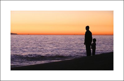
To point out some improvement - the horrizon is tilted to the right a bit. I had so much difficulty in keeping my horrizon straight. But still I tend to slant it a bit if I am not consicous of it.
regards,
ken.
|
|
|
|
|
Senthil Kumar
{K:1648} 12/30/2004
|
Matt,
Thanks very much for taking the time to look at my picture and adding the very valuable critique. The appreciative comments encourage you to take more better pictures while the constructive critiques help you avoid bad pictures.
Thanks,
Senthil
|
|
|
|
 Sudhir K. Reddy
{K:7583} 12/29/2004
Sudhir K. Reddy
{K:7583} 12/29/2004
|
We take somewhat similar pictures Senthil...another one here, but I like your colors, composition, silhouette and frame better though!
http://www.usefilm.com/image/509395.html
|
|
|
|
 Matt Davis
{K:3935} 12/29/2004
Matt Davis
{K:3935} 12/29/2004
|
Senthil. Thanks for your words on my recent upload.
This photo has pleasing colours giving a feel of calm and is a great silhouette.
On the downside I think it would be better to crop out the land on LHS (as you view) as I find this a little distracting and also could have been better if you'd waited for the foreground wave to break and run into the shore. These are all thinkgs I'd miss when composing for sure - well certainly the wave!
Composition is strong, I would like to see some other arrangements though.
Matt
|
|
|
|
 C W
{K:4458} 12/26/2004
C W
{K:4458} 12/26/2004
|
Beautiful composition!
|
|
|
|
|
Michele Berti
{K:14921} 12/26/2004
|
beautiful silhouette! great work, congrats.
|
|