|
|
|
Craig Hanson
{K:7836} 12/5/2004
|
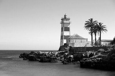
You are absolutely right Roger! I like the composition of this one, but the technical aspects need some improvement.
The white are nearly blown out and there is too little definition in the shadow areas. The lack of sharpness is not the result of cropping - the photo is in it's original form - but because photos converted to grayscale aren't affected by USM. I should have done that before the conversion.
Well, I guess we learn by our mistakes...
|
|
|
|
 Roger Williams
 {K:86139} 12/5/2004
|
Yes, very fine, but a tad lacking in sharpness... I'm guessing it might be a severe crop from a much wider angle shot. The composition and tones are fine, but the textures suffer slightly from lack of definition.
|
|
|
|
|
Craig Hanson
{K:7836} 12/2/2004
|
Muito obrigado Jose! It's Cascais!
|
|
|
|
|
José Vasconcelos Dias
{K:9341} 12/2/2004
|
I am portuguese and i can?t figure wath lighthouse is this! Great foto, very classic but very nice, well chosen tone. Best regards
|
|
|
|
|
Shehabeldin Mostafa
{K:1163} 12/2/2004
|
What a classic shot... very nice...it is just missing a black frame..well done
|
|