|
|
 Matt Davis
{K:3935} 3/22/2005
Matt Davis
{K:3935} 3/22/2005
|
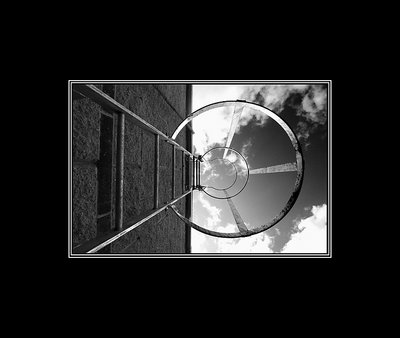
I wondered how you got the deep sky contrast and retained detail in the wall. I'd assumed it was a red filter actually, but I guess digitally changing it later is far easier.
|
|
|
|
|
Shane O'Neill
{K:3054} 3/22/2005
|
Hi Matt,
Once again thanks for your kind comments. I felt this image would look better landscape. Also I went crazy on borders around this time. As you can see the border is massive but still I think it looks well. I have calmed down a bit since then but I will say hands down that I am a fan of borders, its easier for the eye. The above image did need a little bit of photshoping, the sky had to be darkened skightly because there is no way the camera could deal with the extreames in tonal range.
Rgds,
Shane
|
|
|
|
|
Matt Davis
{K:3935} 3/21/2005
|
To put this portrait would render it std, to frame it landscape it becomes abstract.
Great creative eye, bold contrast and above all a splendid presentation. Good to see the gimmicks of PS are well and truly clear of your desktop.
10/10 I see no flaws.
Rgds
Matt
|
|
|
|
 LeAnne Eden
 {K:1683} 2/21/2005
|
your shots are great,and i know what you mean about comercial photography ruining your creativity..It takes along time to get that passion back...You have a great eye..
|
|
|
|
 Don Loseke
{K:32503} 12/31/2004
Don Loseke
{K:32503} 12/31/2004
|
Now this wide border really makes this picture stand out. Great work. Don.
|
|
|
|
 JONATHAN TAD KETCHEN (JTK.CA)
{K:1103} 12/29/2004
JONATHAN TAD KETCHEN (JTK.CA)
{K:1103} 12/29/2004
|
Great shot!
I suggest this title:
Skyhoops
or
Sky Hoops
|
|
|
|
|
Lester Tradelbloom
{K:3291} 12/1/2004
|
You run a fine line between failure and unbelievable success! I love this - but I don’t know why! Which is great, I think; I am a firm believer that although a photograph can be rated in terms of contrast, composition (and all that) but when it comes to a truly creative mind, all the principles and ‘rules’ we all know so well become obsolete, and the heart takes over - For those less artistic; this image is proof that rules are made to be broken… and shattered… and buried!
I think what I like most here is the contrast between the sky and the building, and how your point of focus is drawn up the ladder. You have done a great job here, I love it!
- Justin
|
|
|
|
 Lukasz Kuczkowski
{K:14687} 11/30/2004
Lukasz Kuczkowski
{K:14687} 11/30/2004
|
like the perspective here; good exposure
|
|
|
|
 Verena Rentrop
{K:15233} 11/30/2004
Verena Rentrop
{K:15233} 11/30/2004
|
strong composition and fantastic contrasts...
I'm using for my prints frames which are pretty much the same size in black aluminum...
Cheers,
Verena
|
|
|
|
|
Gustavo Eulalio
{K:3777} 11/30/2004
|
Nice picture. Interesting way to frame it.
Congrats.
|
|