|
|
|
SAM
{K:1503} 9/1/2005
|
Kim, First I have to say you have a spectacular portolio! You have been given some excellent opinions from your fellow UF members and I'm sure that your final decision will turn out to be just one of your prize possessions! look forward to seeing what your final decision will be..
SAM
|
|
|
|
 Nour El Refai
{K:12481} 9/1/2005
Nour El Refai
{K:12481} 9/1/2005
|
a perfect set of landscapes, just perfect
|
|
|
|
|
Hesham Abouzekry
{K:15927} 9/1/2005
|
vvvvery fantastic, light, colours & composition.
the equation of the photo is right.
H.A
|
|
|
|
 Michael Kanemoto
{K:22115} 9/1/2005
Michael Kanemoto
{K:22115} 9/1/2005
|
Honest opinion is each is strong and the interplay fantastic.
My only suggestion is to perhaps have a custom matte cut and mount each seperately. Truely a fantastic series.
|
|
|
|
|
Gerhard BuschEFIAP/AFIAP
{K:18382} 9/1/2005
|
A successful presentation and formation. The disposition of the single subjects are set excellently into the picture. Sincerely Gerhard
|
|
|
|
 Roberto Arcari Farinetti
 {K:209486} 9/1/2005
|
marvellous and congrats for the front page.. a nice mood..
roby
|
|
|
|
|
Kim Culbert
{K:37070} 8/20/2005
|
Thanks Neil, I can see what you mean. Looking at this from a further back standpoint that 1st pano shot has a lot more empty space than any other picture in the collage. I have already printed this, but I can keep playing with it and re-print later.
Thanks for the suggestion... much appreciated.
|
|
|
|
 Judi Liosatos
{K:34047} 8/20/2005
Judi Liosatos
{K:34047} 8/20/2005
|
Wow...this is fantastic. Excellent work Kim.
Judi
|
|
|
|
|
Neil Dolman
{K:26883} 8/20/2005
|
 Hi Kim, thanks for your comment yesterday. I visited your Website, you really do have some great shots. Here on Usefilm it was hard to find a shot without a dog in it :) Just joking (they are all very good) but eventually came across this one. As i'm a fan of your "magic light" landscapes i thought i would reply here. I'm sure by now you have printed this, i sincerely hope so! I like the combination, very colourful and ALL the images are excellent. I can see what you mean about the layout, but i think that is due to the emptiness and colour involved in the top horiz. one. It is just so strong and appears optically to be larger than the one underneath it. When i scroll the photo in IE then i crop just a tiny bit of the top of this photo and it gets a different weight in the overall picture. You lose a little cloud formation (which in the original would be really important) but for the sake of this collage, mabe it helps here. Just IMHO :)
Best wishes from Switzerland, Neil
|
|
|
|
 Chris Hunter
{K:25634} 12/8/2004
Chris Hunter
{K:25634} 12/8/2004
|
Sorry, Kim I forget to ask in the above comment, do you sell prints of any of your images? There are a couple that I would really like to have as prints...if you can, let me know at huntergraphics@verizon.net
Thanks,
Chris
|
|
|
|
|
Chris Hunter
{K:25634} 12/8/2004
|
Hi Kim - they all look excellent together. If I could suggest one thing though - don't have this printed as a collage of all the photos on one print. Pick your favorite four or five, and them printed at a lab, indivdually framed and matted. Then hang them all in a creative pattern or space on a single wall. IMHO this creates a really nice clean look, and will let each picture shine on it's own, with breathing room, etc. and collectively w/ all the prints as a group. To have the pictures touch each other in one big print, it's hard to give each one it's deserved attention - your eye just keeps bouncing around from pic to pic. BTW, these shots all look great together, espically the second pano shot down in the middle.
Chris
|
|
|
|
|
Eric Goldwasser
{K:4294} 11/20/2004
|
Hi Kim, thanks for your recent comments.
I like all of these. All are excellent shots... I think, if you haven't already decided, that I might swap bottom left and top left. To me that would maybe be a bit more symmetrical. And would convey morning shots to evening shots, regardless of when each shot was really taken... Just my 2 cents. :-)
Love each shot, regardless!
|
|
|
|
|
alexander raditya pratistha
{K:917} 11/19/2004
|
hmmmm....nice lay out and composition
|
|
|
|
|
Michael Kenny
{K:679} 11/9/2004
|
Spectacular shots! If i was to have to choose between the two options, i'd choose the 2nd one. Good luck
|
|
|
|
|
Becky V
{K:9699} 10/25/2004
|
I was just gonna say what Stefan said before he said it first. Great minds think alike, I guess. :)
I think separately framed photos on a wall is much more appealing, but if you're set on one giant montage, then I agree that some separation is in order. I would shrink down the photos a bit, give them a tiny border and make the background black. Or whatever experimentation creates that looks best.
In all honesty, I do feel the montage is a little overwhelming and the detail in each photo won't be appreciated as much in this format.
|
|
|
|
|
Stefan Engström
{K:24473} 10/25/2004
|
I agree with the suggestions you received so far as well - hang separately. But if you want to print one big montage, I would suggest to separate them a little in the montage, probably with a white line of a few percent of the width of the montage. The second version looks much more balanced to me.
|
|
|
|
 Jon O'Brien
{K:11321} 10/25/2004
Jon O'Brien
{K:11321} 10/25/2004
|
I agree with everybody else. These are really stunning. I would like to suggest that the two layouts you have shown are pretty static. Could you do some kind of layering / overlapping, maybe with a bit of drop shadow to give a 3D effect? I realize that you lose something from all of them doing it that way, but it might make the entire presentation more dynamic.
Later - when you have more wall space - frame them all separately :-]
Jon
|
|
|
|
|
Jim Christensen
{K:18843} 10/25/2004
|
Don't waste all that beauty on only one print !!!
every shot in the montage, is a exceptional shot in itself.
great collection
jimc
|
|
|
|
|
Mary Sue Hayward
{K:17558} 10/24/2004
|
I prefer to think of these images being framed individually. However, if you want to try for a montage, the second montage seems MUCH stronger than the first. There is more balance, and it seems more organized...much easier for the viewer.
|
|
|
|
|
Luke Luther
{K:14693} 10/24/2004
|
Go for it. These are powerfully moving images, each capturing the light it its own way. Do it!
|
|
|
|
|
Dirck DuFlon
{K:35779} 10/24/2004
|
Kim, every one of these photos makes me green with envy! Each a masterpiece in it's own right! I really like what Mary Sue suggested, and was thinking along those same lines when I saw this. Each photo in it's own slim frame, with just a hair of space between, but still arranged as a montage.
As for arrangement, I prefer your second grouping - it associates the two lake images with aqua hues, and also the two with more purple tones. To top it off, you now have a 'sunrise' feel at the top, and a 'sunset' feel at the bottom! This is going to look stunning on a wall!
|
|
|
|
 Gerry Pacher
{K:7303} 10/24/2004
Gerry Pacher
{K:7303} 10/24/2004
|
Hi Kim,
I prefer your last composition (just below) - It looks more structured.
By the way, these are incredible shot - each single one!
Regards, Gerry
|
|
|
|
|
Kim Culbert
{K:37070} 10/24/2004
|
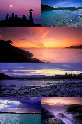
Thanks to Gustavo, Heath and Mary-Sue for your comments... I really want to make one 12 x 18 print of collages to see if it works and if I like the outcome. I have limited wall space and I thought that this might be a different way to showcase some prints instead of many smaller framed prints. Who knows... maybe I'll get it done and realize what you are all telling me now... *grin*
Here is another layout option for the pictures...
|

|
|
|
|
|
Mary Sue Hayward
{K:17558} 10/24/2004
|
Kim, each of these is lovely on its own merit. If you have a space in your house where you want to place a montage, this layout is quite appealing. But, as other commenters have said, these images are so strong on their own, I imagine them framed individually, but placed near each other so that the comparison is possible. Or a single, favorite, image presented alone would make a strong statement.
You have done a remarkable job with each of these images!
|
|
|
|
|
Brenda Orchard
{K:1226} 10/24/2004
|
Great idea. I would shift the lower 2 images up to the top so that asthetically there is a balance on your page and that balance would be stronger than the one you have now. I agree, all pics are lovey individually also.
|
|
|
|
|
Heath Bennett
{K:4429} 10/24/2004
|
I'm always a little cautius with montage, especially when they complete for attention so much against eachother. Each of these shots is good enough to be printed seperately!
The pictures are fantastic though Kim.
HB
|
|
|
|
 Gustavo Scheverin
{K:164501} 10/24/2004
Gustavo Scheverin
{K:164501} 10/24/2004
|
La composición en interesante, pero creo que las fotos son muy hermosas individualmente, to las habría expuesto una a una...
Un abrazo!
|
|