|
|
|
Ferran Lacruz
{K:5466} 10/10/2004
|
En primer lugar gracias por sus comentarios sobre mi fotografia "Playa desierta" le estoy muy agradecido por sus observaciones la defrmacion del horizonte es debida a la calidad humilde del objetivo de mi camara Coolpix 775.
Respecto a su imagen me a gustado mucho la calidez de los colores y la luz me recuerdan a la pintura de bodegones de los grandes pintores clasicos.
Saludos Ferran
|
|
|
|
 Kurt LaRue
{K:5067} 10/8/2004
Kurt LaRue
{K:5067} 10/8/2004
|
Very creative, Hugo. Sorry I can't comment more but I'm suddenly quite hungry. : )
Best wishes, Kurt
|
|
|
|
 Hugo de Wolf
{K:185110} 10/5/2004
Hugo de Wolf
{K:185110} 10/5/2004
|
Hi Randy, thanks for your indepth comment; I think the pushed saturation works quite well (what made you think it'll get you in trouble, I wonder...;o)) It does fit nicely with the altered version Stan uploaded in his comment. It does make the food look more apatising. Much appreciated!
Cheers,
Hugo
|
|
|
|
|
Jorge Vasconcelos
{K:33746} 10/3/2004
|
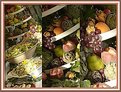
Strange picture,as strange and a bit odd is the theme the site sugest.I think it makes no sense to deal with eggs, but in a dish, at table. But back to your picture,it looks interesting , too many points of attention , or too crowded and overdone.But I choose the concept of "many points of interest". The general feeling is nice, color- I love color- well done gradient on light.All in all I like it and rate 6.Not 7 because my doubts above presented.
Regards
jorge
|
|
|
|
 Randy Lorance
{K:24769} 10/3/2004
Randy Lorance
{K:24769} 10/3/2004
|
forgot to mention that I like the bowl and spoon
...Randy
|
|
|
|
|
Randy Lorance
{K:24769} 10/3/2004
|
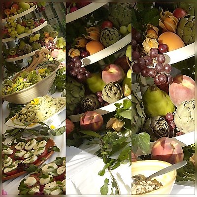
Hi Hugo,I'll add to the chorus and say this is my favorite of the three...all very creative and a nice step outside the box. I looked at this a while before reading what you or others had to say and was quite fascinated, mentally fitting the images from the right to the left,seeing that each was shot from a slightly different perspective. In addition,I like just how much eye movement is created by the diagonal as well as curved lines of the trays, and especially the eye refocusing from one frame to the other for distance. Altogether a very nice composition.
Now I get myself into trouble by submitting a version I fiddled with. After seeing the talk of the food looking appetizing and light/shadows,I did some minor adjusting with selected gamma and saturation.I feel though that it may have lost it's appeal that Thelmo mentioned.
I'll say what I have said to others,I would never take and mess up someone's picture if I didn't like it to start with :)
Randy
|

|
|
|
|
 Jose Ignacio (Nacho) Garcia Barcia
{K:96391} 10/2/2004
Jose Ignacio (Nacho) Garcia Barcia
{K:96391} 10/2/2004
|
marvelous composition. 7(thanks for your advice)
|
|
|
|
|
Riny Koopman
{K:19998} 10/1/2004
|
Lovely taken and toned...Riny.
|
|
|
|
|
Carolyn Wiesbrock
{K:14051} 10/1/2004
|
Incredibly edible and a good combination.
Excellent presentation!
|
|
|
|
|
Hugo de Wolf
{K:185110} 9/30/2004
|
Hi Lori! Thank you for your comment. It sure means alot to me, and I owe you for many of the things we discussed a while ago. Your tips and experience in wedding photography came in very handy. I've shot a few weddings since (about 4 or 5) and the results of combining these types of shots with the "regulars" works quite well. Only very positive reactions....
Good to have you back!
Cheers,
Hugo
|
|
|
|
|
Hugo de Wolf
{K:185110} 9/30/2004
|
Hi Stan, thank you very much for your comment. The moment I saw your rework, I remembered it; my art teacher taught that to us, but I had long since forgotten.... It does make the food look more apatising. Big improvement.
Cheers,
Hugo
|
|
|
|
|
Hugo de Wolf
{K:185110} 9/30/2004
|
Hi Tom, I do know what you mean. The diagonal composition of the vertical panes do create a more dynamic (or better: less static) image. I'll keep this in mind, as I'll definately keep working on such composite images...
As discussed, I've never gotten so many useful comments on a single series as in this one. The unusual approach, maybe?
As on transcending the basic meaning and appeal f a food shot, I think Stan Pustylnik made a very good point. It's something my art teacher taught me, but which I had long since forgotten....:)
Adding the extra effect of rotating the individual panes would introduce an extra element, making it probably even more dynamic (less static). I'm not sure if that would be redundant or not. It'll be something I'll try when I have another occasion..
Talking loud is the best way of commenting, I think. It is the most effective way at looking at one photo through the eyes of another.... Thanks! Very much appreciated!
Take care,
Cheers,
Hugo
|
|
|
|
|
Hugo de Wolf
{K:185110} 9/30/2004
|
Hi Thilo, I agree. It's a shame of the painted look.
Weird enough, I didn't notice that when I put the shots together. That Painted look was induced by the noise reduction of Nikon Capture., but went too extreme on it.
Thanks for your comment, Very helpful!
Cheers,
hugo
|
|
|
|
|
Hugo de Wolf
{K:185110} 9/30/2004
|
Hi Steve, Thanks for your comment. About the frame, I must admit, that's not my own Idea, but Peter de Rijcke. I believe I mentioned that before some time ago? Well, this is it!
Cheers,
Hugo
|
|
|
|
|
Hugo de Wolf
{K:185110} 9/30/2004
|
Ha Teunis, Dank je voor je uitgebreide commentaar. Ik begrijp zeer goed wat je bedoelt, en vanzelfsprekend is je engels je vergeven...:)
Wat betreft de compositie, het was eeen variant waar ik zelf ook uitgebreid over na heb gedacht. De reden, dat ik het wit er in heb gelaten is omdat de onderzijde dan wat onrustig zou worden (en dat vind ik ook een beetje in jouw versie) Dat geldt met name in de details: de schotel met mozarella en tomaat links, als ook de perzik en de kom rechts en de bladeren in het midden worden op die manier wat "kort af gesneden". Ik ben het echter wel met je eens wat betreft het wit, dat misschien wat overheersend is.
In ieder geval, mijn dank; goed om te zien, en je hebt een sterk element; in het overzicht is jouw versie beter...
Groeten,
Hugo
|
|
|
|
Lori Stitt
 {K:75282} 9/30/2004
|
PERFECT 7+++
Hello Hugo!
You have taken the edible and creative flower to a whole new realm!!
Finally I have viewed all three of your creations.
This one is by far the best one of the three. I like it very much.
I can see all three in a lovely wedding album, and I know any bride and groom will enjoy remembering their special day and the food served.
They want to remember it ALL, and with your expertise they will have those wonderful memories!
For me, the other two didn't 'flow together' enough. Not to take away from the creativity...this is just my taste. Maybe if there were lines between each frame...
Now THIS ONE I think flows so well! Love it, this is more 'complete', I know I'm not explaining this very well!
Maybe it all comes down to preference and taste (not a pun..:), this just works very well, and could be a stand along image also.
Very nice Hugo, everything has already been said, so I won't repeat...except for
WELL DONE!!!
Lori :)
|
|
|
|
 Emgy Massidda
{K:60358} 9/29/2004
Emgy Massidda
{K:60358} 9/29/2004
|
Hugo.
I don't like much the lower bottom part cause of the bowl with spoon and the white table cloth. Yet, this is my favourite image. I am not quite sure why but probably it's for the presence of those curved white stripes which, IMO, add artistry to the image. Beautifully composed, the lighting is superb!!
Emgy
|
|
|
|
|
Stan Pustylnik
{K:6768} 9/28/2004
|
Hugo, I really love entire image. Just one tip. Couple years ago I hears that red/yellow colors in human's brain are stimulating appetite. In case of food photography it works very effectivelly. Just my 2 cents.
|

|
|
|
|
|
Jani Salvataggio
{K:27283} 9/28/2004
|
great idea, fantastic picture!!!!
regards
Jani
|
|
|
|
 tom rumland
{K:14874} 9/28/2004
tom rumland
{K:14874} 9/28/2004
|
hugo, this is the one. my favorite of the three. love the angle. it causes me to remember the image in my mind as if it was cropped at an angle. kind of diagonal panes rather than vertical. i can't explain. it's a bit odd. hopefully you know what i mean.
i've looked at this one for a while and refrained from commenting too soon on purpose as i wanted it to seep in. several ideas have come and gone as this is a rather diffcult subject. everyone likes food. but how do you compose it in such a way that it transcends it's basic meaning and appeal? to become more than just food? to be honest, after much looking and deliberating, i can't come up with a good way. but that's a problem with my vision as i'm sure i wouldn't have been able to get this far myself.
perhaps an optical illusion type of effect. keeping with the same (and very cool) zooming effect. in addition to the painterly look of the right pane. it would require a different shot, but how about making the shot in the left pane continue the apprent rotation shown in the other two? at the same time slowly increase the painterly effect in each frame.
sorry, i'm thinking out loud now ;^) a very interesting series all the way around. would've never occured to me. i probably would be at the bar taking pictures of beer and liquor bottles ;^) very nicely done.
take care,
tom
|
|
|
|
|
Shahenaz Fouad
{K:453} 9/28/2004
|
Very creative idea. Beautifully taken.
|
|
|
|
|
Kam Broumand
{K:-82} 9/28/2004
|
Hi Hugo,
Greetings from Tehran! Thanks for your comments on my latest pictures! I like the creativity on these pictures, great concept. The use of shadow works really well here and the colors really add value to the image. I also like the angle the shots are taken.
Great work
Regards
Kam
|
|
|
|
 Rob Ernsting
{K:8899} 9/28/2004
Rob Ernsting
{K:8899} 9/28/2004
|
It is nice and different. I like this one best because of the DOF as I remarked with the previous ones. It is also the best in composition IMO. Regards, Rob.
|
|
|
|
|
Maria Luisa Vial
{K:36017} 9/27/2004
|
Definetely Hugo this is the best of the three... It made me hungry and not dizzy... which is a complete turn with what I felt with the other two... Loved the the way you composed the tryptich... It looks very well balanced... except... I love the cropping and and framing that Teunis did...
Cheers,
MaLuisa
|
|
|
|
|
B:)liana
{K:30945} 9/27/2004
|
wow. well done dear Hugo. I like it!
Kisses, Biliana
|
|
|
|
|
Telmo Domingues
{K:9639} 9/27/2004
|
Well... I do like this!... not only because of the motive (I'm a 93kg hungry boy) but because of the photo itself. If the colors/lighting were "right" this would lost it's beauty. I like the "zoom effect" toghether with the diagonal stripes along the composition. You used no PS... This is even better!
Cheers! (I'm going to eat - you made me hungry! ;-)))
|
|
|
|
 Thilo Bayer
{K:50358} 9/27/2004
Thilo Bayer
{K:50358} 9/27/2004
|
5.2 is way too low. try to change that =)
|
|
|
|
|
Christian Barrette
{K:21125} 9/27/2004
|
I will join the band and confess that this is my prefered one too. Teunis has made a point in his cropping suggestion. Closing in from left to right, maintaining the tilted framing and the structural reference drawn by the plates all contribute to the solid integration of the three images.
|
|
|
|
|
Sally A.
{K:4601} 9/27/2004
|
i like this one too, you see the whole image and then it get's closer... very nice.
Keep it up.
|
|
|
|
|
Regina Rianelli
{K:24147} 9/26/2004
|
WOOOEEE.............what a superb collage, Hugo!
this is an amazing composition... my Compliments!
although You said they came from different shots, they seem to be enlarged from the very first...
beautiful! ...the vertical cuts are extremelly pleasing to the eye... and the round platforms are eye-catching and drives us across that fabulous variety of flowers, salads and so forth!!!
as Steve and Chris and Teunis seem to put very well together,this is also the Favorite to me, out of the three...
keep up the great work!
my Best + Groejes,
Regina
|
|
|
|
|
Thilo Bayer
{K:50358} 9/26/2004
|
Dear Hugo,
I appreciate the idea a lot to put three different pictures together which seem to be the close-up of each other. very creative stuff.
I was wondering if the painted look was intentionally but you stated that this was done by accident. hmmh... it can even be seen in the middle, but on the right it's totally obvious. If you had not clarified this I would praise your idea of realizing a more painted look when moving to the right =)
The white curves are really cool and create a connection between the three thirds. I also like the lighting play and the shadows here - unfortunately the shadows on the right become very weird by the selective blur. Seems to get opaque. A pity.
anyway well done and I will hunt for my midnite snack. ;-)
take care,
thilo
|
|
|
|
 Roberto Arcari Farinetti
{K:209486} 9/26/2004
Roberto Arcari Farinetti
{K:209486} 9/26/2004
|
excellent colage and moment!
ciao my friend!
roby
|
|
|
|
 Massimo Di Maggio
{K:-53658} 9/26/2004
Massimo Di Maggio
{K:-53658} 9/26/2004
|
A zoomed compo!! Yes Hugo, you surprised me again ;) Good angle and colours, a bit of PS to have a paint effect, decidedly a creative work!! A bravo to the chef too, he composed the foods with a lot of taste and elegance. Bye Max
|
|
|
|
|
Tiro Leander
{K:19060} 9/26/2004
|
I think this is really delicate, and yes i agree - the best one. The colors are so vivid and happy, and the whole thing seems so enjoyable. Very good.
|
|
|
|
|
Hugo de Wolf
{K:185110} 9/26/2004
|
Oh, and I reduced some of the noise in the image when converting from RAW to JPEG in the right hand panel. On closer look, I did over do that a bit, which caused the painted look, unfortunately.
Cheers,
Hugo
|
|
|
|
|
Hugo de Wolf
{K:185110} 9/26/2004
|
Hi Verena, No filters or PS tricks used, except for creating the composition and the usual level tweaks... I'm curious about your final statement...:)
Cheers,
Hugo
|
|
|
|
|
Bart Aldrich
{K:7614} 9/26/2004
|
Fine compilation...yum!
|
|
|
|
 Verena Rentrop
{K:15233} 9/26/2004
Verena Rentrop
{K:15233} 9/26/2004
|
Dear Hugo,
before a final statement, did you used any filter or did some special work in PS? Perhaps some unsharpen effects?
A first statement is positive about the white curves which I like a lot.
Rest is coming after your reply...
Cheers,
Verena
|
|
|
|
 Orazio Minnella
{K:49417} 9/26/2004
Orazio Minnella
{K:49417} 9/26/2004
|
Another beautiful collage composition.Light and colors are wonderful.All well done.
Regards....Orazio
|
|
|
|
 NN
{K:26787} 9/26/2004
NN
{K:26787} 9/26/2004
|
Yessss, this is IT! I like especially how the close-up increases to the right ... a bit bright in some parts, but still ... excellent, original work!
|
|
|
|
 Saeed Al Shamsi
{K:47735} 9/26/2004
Saeed Al Shamsi
{K:47735} 9/26/2004
|
You hit it, bulls eye.. it is a nice challenge to find a creative look, definitely no comparison to the others two ,to IMHO, The vertical portions help a lot, but I think the attractive part is because of the same elements in all 3 shots, as well as the close brightness, as I said before it is a matter of taste but to me this image can be included in the wedding album among others : ) I like it, this is my honest thought. Saeed
|
|
|
|
|
Stephen Bowden
{K:64141} 9/26/2004
|
Wonderful composition. A neat idea Hugo and very well put together , this is also my favourite of the three.
The colours are evenly balanced and I am not sure if there is a pastel effect applied on the image on the right (looking at the grapes and the contents with the bowl) ?
I also like the frame ... then again of course I would say that lol
Best wishes,
Steve
|
|
|
|
 Teunis Haveman
{K:53426} 9/26/2004
Teunis Haveman
{K:53426} 9/26/2004
|
Hello Hugo,
I have look for this one an long time
Than I tought it is the white on the Bottem that give an mistake on this beautiful compositie , it make me hungry . I have cropp teh bottem and added this to this comments and I give an frame
Hugo , vergeef me mijn engels
Ik heb het onderste gedeelte weggeknipt
Ik keek lang naar deze prachtige compositie ,je kreeg er bijna trek in.maar dat witte van het kleed stoorde.
Groet teunis
|
|
|
|
|
|
Chris Spracklen
{K:32552} 9/26/2004
|
My favourite too, Hugo!
Mgnificent series all round!
Excellent concept and the food looks good enough to eat!
Best regards, Chris
|
|

 Das")