|
|
 James Philip Pegg
{K:10138} 10/11/2004
James Philip Pegg
{K:10138} 10/11/2004
|
A wonderful portfolio Amanda, some great children photos. I see a lot of photographers have left you some good comments, so I will not bore you with any more, nice self portrait, I like the tones/ colours. Cheers, James
|
|
|
|
|
Stephen Bowden
{K:64141} 9/21/2004
|
Beautiful photo Amanda - I love the composition just the way it is.
I like the dark side on the left and the light side on the right.
To my novice eyes I think it is perfectly balanced, the toning is exceptional and the idea brilliant.
Unfortunately, I cannot find anything to nit pick about :-)
Best wishes,
Steve
|
|
|
|
 ARMANDO ALCÁZAR
{K:42404} 9/11/2004
ARMANDO ALCÁZAR
{K:42404} 9/11/2004
|
excellent self portrait and colors combination, congrats my friend.
PS: you have a realy beautiful model :0)
|
|
|
|
|
A K
{K:8499} 9/10/2004
|
Thanks so much David :) I actually have two parts to that site - the main one, www.fallintoblue.com and www.fallintoblue.com/children which is where I try to get business ;)
|
|
|
|
|
A K
{K:8499} 9/10/2004
|
Thankyou Heath. I personally thought the composition was good, but I guess that is always open to interpretation. Being able to only show such a small image on usefilm can be a hassel - especially with this photo, which looks so much better in it's full-size.
|
|
|
|
 Trish McCoy
{K:15897} 9/10/2004
Trish McCoy
{K:15897} 9/10/2004
|
beautiful and soft.
|
|
|
|
|
Terry S.
{K:3083} 9/10/2004
|
Beautiful shot. I actually like the composition a lot and the sense of place it provides. I looked at the site you posted in your bio and agree with David - beautiful.
|
|
|
|
|
B:)liana
{K:30945} 9/10/2004
|
wow. excellent! love the blur and the soft pale tones of colors in it!
Kisses, Biliana
|
|
|
|
|
David Fisk
{K:7444} 9/10/2004
|
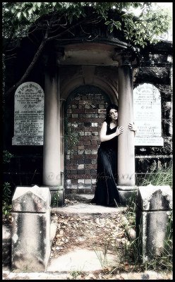
Amanda:
This id stunning!! I love the mixture of color, and B/W, and I see even some sepia. Great idea, and I've looked at it on fall into blue. WOW!!
Great stuff my friend.
Best to you
David
|
|
|
|
|
Heath Bennett
{K:4429} 9/10/2004
|
I really like the effects you apply to your shots.
regarding the composition issue - I believe that you are the focal point of this shot. the reason why it is zoomed out is for situational instruction! I can understand Ivan a little, but only if I am being super super picky. actually now that i think about it i disagree with ivan! everything else in this shot is symmetrical, so the eye is drawn to YOU.
i especially think that would be the case in a high res shot because there would be more detail in your face. This picture in its small size i dont think is doing it justice.
sorry for the essay. i just couldn't stop typing
|
|
|
|
|
Gertrud Gozner
{K:14222} 9/10/2004
|
I like it! beautiful!!
|
|
|
|
|
Ivan Jimenez
{K:9078} 9/10/2004
|
Of course Amanda, of course.
Personally I think you should have got a bit closer to the subject in the picture. You could have emphasize her that way whilst sending and added message with this very interesing location.
In short, I feel the lady in that picture gets lost in the location and she desserves a bit more attention.
|
|
|
|
|
A K
{K:8499} 9/10/2004
|
What would you suggest to improve the composition. It's more helpful to tell me this than just to say that it could be better.
|
|
|
|
|
Ivan Jimenez
{K:9078} 9/10/2004
|
The idea is nice, but you could have improved a bit the composition... Still, interesting way to play with the colours and tones.
|
|