|
|
|
Chris Spracklen
{K:32552} 9/13/2005
|
Aw, Pia, you're too kind!!  ) )
And your images are sooooo cool!!
Thanks!
My best regards, Chris
|
|
|
|
 PK- Photos
{K:13099} 9/13/2005
PK- Photos
{K:13099} 9/13/2005
|
....I don't agree, you are very good in bw-portraits:))
my best regards and hope I could inspire you:)
Pia
|
|
|
|
 Hugo de Wolf
{K:185110} 11/12/2004
Hugo de Wolf
{K:185110} 11/12/2004
|
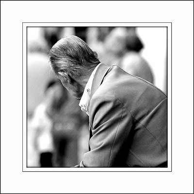
Hi Chris, the shot itself is excellent, as is the soft blurry background. You know how I feel about the PS filters, and I think a gaussian blur would've done the trick, no need for the sketched filter, IMO. Other than that, a very strong shot.
Cheers,
Hugo
(PS: Guess I've missed this one...;o)
Cheers,
Hugo
|
|
|
|
|
Chris Spracklen
{K:32552} 8/22/2004
|
Thanks for the comment, but could you explain what a 'bokeh' is? I've never heard of the word!
Sincerely,
Chris
|
|
|
|
al shaikh
 {K:15790} 8/22/2004
|
Straight: the photoshop bokeh kills it.
|
|
|
|
|
Jim Gamble
{K:12164} 8/20/2004
|
Very good image
Cant decide which I like better, the colour or, the black and white, both are good
I fear that this a fate that will befall us all one day.
Have a blessed day,
Jim Gamble
|
|
|
|
|
Chuck Freeman
{K:13616} 8/19/2004
|
I am beginning to feel this way every time I go shopping anywhere. Yet, I am only 59 yrs of age.
Nice photograph.
|
|
|
|
 Menno Naber
{K:3570} 8/19/2004
Menno Naber
{K:3570} 8/19/2004
|
Hello Chris,
This is a good picture for b/w
You do not need colors to tell the story in this case, with a bit of imagination...
well done
regards menno
|
|
|
|
|
Stephen Bowden
{K:64141} 8/19/2004
|
ps - I DO hope to hear from you within a few weeks, last thing I want to do is upset you as well lol
|
|
|
|
|
Stephen Bowden
{K:64141} 8/19/2004
|
Hi Chris, I prefer the B&W myself but find the background not quite matching. Perhaps a slight radial blurr on the background would suit better - I don't know, what do you think ?
|
|
|
|
|
Maria José Barres
{K:11276} 8/19/2004
|
Excellent.....7+
|
|
|
|
|
B:)liana
{K:30945} 8/19/2004
|
wow.. excellent. love the effect!
super dear Chris.
Kisses,Biliana
|
|
|
|
|
Antonio Trincone
{K:23167} 8/19/2004
|
ironic comment LOL
about the photo it is interesting the background effect even the heavy frame does not add more to it
|
|
|
|
|
PK- Photos
{K:13099} 8/19/2004
|
P.S.
....you see so many good and positive critique, I like that:)
I know you like digital-imaging work and its great to give some photos an artistic-style, but I think if it comes to the topic "People" or "Street-Photography" you need ONLY your camera!
I wished I would have so a good eye:) I am also a beginner in street-scenes and people shots and I have to improve myself a lot, but you are an inspiration for me to go on with it....thanks.
*Pia*
|
|
|
|
|
Craig Garland
{K:27077} 8/19/2004
|
Chris; I honestly think this is quite a poingnant (sp?) photo. You've captured a somewhat sad-- maybe forlorn look just judging from this gentleman's posture-- and your title shows that you know that's what you captured. I do question the diagonal streaking in the middle ground. I find it a little distracting and think that just a nice blur would be more suitable and effective. Cheers. Craig
|
|
|
|
|
Linn Currie
{K:24426} 8/19/2004
|
Hmmm ... the colour version works for me! Definitely. Could it be because you darkened to white corners? Maybe.
What I like about this is how the colour of his neck/face blends in with the sepia background. This mix of B&W and Sepia is quite inspiration Mr S! I need a bit more practice with PS and then I will probably do a Spracklen copy! Be flattered!
But you know what I like most of these images? That it is so different! You know I love your cottages and flowers - but when you break away and "shock" us with something so entirely different, it is quite refreshing!
More! More! More!
Linn
|
|
|
|
|
Craig Hanson
{K:7836} 8/19/2004
|
Compared to the age of the earth, we are all todlers!
|
|
|
|
 Roger Williams
{K:86139} 8/19/2004
Roger Williams
{K:86139} 8/19/2004
|
I'm not the one to comment on street photography OR people, but I find the rendering of the scene your old man is looking at too blurred (I'd like to have been able to see at least the kind of thing that was attracting his attention) and it has a strange texture of its own. A PS filter, no doubt. The B&W tones are quite beautiful, and the sharpness and textures are good, apart from the distracting texture of the background.
|
|
|
|
|
PK- Photos
{K:13099} 8/19/2004
|
Hi Chris, ok no flowery stuff, but I am really impressed :) I like very much that I could inspire you with a b/w version, thats very much expressive.
About the background....it looks nice with your PS-effect, but honestly I would prefer a natural blur background with f/2,8. I look forward to seeing more bw-photos from you (without any manipulations), you are great!!!
Wish you a nice day and best regards from Germany:)
*Pia*
|
|
|
|
|
Neil Dolman
{K:26883} 8/19/2004
|
Interesting reading all these comments you get Chris. So here is my 2 cents worth! I prefer the black and white version! I like the subtle way you have the effect just on the background and my only questionable point would be the angle of the effect? Now that Merete has mentioned it, maybe i would have tried a slighlty different angle so the creases in his neck go more with the angle you used - more like 75? instead of 45?? Anyway now i'm nit picking and i do like your result.
Best wishes - Neil
|
|
|
|
|
Merete Westerdahl
{K:11079} 8/19/2004
|
I don't like the main-upload..but the coloured photo is great! The colour of his neck fits to the background..great!
Actually I shouldn't comment on a photo... really.. :-/ Don't know anything about filters...technics etc...
Have a great day..I attend to.. ;-)
Merete
|
|
|
|
|
Regina Rianelli
{K:24147} 8/19/2004
|
Dearest Chris,
i enjoy very much both uploads of yours: colour version and b&w that i found such texture fascinating!
this crisp behind the gentleman gives me an idea of time speed.... very much so!
i like it!
You always surprises me, my Friend!
Keep up the good work...
my Best,
Regina
|
|
|
|
|
Lori Stitt
{K:75282} 8/19/2004
|
Honesty huh? Well I like it Chris, just not as much as the first one. But I STILL like this image.
What I do like is the line to it, the crispness/clarity. Only the background is penciled, not the subject this time. So why do I like the other one better? I think it's because the subject was SO DIFFERENT! More radical than this one. It looked more 'artsy'....that's IT! IT LOOKED more artsy!
But this is still good Chris....(now are you going to go AWOL?) LOL
Well done,
Lori :)
ps...I didn't 'do flowery' did I? :)
|
|
|
|
|
Jim Christensen
{K:18843} 8/19/2004
|
Chris
Very nice, i like the effect you are using in the background really nice
jimc
|
|
|
|
|
Chris Spracklen
{K:32552} 8/18/2004
|
Thanks, Don! I took your advice ~ here's the colour version?
|

|
|
|
|
 Don Loseke
{K:32503} 8/18/2004
Don Loseke
{K:32503} 8/18/2004
|
Yes, I know about that being young once. Now when I get down on the floor I have to roll around like an old sow trying to get up. This is very nice in black and white.
The background is well out of focus, how about darkening the upper right corner and lower left white area so it does not draw the eye so much. Don.
|
|
|
|
|
Margaret Sturgess
{K:49403} 8/18/2004
|
Wont be flowery - very good, like it. Street photography and B &W, no end to your talent.
Thanks for the comment on my BW - wasn't sure about that either
Margaret
|
|


")


