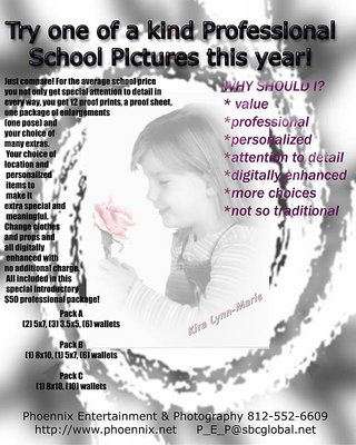
This is our new flyer to do special school pictures. I want your thoughts on the entire idea, the layout, the price, every detail. Please give me feedback on this, its a new idea that isnt done by anyone else around here. Thank you for honesty.
Yoshi, You continue to give me wonderful compliments and make me smile. Thakn you for that. Also thank you for your comments and thoughts. I will reowrk this based on everyones ideas. They mean alot to me. I love this place and the people what would I do without the people like you guys? Thank you for being so open and honest in your thoughts, exactly what I am looking for! ~mandy
1) Is this a Flyer? As in, hand-out? If so, I think I would make the photo come out a little stronger - I think it looks too faded to get people's attention right away. It's a nice cute photo, so I would make it stand out some more.
2) I wouldn't cover the photo with the words on the right; takes a little much away from the photo, and is distracting?
3) I would change the colours of the FONT. The writing on the right is being sucked in to the photo and loses a couple of words. The black is OK, however the left hand info is a little too busy, and I'm not sure if John Q Public knows what a Proof Print and Sheet look like or what they really mean? May be you could add a couple of small pictures to show what they are?
4) I would make the Price Listing much more clearer. If it's an Advert, most people go straight for that, and right now it looks like you're trying to hide it....?
5) Again, the Pack A,B,C listing should be away from the Photo - may be horizontally below the photo would be more operational and clearer?
No not mad at all. I really appreciate your entire honesty and complete feedback thats what I need to grow and learn before I market somethign like this. I need to know what works and what doesnt so I can advertise and be productive at it. Thank you very much and I will work with your suggestions. Also thank you for the compliments on my portfolio, that means alot to me! thank you! ~mandy
I too am a graphic artist and know how much of an utter pain it is to put text on top of a photograph, considering the different areas of contrast.
My honest feedback is that I don't like the layout. Most of the text is too hard to read, there are too many fonts, the photo is too obliterated, and the layout is too busy.
You have a nice portfolio of photography and I think you should build your ad around your image, "Lost in thoughts about.." The image is really striking, and there's a clean area running the left side of the image to put your text.
Use one font for the headline and your contact info, and another for the body text. Your are selling the quality of your photography and the more stuff you put on top of your image, the less impact it has.
It's really hard to explain layout in a forum like this, but what I usually do for inspiration is to head down to the bookstore and flip through the latest Communication Arts or Print magazine and use layouts I like as inspiration.
You are a talented photographer and there's no reason you can't use your eye in that medium, to excel in this one.