|
|
 Clifton Jones
 {K:10688} 2/2/2004
|
Great.........
|
|
|
|
 Dale Hardman
{K:394} 1/15/2004
Dale Hardman
{K:394} 1/15/2004
|
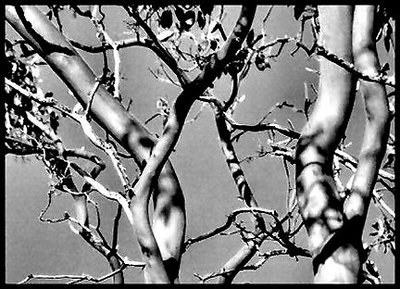
I like the clarity of the line definition within the contrast, but do feel somewhat distracted by the background noise/artifacts. However, the strength of the overall photo outweighs the minor note. Love the supple feel of branches you capture with lighting.
|
|
|
|
 Nuno Murias
{K:5323} 1/12/2004
Nuno Murias
{K:5323} 1/12/2004
|
This is my favorite one...thanksssssssssssss for your coment!
|
|
|
|
|
Richard Marriner
{K:6657} 1/12/2004
|
Of the series, I prefer this version, mainly for the pleasing arrangement of lines and shadows within the chosen crop. I'm a bit suspicious that the scanning and/or post processing hasn't done the original photo justice. While I very much like the composition and subject matter, the three images presented here seem to have lost detail and dynamic range whilst gaining noise and jpeg artefacts. (This doesn't matter as much if it's just the toning you want people to comment on, but it does make it a little harder to critique objectively.)
|
|
|
|
|
ana ribeiro
{K:21290} 1/12/2004
|
i like this one , the colored one has not a good resolution on colouring
|
|
|
|
|
jiorji m
{K:489} 1/11/2004
|
yeah i agree i love the bwcontrast. it makes the tree look more of a composition than purely a tree picture ifyou know what i mean.
|
|
|
|
|
Ronald Huntley
{K:72} 1/11/2004
|
Gayle...
I prefer the B/W image more than the colour image. I like the monochromatic contrast.
Ron
|
|