|
|
|
Daniel case
{K:756} 11/6/2003
|
I find that fuji 100 & 200 seem to be geared toward a warmer tone. Also my local lab rarely prints fuji the right way, maybe it's just the lab. Good luck!
|
|
|
|
|
Maarten Geers
{K:1070} 10/14/2003
|
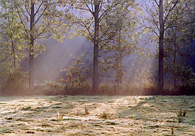
Hermen, nice early moning photo. IMHO, you should spot metering the shadow on the grass to get a better image and preserve the light you saw.
|
|
|
|
 Hermen Pen
{K:9168} 10/8/2003
Hermen Pen
{K:9168} 10/8/2003
|
To Daniel Taylor: thanks for your comments on the film choice! I am prepared for my next excursion now, with a couple of rolls of Fuji Sensia and Velvia in my fridge :) Next week, I will get a film scanner, so I will probably use more slide film than negative film in the future. I will also scan the negative of this image by that time, to see if I can get better results.
|
|
|
|
 Raymund Macaalay
{K:7218} 10/7/2003
Raymund Macaalay
{K:7218} 10/7/2003
|
I think on my own point of view, it lacks more of the foggy effect
|
|
|
|
|
John Muzo
{K:52} 10/5/2003
|
the picture is too grainy but the capture of the ligh is indeed magic. Great work.
|
|
|
|
|
Daniel Taylor
{K:3495} 10/4/2003
|
I find that negatives ALWAYS require considerable color correction post scan, so I'm not sure if the color cast is anybody's "fault". Plus negatives are balanced to a certain color temperature, yet you encounter many different temperatures of light (hence why digital users are so found of auto white balance). To me print film responds poorly to "off" color temperatures, where slide film often has the more interesting results.
I think the best technical improvement you could have made would have been a different film selection. I would love to see how Provia F 100 or Velvia 50 might have rendered this. In this situation with Provia and a tripod I would have bracketed +/- 0.5 stop.
The Kodak Supra line (Royal Supra now?) is also punchier with less grain, and is one of the few neg films I like. In my experience, slide films and Supra also scan better than consumer neg film. Sometimes I don't even need to color correct Provia, just set the levels.
Artistically, this is a good shot. I think it just needed a better film.
|
|
|
|
 Maja Gligoric
{K:13528} 9/29/2003
Maja Gligoric
{K:13528} 9/29/2003
|
Excellent shot!Really,photo looks great here.It is really magic light.
About your work on my picture of village:I agree with you that there need to be more contrast,I tryed to fix it but the film was too grainy and no possibility for effects (lights...) .
But,I can tell you I don't like what have you done with my photo :) Sorry.
Anyway,thank you to keep attention on my photograph and also thank you for comment.
Best regards!
|
|
|
|
|
Hermen Pen
{K:9168} 9/29/2003
|
Thanks, Al - I will definitely look for a polarizer for my new lens.
(I have got one for my standard zoom but unfortunately that one has a different thread)
|
|
|
|
al shaikh
 {K:15790} 9/29/2003
|
A polarizer would definately improve the contrast and deepen the blues in the background.
|
|
|
|
|
Stefan Engström
{K:24473} 9/29/2003
|
If the negative is light it would seem you did underexpose the scene, although one would think that some sort of evaluative metereing would handle this situation. Using the available dynamic range in your film might be the issue, although this looks like a rather soft scene, contrast wise.
|
|
|
|
 Masahiko Shibata
{K:14107} 9/28/2003
Masahiko Shibata
{K:14107} 9/28/2003
|
I feel nice atmosphere.Good work!
|
|
|
|
|
Hermen Pen
{K:9168} 9/28/2003
|
Kaj: thank you for the reworked image, I also would have liked more contrast in it, like it was in 'real' scene.
Increasing contrast in PS helps but it also has a drawback: the highlighs become washed out and detail is lost, so I would like to find some way to improve the negative as well, next time...
Al: which effect would a polarizer have here? Better colours / contrast ?
|
|
|
|
|
Alberto Agnoletti
{K:12811} 9/28/2003
|
Very nice shot!!!
Great lighting!
Best regards,
Alberto
|
|
|
|
|
Kaj Nielsen
{K:15279} 9/28/2003
|
Excellent compoced, good capture, beautiful light and you done vell. To me I would like more contrast in foto, pleace se, I like the foto.
regards Kaj Nielsen
|

|
|
|
|
 Shiv Kumar Surya
{K:17362} 9/28/2003
Shiv Kumar Surya
{K:17362} 9/28/2003
|
Very beautiful.
|
|
|
|
 Harlan Heald
{K:15732} 9/28/2003
Harlan Heald
{K:15732} 9/28/2003
|
Beautiful scenic study! In answer to your question, you might have used a slightly longer exposure, but I would see what I could do in PS with curves, since you already have the image.
|
|
|
|
|
al shaikh
{K:15790} 9/28/2003
|
A polarizer may have helped you get the look you wanted.
|
|
|
|
|
MaryBell
{K:32791} 9/28/2003
|
Hermen,
I don't know a lot about this - the color cast could partly be the labs fault. I would imagine a longer exposure would help and I wonder if someone with more knowledge than I could suggest a filter because I know that filters can adjust the color and make it more "true" too...
Mary
|
|
|
|
|
Francesco Martini
{K:12249} 9/28/2003
|
Beautiful!!!
|
|
|
|
|
ken krishnan
{K:19102} 9/28/2003
|
I think the final image looks wonderful. In my experience the scans allways come out doggy. Allways needs some work in the PS to get it right. You have done a wonderful job. Refreshing feel to it. well done.
|
|
|
|
|
Peter Aczel
{K:1852} 9/28/2003
|
Wonderful photo. Maybe the colors are a bit shifted to violet.
|
|
|
|
|
Hermen Pen
{K:9168} 9/28/2003
|
This is the original scan from print.
|

|
|
|
|
 Teunis Haveman
{K:53426} 9/28/2003
Teunis Haveman
{K:53426} 9/28/2003
|
Beautiful, but I can not help you for an answord.
Teunis
|
|