Garry saw my shot at http://www.usefilm.com/Image.asp?ID=1505698 and suggested to take a shot for the BIN which could make a great close up,as he said,this very day I have returned to the place,with an other UF member Yazeed,for collecting what I have missed in the first time,with Garry's and JDs suggestions on the top of my list,
Thank you so very Much Paolo,I know the difficulties when all the elements have the same tones, the extreme editing will change the reality for this kinds of shots,my best wishes and regards, Saad.
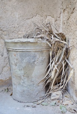
thank you dear JD,for the tips,and the makings, this shot is exactly as it looks in nature by my eyes,and I have an other one of the same pot,I will apply what you have said and post it ,very soon, so thankful and grateful,for supporting me with High spirit, my regards, Saad.
you are so very much welcome Garry, and think you like or wish,just a hint about it ,and you will find it ready,as much as I could. About the contrast,it troubled me and put me in a middle of a dilemma,all the elements in the shot are within the same range of color and tone,if I edit it ,it will loose its real face,if I keep it as such ,it will be so flat,especially in this series where I want to show the house in its real shape,colors,and appearance, thank you for accepting the shot,and for your supporting input,my regards as always, Saad.
dear Saad i try to increse contrast but it's no easy to maintein the same range of colours take a look to this.. have a nice day my friend cheers Paolo
Gary was right, I saw this piece in the original shot and thought the same; I do agree with Gary about details and subtle colors; probably contrast is a bit low for my taste, some boost is needed (just apply a S-type curve in adjusments-curves in PS; I checked the histogram and looks good, no clipped lights nor shadows, but that's the problem, for me the image is one stop overexposed, you have details in every shadow, but you do not really neeed it, what you need is to emphasize the 3D aspect of this wonderful old vase, so just clip some shadows moving the slider to the right just some thoughs jd
SHOKRAN/THANKYOU Saad. It's just the sort of shot I would have taken had I been there. Resolutin is very good and I actually like the low contrast colouring, it emphasises the decay, as if the life was being sapped out of it, too much saturated colour would make the place appear too vibrant. Regards, Gary
dear Paolo,I have done it in BW,but revert from uploading it,and prefer the colors, I would like to ask you a question Maestro,if you do not mind,this shot is taken in optimum conditions and with a good camera too,with the hands of an a knowledgeable photographer as I think, but the whole element of the shot are within the same range of colors,and as if it was monotonous color,I lack the contrast in this shot,despite the fact that its histogram is very well,what I should do to increase the contrast without interfering with the real colors,I will be thankful to your response, my best regards, Saad.