|
|
 Nick Karagiaouroglou
 {K:127263} 1/3/2007
|
Thank you very much for the nice detailed comment, Andre! When I look at the two images again, carrying in mind your comment, I can see what you mean. Indeed it's the sharper one that wins. It separates the main subject much better from its background and enhances it this way.
Thanks again and best wishes,
Nick
P.S.: Ask and you'll get the answers... sometimes! ;-)
|
|
|
|
|
Nick Karagiaouroglou
{K:127263} 1/3/2007
|
Thanks a lot, Giuseppe!
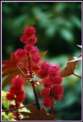
Red and its complementary color - something greenish-blueish - are always very pleasant to look at. Thanks heavens we find that combination quite often out there. The reasons for that are clearly evolutionary, since the red flowers/fruits are best seen by living beings that need them on such a complementary background. So one might say... that evolution was very nice to photographers! ;-)
Best wishes,
Nick
|
|
|
|
 Andre Denis
{K:66327} 1/3/2007
Andre Denis
{K:66327} 1/3/2007
|
Hi Nick,
The composition in both is about equal. But this one has a softer focus on the red flowers. I think the sharper image gets my vote in this case. Mostly because the sharper flower helps the main subject stand out from the background. Both images are equally distinctive with the colour scheme. The reds and greens are both not quite the usual shades. I think that is a good thing because after viewing thousands of great images, our attention is usually grabbed by something a little unusual.
ps
I took note of your reply to Ace Star. :) We need to know why! And he responded! Good job!
Andre
|
|
|
|
 Giuseppe Guadagno
{K:34002} 1/2/2007
Giuseppe Guadagno
{K:34002} 1/2/2007
|
Red spheres in green hands. The contrast of the two colours is beautiful, Nick.
Ciao.
Giuseppe
|
|
|
|
|
Nick Karagiaouroglou
{K:127263} 1/2/2007
|
Thanks a lot for the nice comment, Özcan!
Nick
|
|
|
|
 özcan çeltikli
{K:3575} 1/2/2007
özcan çeltikli
{K:3575} 1/2/2007
|
it is very good.
|
|