|
|
Mary Brown
 {K:71879} 7/7/2006
|
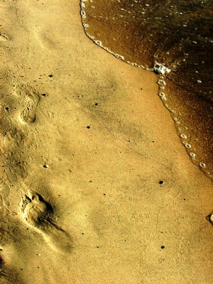
I love the golden, warm tones in this. I see two main parts--the water and the footprints. These two together have symbolism and tell a story. Even though we don't know what the story is, the story is there to discover. What I find is the wide space between the water and the footprints divides these two main elements too much. For me, I would like to see them closer together. Unless the space symbolizes something that I have missed. I really like the angle of the water as it rather shows that life is never staightforward. Your title gives the story a sad meaning. From looking at just the picture without the title, it could also tell a happy story.
MAry
|
|
|
|
|
Mary Slade
{K:40338} 7/7/2006
|
Stunning image. The colours- so warm and clear. And the water and footsteps- brilliant idea and image.
|
|
|
|
 Giulio Rotelli
{K:28441} 7/6/2006
Giulio Rotelli
{K:28441} 7/6/2006
|
Be constructive, not abusive, and leave a nice long meaningful critique. Have fun! (usefilm staff)
Did you think you did it?
|
|
|
|
|
Giulio Rotelli
{K:28441} 7/6/2006
|
Ok! But with short sentense how can i take care of suggestions?
I love usefilm 'cause i think it's a big opportunity for new photographer to compare and take teaching from expert or professionist photographer, and i think that expecially Critique Corner is made for this.
So that's why I answer so determinated to your very short and no-constructive critique...
That's all.
|
|
|
|
 Kiarang Alaei
{K:49415} 7/6/2006
Kiarang Alaei
{K:49415} 7/6/2006
|
Dear Mr.Rotelli ( Be sure that it's not ironic )if you feel i have some problems of arrogance, it's anyway your feel and i can't change it. i know what you tell about constructive comment and structural. but you know some times viewer try to transfer his mean with so shorts sentences as i did. i knew that you click the Critique Corner for it. but i prefered to write short, because i thinked that even some short words are much better than nothing and closing the photo.
Yes.there was a thing that catch my eyes to open your photo, as i told (angle). but then after opening i couldn't contact it or feel it.
i wrote my idea honesty.
anyway...forgive me if i couldn't write any more!
|
|
|
|
 M. Bi
{K:3646} 7/6/2006
M. Bi
{K:3646} 7/6/2006
|
Che bei colori!!! Gran bella foto...
Mauri
|
|
|
|
 a. gianfranco baccelli
{K:21379} 7/6/2006
a. gianfranco baccelli
{K:21379} 7/6/2006
|
Che bel lavoro... Di una bellezza e semplicità unica. La tonalità dorata rende un'atmosfera stupenda.
|
|
|
|
|
Giulio Rotelli
{K:28441} 7/6/2006
|
dear Mr. Rotelli...?!?
Seems to me a little ironic.
Anyway it seems to me that you have some problems of arrogance, I take a look at your portfolio: a lot af very good works and a lot of justified awards... Nothing to say...
and that's for that reasons that from you I expected a more constructive critique. I repeat: i recivied other not good critiques, but always with tecnical or personal explained motivations (that's what i call constructive). Here you only give a maybe right (i'm just an amateur) negative sentense, with no explanation and a soft touch of arrogance: if it didn't gave to you any interest or meaning (your words) why you click it?!?
Just to put negative sentense?
I'm so sorry of it, it's the first time that it happened....
|
|
|
|
 pan g.
{K:16899} 7/6/2006
pan g.
{K:16899} 7/6/2006
|
Wonderfull composition and colours, an excellent work!
|
|
|
|
|
Kiarang Alaei
{K:49415} 7/6/2006
|
dear Mr.Rotelli. seems that you don't need any critique. i found your photo without any interest or any meaning. and wrote my feel honesty in short sentenses, not more.
|
|
|
|
|
Giulio Rotelli
{K:28441} 7/6/2006
|
always open to critiques, i think the best come from real, concrets and constructives critiques. But, honestly, from your, I can't find something positive: Strange angle....? just it......?
exposure....?
What you mean?
How can you value exposure in a graphic elaboration work?!?
You might say that you don't appreciate this kind of job, but talking abaout exposure....?!?
Anyway i think, that exposure is wrong, when you hace something burned or something too much dark: here you can "read" every single detail!!!
Sorry, it's the first time I reply to a critique by this way....
|
|
|
|
 Piero Somma
{K:13399} 7/6/2006
Piero Somma
{K:13399} 7/6/2006
|
ottima giulio...abstract ben riuscito...mu piace l'effetto gold...bel progetto!
ciao
|
|
|
|
|
Kiarang Alaei
{K:49415} 7/6/2006
|
What a strange angle. but just it: angle. nothing more! exposure isn't well!
|
|
|
|
|
H H
{K:-67} 7/6/2006
|
very nice composition and color harmony!
|
|