|
|
 Andre Denis
{K:66407} 5/30/2006
Andre Denis
{K:66407} 5/30/2006
|
Hi Kathy,
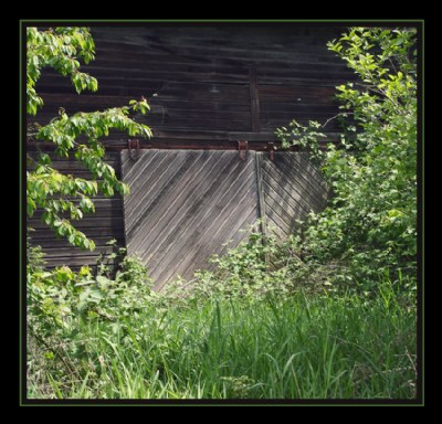
I actually prefer the colour version of this shot. The reason being that in the B&W conversion, there doesn't seem to be enough difference in the greyscale contrast between the vegetation and the barnboard. In colour, this is not a factor because of the green, (obviously)
I found a similar problem when converting my last forest image to Greyscale. The tree trunk just didn't pop out of the image like it did when surrounded by lush green.
The greens combined with the greyish barnboard is very pleasing to the eye in this image.
Andre
|
|
|
|
 Alison DuFlon
{K:36566} 5/28/2006
Alison DuFlon
{K:36566} 5/28/2006
|
Nice contrasting lines and play of light. nicely seen Kathy. Alison
|
|
|
|
 Eb Mueller
 {K:24960} 5/27/2006
|
I like the monochrome version as it enhances the abstraction inherent in this scene. My response to the B&W would be to suggest trying various conversion techniques (if you have not already done so.) I like the weathered wood contrasted with the leafy frame to the square. I am glad that your new camera has not changed your keen ability to visualize nice framing of your subjects, Kathy!
Eb
|
|
|
|
 Markus Scholz
{K:23722} 5/27/2006
Markus Scholz
{K:23722} 5/27/2006
|
Very nice scene, Kathy, and, as you might already know, I prefer the color version.
Regards, Markus
|
|
|
|
|
Alicia Popp
{K:87532} 5/27/2006
|
Encantadora composición..dan deseos de "meterse" en la foto!. Felicitaciones!
|
|
|
|
 Gorilla K
{K:17526} 5/26/2006
Gorilla K
{K:17526} 5/26/2006
|
hello Kathy, both versions are nice...however, a little bit more I like the b/w version...is a nice still life with great light...and is a romanticism...
well done!
Winfried
|
|
|
|
 Gabriela Tanaka
{K:16594} 5/26/2006
Gabriela Tanaka
{K:16594} 5/26/2006
|
Dear Kathy, I definitely prefer the sepia shot. The green is disturbing the eye from concentrating on the patterns of the wood. Though...the wood colour is very beautiful. But as a whole, the sepia version functions better.
Best regards,
Gabriela
|
|
|
|
 Robert Kocs
{K:89085} 5/26/2006
Robert Kocs
{K:89085} 5/26/2006
|
I do like both, very nice composition with greens.
Very nice texture and lighting, the details are superb.
I prefer the coloured version, it's living, lovely bold
colours and clear details. Great work dear Kathy!
Best wishes my friend!
Robert
|
|
|
|
|
Kenneth C. Long, Sr.
{K:4245} 5/26/2006
|
Kathy, very nice, well composed, lighting is fabulous, title is fitting the shot, well done.
|
|
|
|
 Susie OConnor
{K:34798} 5/26/2006
Susie OConnor
{K:34798} 5/26/2006
|
Nice title choice Sissy. Very fitting! I will once again probably be in the minority, but I really like the color version best. The palette of greens is really nice and enhances this shot IMO. I wonder what used to come in and out of that sliding door? I like it a lot!
Suz
|
|
|
|
 Gregory McLemore
{K:35129} 5/26/2006
Gregory McLemore
{K:35129} 5/26/2006
|
The title is very fitting for this image, strikingly captured and presented.
|
|
|
|
 Laura Spell
{K:24080} 5/26/2006
Laura Spell
{K:24080} 5/26/2006
|
Very nice light/shadow study. The lines on the doors form an intersting pattern. I like the sepia version best, the tones and contrast seem better.
|
|
|
|
 Kathy Hillard
{K:25721} 5/26/2006
Kathy Hillard
{K:25721} 5/26/2006
|
Here's the sepia version
|

|
|