|
|
 Gayle's Eclectic Photos
{K:91109} 5/29/2006
Gayle's Eclectic Photos
{K:91109} 5/29/2006
|
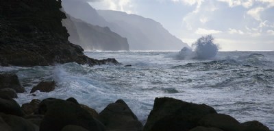
hi,sorry just now getting back to you about this shot....i like it in these natural colors and the layers giving depth in the BG...that roundish blast of wave on a rock? is something i forgot to mention previously and it draws my eye to it,but honestly i wish it had a different shape...not a biggie and just my opinion...still a powerful seascape
regards,gayle
|
|
|
|
|
Pat Snelling Weiner
{K:1920} 5/26/2006
|
I think it is beautiful! I like the how the cliffs recede and the big splash. Has a very nice mood to it. Pat
|
|
|
|
 a. M.
{K:9020} 5/16/2006
a. M.
{K:9020} 5/16/2006
|
oohhhh...this is really nice..so clear and vivid..its also relaxing to look at as the waves crash against the rock. awesome job
Ant
|
|
|
|
 Roberto Arcari Farinetti
 {K:209486} 5/16/2006
|
i like it, simple and great..
all my bets wishes
roby
7
|
|
|
|
 vanessa shakesheff
{K:68840} 5/16/2006
vanessa shakesheff
{K:68840} 5/16/2006
|
Beautiful .the capture of the waves crashing on the rock and the colour and tone ..lovely
|
|
|
|
|
Saintz Saintz2
{K:11250} 5/16/2006
|
I like the "idea" of your pic .. but ther's a few colors in it ..!!
It's all too much Dark or too much white ..
But I knew that isn't a simple shot ..!
For Example I can't see the green Harbour .. i can only image it ..
I Like the water on the right side .. but another time it's too White ..
Anyway I like the pic .. but i think you can be better :-)
|
|