Michael, I have this suspicion that most photos have something redeemable, if we only look beyond the box. I cropped your photo and altered the lighting, contrast, and saturation, and I cloned out what was left of the dark upper right corner with some space from the lower left. Then I applied a dry brush filter to the photo and came up with what is, to my eye, a really nice piece of photoart. I've appended the result below. I hope you like it as much as I do. Steve
Hugo, thank you so much for this very honest and insightful critique. I knew this photo had problems that's why I posted it. I had not posted in a long time and felt my recent work was a little rusty.
I so wanted this shot to work but needed advice on hoe to improve my future work. I tried going back to the original image and using your composition recommendations, but the image quality just isn't there.
I hope my next round of postings show a progression of improvement.
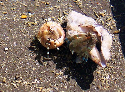
Hi Michael, Since you posted this in the Critiquer's Corner, I'll be completely frank.
I think the potential in this photo doesn't really show here. The image quality, which is rather soft, and undefined, obscures the details in the hermits a bit too much. (also due to the layer of water you had to shoot through, I'm sure) Also, I think the shadow in the top right corner is rather distracting.
As to the composition, the emptiness on in the lower left quadrant creates an unbalance. A minor crop on the left would already improve the composition, though.
Reading this back, I realise it sounds rather negative, but browsing through your portfolio, I think you can do much better than this.