|
|
 Joe Ciccone
 {K:3684} 3/6/2006
|
thanks for viewing and your comments John...cheers
|
|
|
|
 John Beavin
{K:4477} 3/6/2006
John Beavin
{K:4477} 3/6/2006
|
I think this shot, nice as it is, could be improved if a few of the cars were showing tail lights,there is little to hold intrest in the lower third of the picture.
|
|
|
|
 Dave Stacey
{K:150877} 2/26/2006
Dave Stacey
{K:150877} 2/26/2006
|
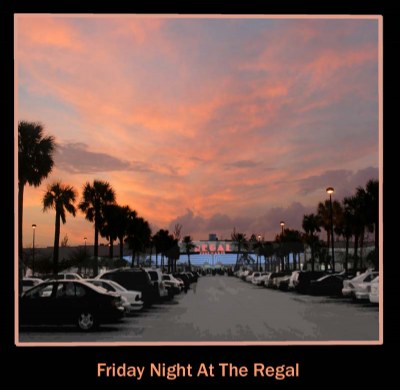
Joe, if I understand correctly what you were doing here, that is making an "old time" poster type shot, I think what you've done is very effective. I actually like the silhouetting effect on the trees, leading the eye right to the name of the theatre, which you've highlighted very well. The sky colour and dramatic cloud formation works well to emphasize the whole effect. Could you get the palms to descend from the corner of the frame without giving up several cars in the process? I'm not sure you'd want to do that!
Dave.
|
|
|
|
|
Joe Ciccone
{K:3684} 2/26/2006
|
thanks Paul for taking the time to view and comment....
I agree with the moving forward idea,
however I was in a traffic lane when this was shot...I guess I would have been better off with my 28-200 lens...than the straight 24mm...thanks again and cheers...
|
|
|
|
 Paul Lara
{K:88111} 2/26/2006
Paul Lara
{K:88111} 2/26/2006
|
Joe, this is a VERY strong shot.
I like the posterization of the roadway, but I think lightening the shadows would reveal a tiny bit of texture in the palm fronds.
Further, had I seen this image before me, I would have taken about 20 paces forward, so the left line of palms would descend from the corner of the frame.
|
|
|
|
|
Joe Ciccone
{K:3684} 2/26/2006
|
thanks for viewming and your comments.
This was a hand held shot near sundown that I worked in PS till I felt it was about as close to 'the look I was seeking" as possible.
you comments are excellent. cheers
|
|
|
|
 Kambiz K
{K:37420} 2/26/2006
Kambiz K
{K:37420} 2/26/2006
|
It is a nice image as many of your viewer said.
But if you like me to go more on details in HONESTY, then read more.
The foliage is little bit dark, as well as few cars.
need little bit sharpening.
I prefer to cut little bit of sky.
The lines of the border on the lower left doesn't meet each other.
Would be better to use smaller size font.
|
|
|
|
|
Joe Ciccone
{K:3684} 2/26/2006
|
thanks for viewing..this was shot with sun almost gone. In photoshot I used a poster effect, which is what the parking area is, the sky was lightened and the theatre's name brought out in Red....cheers
|
|
|
|
|
Yatharth Kumar
{K:2914} 2/26/2006
|
Beautiful shot you have captured. The road is totaly full of standing cars. But the colours are not looking very good.
Regards,
Yatharth.
|
|
|
|
 Rashed Abdulla
{K:163889} 2/26/2006
Rashed Abdulla
{K:163889} 2/26/2006
|
great night capture and with wonderful colors and contrast , all of the best my friend .
|
|
|
|
 Ace Star
{K:21040} 2/26/2006
Ace Star
{K:21040} 2/26/2006
|
strange image  try B&W .... (color) not a good idea try B&W .... (color) not a good idea
strangly i am gonna rate it 7
hehe
see you soon :)
|
|