|
|
Linda Mac Donald
 {K:1892} 8/25/2006
|
Hi Doyle
Thank you so much for your comments and critique.
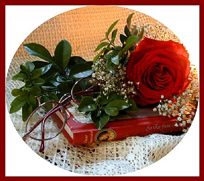
I agree that the lighting on the right is too bright. You are right, I should have backed it off a little more. It's funny I loved it in January and 6 months later I love the composition
but I can see its faults. Thats what makes usefilm so great, with great critiques like yours we learn as we create. Thanks again Doyle
|
|
|
|
 Doyle D. Chastain
{K:101119} 8/25/2006
Doyle D. Chastain
{K:101119} 8/25/2006
|
Wow! What a beautiful image to be on the front page! Incredible that even now I'm only the third comment!! I don't (personally) feel this is too busy! Colors and comp are awesome. MY distraction is the right side light . . . which would have been better (IMO) a tad bit father right and out of the image altogether. While I love it as is too . . . I would also consider a tad sharper focus on the image on the book spine . . . personal preference for sure. Thank goodness for Susie's FC that landed you both on the front page . . . I missed this in January and would surely not have seen it otherwise! Very nice and a crime that 240 views only landed these few comments . . . but still . . . quality work is its own reward!
Regards,
Doyle I <~~~~~
|
|
|
|
 Susie OConnor
{K:34798} 1/15/2006
Susie OConnor
{K:34798} 1/15/2006
|
 Hi Linda,
Nice idea for a still life. This might be a good ad for the bookseller! I agree with Laura on the busyness, I think that maybe just removing the baby's breath and a little of the greenery would take care of it. Nice lighting. I can see you have a knack for still lifes. Can't wait to see the next!  ) )
Susie
|
|
|
|
 Laura Spell
{K:24080} 1/15/2006
Laura Spell
{K:24080} 1/15/2006
|
Very vivid colors. The light and details are good. There seems to be too many items in the frame, my eyes can not decide what to focus on.
|
|