Thank you for your comments. No problem with being direct.
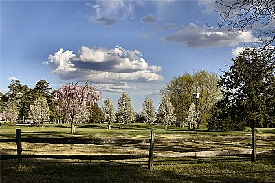
To answer your question: No (emphatically...no). The clouds were as they appeared 'in camera' with only a minor tweak to the exposure to lighten up the foreground. I considered playing with the saturation, but felt it didn't need it, but I did sharpen the image just a tad. Funny thing is, I wouldn't even know how to go about pasting the clouds in lol, and even if I did I'm not comfortable doing that kind of manipulation for a 'straight' photograph.
If I get a chance I will upload (or link) to the original jpeg as shot.
ok, I understand your intent when including the fence. interesting discussion between yourself and hdw. enough said about that. but for me, vision is locked on those clouds. they appear out of place and I see a darkened area around them as though they've been badly blended during post processing. please forgive my directness, but have you dropped the clouds in from another image, or am I just seeing things?
It seems this is turning out into a very good example of what your thread is about.
I agree with the importance of having a subject in the foreground, it can be very functional to grab and hold the viewers attention. The tree in that respect does fulfill its function as natural framing, yet as the fence presents us (me/ the viewer) with a horizontal barriere it also takes up a rather dominant role. That would fit with your intention of taking a photo of a privat - off limits - domain, the b-count.
That's something I didn't catch when I opened and assessed the image, though. (then we're down to what Chris mentioned, how to assess a photo, and I guess I should've picked up on what you wrote in your about before assuming...) With the "off-limits theme as primary subject, I think composing the fence this way is an appropriate choice...
The image quality may well have to do with the way UF handles the uploaded image. Or me, as I struggle with it. A lot.
Hugo, you are certainly a gentleman! I appreciate you stopping by to lend your wonderful eye to my humble shot (I mean this most sincerely, as an admirer of your work!).
Let's see...
Well, I did include the fence intentionally for two reasons-
a. I wanted to place something in the foreground (and also the branches you pointed out)as 'framing' for the shot. This was the scene when I stumbled upon it, and I felt that it gave it a more picturesque and postcard-like composition. I also read somewhere recently that landscapes are 'best' (subjective I know...)when you include something in the foreground to give the shot depth. If I moved closer I would have lost that element.
b. This is a place that I (most likely...) will NEVER get to go. As a private golf course it is very exclusive and requires quite a lot of money to join. I have lived in this town all of my life and this place represents an "off-limits" area to me. I thought the fence and the distance from the golfers represented this well.
Yes, saturation is tricky and often hard to know exactly what others are seeing. I have a calibrated monitor and the balance I went for was to be as accurate as possible but still accent the terrific color of the trees.
I will certainly consider your comments in the future the next time I'm taking this type of shot.
Thanks so much for your time, I appreciate it much!
What strikes me about this photo is the lush, crisp spring feel. It sure creates a very pleasant scene.
In a way the openness and wide vista with the two people playing golf in the distance is a bit obstructed by the fence in the foreground, rather blocking the view thus creating a closed composition. That's something I wouldn't expect in a photo that captures the spring feel in the meadow / golf course; Did you include the fence deliberately? And if so, why?
I think it would be interesting to see the result as well as the change in feel and atmosphere if you'd taken this shot from a position closer to the fence. I think it might well be too empty, though; the twigs in the upper right corner add to the image, and I think it needs a specific feature in the foreground to grab the viewers attention.
Maybe a tad more saturation would also increase the impact of this photo, but that's more subjective, and definitely a personal preference. I do notice a slight decrease in saturation between what I see on screen compared to how I prepared them, so that might the explanation.