|
|
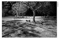
Critique By:
Matej Maceas (K:24381)

11/22/2004 7:56:51 AM
Poor focus, too much contrast, static situation, shooting peoples' backs with a telelens is a difficult way of achieving memorable examples of street photography.
|
| Photo By: cecilia tovini
(K:29423)
|
|
|
Critique By:
Matej Maceas (K:24381)
11/14/2004 7:39:39 PM
Orloj? :-)
|
| Photo By: Rozmi [ . ]
(K:360)
|
|
|
Critique By:
Matej Maceas (K:24381)
10/29/2004 3:30:30 PM
Hmmm, a new position, it seems :-) Cool.
I guess now the only place where you haven't stuck the camera yet is the underside of the chassis for a hell of a low point of view? ;-)
|
| Photo By: Kostas Tzanetos
(K:22012)
|
|
|
Critique By:
Matej Maceas (K:24381)
10/29/2004 3:21:15 PM
I hope you won't be away too long and look forward to seeing your future work.
|
| Photo By: Aris Michalopoulos / OsirisiS
(K:1916)
|
|
|
Critique By:
Matej Maceas (K:24381)
10/29/2004 3:10:15 PM
Nice work, there is a look in her eyes that reveals a strong emotional connection, such a connection between the photographer and the subject makes splendid portraits. I also like the fact that it's not just a headshot but has clear context, this strengthens the involvement because it shows that even in the midst of a busy event you two can share moments of unspoken communication.
|
| Photo By: Anthony Gargani
(K:4527)
|
|
|
Critique By:
Matej Maceas (K:24381)
10/29/2004 3:03:55 PM
Good portrait, very thoughtful and calm, he seems very comfortable with you photographing him, this speaks of the friendship between the two of you. I would also like to see a version of this shot with natural light only, I think it might contribute to the calmness and perhaps add a touch of mystery.
|
| Photo By: Anthony Gargani
(K:4527)
|
|
|
Critique By:
Matej Maceas (K:24381)
10/29/2004 3:01:19 PM
I agree it's an unusual perspective, it's interesting to see the action in a supporting role rather than as the main focus, although perhaps it's just a bit too far, shifting the feeling from active, alert, prepared defense towards 'hmmm there's not much to do on this end of the field'.
On the technical side, I find curious the manner in which the background is blurred, e.g. the colour effects on the skin of the player in the blue dress. Is this characteristic of the lens or is it the camera's chip?
|
| Photo By: Anthony Gargani
(K:4527)
|
|
|
Critique By:
Matej Maceas (K:24381)
10/29/2004 2:50:34 PM
She sure seems to be enjoying herself, nice sense of speed and excitement. Personally I'd be afraid to take a brand new camera out to sea for fear of dropping it into the water :-)
I'm guessing you were at the wide end of the lens, the hand is disproportionately large compared to the body, this is something that draws attention especially in combination with the lighter skin tones of the hand (I assume it's because the hand was much closer to the flash).
|
| Photo By: Anthony Gargani
(K:4527)
|
|
|
Critique By:
Matej Maceas (K:24381)
10/29/2004 2:11:46 PM
Thanks 
|
| Photo By: Matej Maceas
(K:24381)
|
|
|
Critique By:
Matej Maceas (K:24381)
10/23/2004 6:14:44 PM
I am not convinced the problem lies with the models' facial expressions. There is a more fundamental question, the answer to which I am unsure of: what is your subject in this photograph? The models, or the car?
|
| Photo By: Bjorn Beheydt
(K:12096)
|
|
|
Critique By:
Matej Maceas (K:24381)
10/20/2004 5:48:46 PM
Quite nice.
|
| Photo By: ryan winton
(K:3027)
|
|
|
Critique By:
Matej Maceas (K:24381)
10/20/2004 5:18:57 PM
OK moment but photo is lacking in technical quality (no shadow details, white aura around the subjects, strange shift in floor tonality between left woman's legs).
|
| Photo By: Ning Fandango
(K:1277)
|
|
|
Critique By:
Matej Maceas (K:24381)
10/16/2004 4:18:44 PM
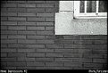
I agree with Viktor about the titles. If you like to have them underneath the photo, great, but at least use a different font ;-)
The geometry of the bricks and the window is compromised by the very strong distortion. I guess this is to be expected from a hyperzoom lens (but I must admit that my favourite 50mm prime has the same problem, albeit to a much lesser extent).
Overall, I like the photo, I enjoy viewing this kind of architectural abstracts.
|
| Photo By: Rafael Torcida
(K:1926)
|
|
|
Critique By:
Matej Maceas (K:24381)
10/16/2004 4:18:06 PM
I see you've taken your past experiments with double exposures to a whole new level :-) But what caused the unsharpness, an accidental bump into the tripod? I don't mind so much the unsharpness of the right Marusha, it sort of works with her pose and makes her look like a spirit of the woods - but I agree the tree ought to be sharp to make it fully work.
Two compositional nitpicks: hand growing out of right Marusha's head, tight space above left Marusha's head.
|
| Photo By: Bjorn Beheydt
(K:12096)
|
|
|
Critique By:
Matej Maceas (K:24381)
10/16/2004 4:17:34 PM
Grain is cool :-) Blown-out highlights are not :-(
One little problem I have with the composition is that the blade of the dagger leads the eye right to the edge of the image area and out. Have you tried any other variations on this arrangement?
|
| Photo By: Bjorn Beheydt
(K:12096)
|
|
|
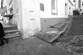
Critique By:
Matej Maceas (K:24381)
10/16/2004 4:17:02 PM
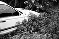
Strange place to park a car. Or is it? It is not clear from the photo if this was shot in a modern urban area (I assume it was, given the street category and the location info) where this kind of scene would be quite amusing, or somewhere in the country where it would be an ordinary sight. Given no information other than the photo itself, I would lean towards the latter, and this makes the photo rather unexciting. The magic feel of the city, present in much of your work, is absent here.
|
| Photo By: paul shelasky
(K:1211)
|
|
|
Critique By:
Matej Maceas (K:24381)
10/16/2004 4:15:11 PM
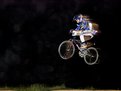
Where exactly was the tree? There's something brownish in the right part of the front wheel that could be a tree trunk in the background but it could also bee some kind of light reflection, I am not sure. The rider appears compressed horizontally, I assume this is caused by subject velocity and shutter speed (or is it caused by the angle from which you took the shot?), is there any way to avoid this effect? There are several grey "stains" in the left part of the image, probably only visible with relatively bright monitor settings, but worth cleaning out anyway as they distract from the racer.
Is the racer your son?
|
| Photo By: Ray Heath
(K:4559)
|
|
|
Critique By:
Matej Maceas (K:24381)
10/16/2004 4:13:43 PM
This must be the funniest still life I've seen :-) but I suspect it could well do without some of those blown highlights - especially the socks and the bottom left corner, but also the object on the model's head and the stone on her left thigh.
|
| Photo By: Alessandro Holler
(K:508)
|
|
|
Critique By:
Matej Maceas (K:24381)
10/16/2004 4:11:23 PM
It looks like a robot's face with big eyes and a somewhat concerned expression :-)
|
| Photo By: João Magalhães
(K:2067)
|
|
|
Critique By:
Matej Maceas (K:24381)
10/12/2004 3:34:37 PM
I agree the frame as such is beneficial, but given the square format of the photo, the top and bottom perforations look rather unnatural and act as an immediate giveaway that something is "not right". Perhaps a smooth frame would be better, in simulation of medium format? Not that it matters all that much, but you place a lot of importance on presentation, so I decided to mention it anyway.
|
| Photo By: Ray Heath
(K:4559)
|
|
|
Critique By:
Matej Maceas (K:24381)
10/11/2004 6:33:45 PM
Yes, keep the surfaces (and the entire darkroom) clean. This can be a problem, especially when using glass plates in the enlarger's film holder. Glass is great for holding the film firmly, but having to deal with dust and scratches on four surfaces can be frustrating, which is why I prefer to use metal plates instead of glass.
Another thing I do to minimize dust spots is to always wash the negative before enlarging. I have found distilled water with a splash of wetting agent works well. After the negative dries naturally, I inspect it under a lamp to see if any larger dust particles have remained on it, and if so, I carefully try to remove them. This can take a bit of time, and further washing & drying cycles may even be required, but in the end I find it easier than having to retouch a print full of spots.
|
| Photo By: Alessandro Holler
(K:508)
|
|
|
Critique By:
Matej Maceas (K:24381)
10/10/2004 10:35:09 AM
You shouldn't have titled it 'The Mirror', to see how many viewers would recognise that it is indeed a mirror :-) At first, I thought I was looking through a doorway. Only after I noticed the title did I realise the meaning of the face in the corner, and the fact that you can also be seen at the table.
I can't quite decide what to think about the tonality. On the one hand, I appreciate the mysterious atmosphere created by the overall darkness, on the other hand I would have welcome more detail in some of the shadows (the cupboard in the back of the room, and the people around the table). What I *do* know I like is the very clear rendering of the chandelier - that particular part of the image is very good just as it is.
I think it would benefit the presentation if you could get rid of the dust spots. Is the image scanned from print or from the negative?
|
| Photo By: Alessandro Holler
(K:508)
|
|
|
Critique By:
Matej Maceas (K:24381)
10/1/2004 12:24:23 PM
Very nice light you have there.
I haven't tried exposing this film at 1600. Could you share the development details?
|
| Photo By: Dagmara Domagala
(K:0)
|
|
|
Critique By:
Matej Maceas (K:24381)
10/1/2004 12:16:10 PM
I think this photo is the best in the series.
|
| Photo By: Dennis Couvillion
(K:165)
|
|
|
Critique By:
Matej Maceas (K:24381)
10/1/2004 12:10:46 PM
I'd say aim the camera a bit lower, some of the empty space at the top could be sacrificed to include the collar tips instead and to move the eyes above center. The lighting is very nice and even, I'm curious how you achieved it. Was it a single flash or something more sophisticated?
|
| Photo By: Brenda Sellers
(K:322)
|
|
|
Critique By:
Matej Maceas (K:24381)
9/28/2004 5:56:09 PM
Lovely. What lighting did you use?
|
| Photo By: Jim Fuglestad
(K:1564)
|
|
|
Critique By:
Matej Maceas (K:24381)
9/28/2004 5:07:23 PM
Interesting light. Night shot, correct?
|
| Photo By: João Magalhães
(K:2067)
|
|
|
Critique By:
Matej Maceas (K:24381)
9/28/2004 5:07:04 PM
All that noise does not look very good.
|
| Photo By: Ray Heath
(K:4559)
|
|
|
Critique By:
Matej Maceas (K:24381)
9/28/2004 5:01:42 PM
Aris, your portfolio is one of my top favourites on this site. Very inspirational.
In your recently posted work, it seems there is a tendency towards lower contrast and much smoother tonality (very much to my preference). Is there anything in particular that has motivated you to change the presentation of your images in this manner?
|
| Photo By: Aris Michalopoulos / OsirisiS
(K:1916)
|
|
|
Critique By:
Matej Maceas (K:24381)
9/23/2004 1:21:01 PM
I thought you didn't like 'artistic' titles :-)
This is the sort of image I call an anti-photo; a sort of insider photographic joke that offers quite a splendid visual & mental experience. Cool :-)
|
| Photo By: João Magalhães
(K:2067)
|
|