|
|
Critique By:
John Charlton (K:5595)
5/29/2003 2:40:13 PM
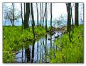
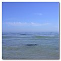
Hey Meirion. Welcome to Usefilm. I agree there is a bit too much featureless sky in this photo. Nice rural scene though.
|
| Photo By: Meirion Jones
(K:0)
|
|
|
Critique By:
John Charlton (K:5595)
5/28/2003 4:42:11 AM
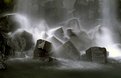
The sky was problematic in this photograph. I could not shoot any lower than I did as I was avoiding a road culvert in the foreground. Cropping the sky out completely seemed as harsh a soloution as the lighting. Maybe I will catch this scene again when the sky is more cooperative.
|
| Photo By: John Charlton
(K:5595)
|
|
|
Critique By:
John Charlton (K:5595)
5/18/2003 9:12:46 AM
Very nice Hayri. What camera did you use? What lens?
|
| Photo By: Hayri CALISKAN
(K:16195)
|
|
|
Critique By:
John Charlton (K:5595)
5/17/2003 2:41:54 PM
A stunning photograph.
|
| Photo By: Peter Gulbinat
(K:454)
|
|
|
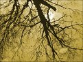
Critique By:
John Charlton (K:5595)
5/17/2003 2:34:37 PM
Trippy, very trippy.
|
Photo By: Eric Goldwasser
(K:4294)

|
|
|
Critique By:
John Charlton (K:5595)
5/17/2003 10:28:21 AM
Phantasmagorical! Another of your photos to add to my favourites.
|
| Photo By: Beverly Gustafson
(K:1572)
|
|
|
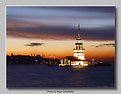
Critique By:
John Charlton (K:5595)
5/11/2003 1:43:45 PM
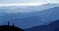
Fantastic - yes, but tell us. Where is it? I'm guessing France or Spain.
|
| Photo By: Christian Barrette
(K:21125)
|
|
|
Critique By:
John Charlton (K:5595)
5/11/2003 1:02:14 PM
Oops. Screen it is.
|
| Photo By: John Charlton
(K:5595)
|
|
|
Critique By:
John Charlton (K:5595)
5/11/2003 11:05:56 AM
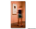
Thanks Karen and Matej. The light in the gallery is in fact very pink - a strange unnatural light it seems to me, for such a place.
The picture on the wall, is a bit of torn fabric mounted on white board under glass and was part of a large exhibition which completely failed to move me, so bored with the presentation, I wandered around looking for things to photograph.
It is interesting Matej, that you interpreted this as longevity versus transience. That is fine with me, but I saw it more as a contrast between the deadness of the pretentious art hanging on the wall and the vibrancy of the living breathing spectator passing by. In my version, the girl is turning away from the art rejecting it the same way I had.
My title refers to my bemused sense of what constitutes modern art.
Attached is the original uncropped photo which reveals a second spectator and more of the room.
|
| Photo By: John Charlton
(K:5595)
|
|
|
Critique By:
John Charlton (K:5595)
5/8/2003 4:59:54 AM
I agree with you Matej that this image lacks a strong subject. For that reason, I find the composition weak.
Attached is the original file shrunk down to 500 px wide. What I like about cedar groves is the light I find there. Just a few feet from the edge of the forest, one is plunged into darkness.
It was this transition of light which caught my eye. Light is ellusive. Hard to pin down. Hard to photograph except as a quality of light upon a subject. I did look for something to pin my vision upon but there wasn't anything that stood out, so I took the picture anyway. Thanks for seeing the weakness in this shot and reinforcing my own concerns. Better luck next time, eh?
|
| Photo By: John Charlton
(K:5595)
|
|
|
Critique By:
John Charlton (K:5595)
5/8/2003 4:44:13 AM
Thanks Matej. This vehicle is actually black as can be seen to the left of the license plate, but there is hadly any of hint of that here with the chrome front end and the business side of the Hummer so prominently displayed.
|
| Photo By: John Charlton
(K:5595)
|
|
|
Critique By:
John Charlton (K:5595)
5/6/2003 3:45:15 AM
Thanks Mary; The small reflecting pond beside my house has provided me many wonderful photo opportunities over the last year. Two frogs chose the shallow waters of our pond over the safety of the surrounding garden and meadow. It was sad thing to find them and this picture was my only compinsation up until now. I'm grateful for your comment.
|
| Photo By: John Charlton
(K:5595)
|
|
|
Critique By:
John Charlton (K:5595)
5/1/2003 3:50:05 AM
Thank you Mary. That is an excellent title and I am pleased to implement your suggestion. I have changed the title from Green to Fan Dance and will be looking forward to seeing your own version as I add you to my list of friends. Cheers.
|
| Photo By: John Charlton
(K:5595)
|
|
|
Critique By:
John Charlton (K:5595)
4/28/2003 4:06:16 AM
Hey, great critiques guys. Thanks.
Yes, I was trying to break some rules of balance just to see what would happen. I agree that the result above supports the rules more than it breaks free of them. Your points are well taken and will encourage me to try again. Thanks again for such great feedback!
|
| Photo By: John Charlton
(K:5595)
|
|
|
Critique By:
John Charlton (K:5595)
4/27/2003 3:38:07 PM
Dramatic. A very good use of this technique. Freeman and Andre would approve.
|
| Photo By: John Barclay
(K:3650)
|
|
|
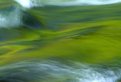
Critique By:
John Charlton (K:5595)
4/27/2003 3:33:54 PM
A beautiful, graceful movement well captured however I would have liked it even more without the distraction of the highlights which I find jarring in comparison to the rest of the image. The green has so many shades and is so rich on its own, that to me is enough.
|
| Photo By: John Barclay
(K:3650)
|
|
|
Critique By:
John Charlton (K:5595)
4/27/2003 3:12:50 PM
Smokin'
|
| Photo By: John Barclay
(K:3650)
|
|
|
Critique By:
John Charlton (K:5595)
4/27/2003 3:06:59 PM
Looks like an image right out of LensWork magazine!
|
| Photo By: Alisa Mudge
(K:7511)
|
|
|
Critique By:
John Charlton (K:5595)
4/27/2003 2:59:38 PM
I know exactly what you mean about taking pictures of people. I feel the same way. This one is very good, although I wouldn't have cropped her feet so they look like they are resting on the bottom of the frame. I sugest you either cut them off completely or let them dangle as they were in real life. I like the background as is, but would lighten it if anything to enhance the atmospheric haze and increase the sense of depth.
I take it this is the lookout on Mount Royal? What a great place for people pictures.
|
| Photo By: Christian Barrette
(K:21125)
|
|
|
Critique By:
John Charlton (K:5595)
4/23/2003 1:34:58 PM
Hi David; I can't say I get it, although I do get the title; but still...huh?
This is a neat technique. I took a 4 x 5 evening course at Sheridan College many years ago in which the prof used a similar double exposure to show us how to illustrate a box and its contents at the same time. This shot reminds me of that class and a good time long ago.
|
| Photo By: David Chang-Sang
(K:680)
|
|
|
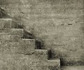
Critique By:
John Charlton (K:5595)
4/23/2003 1:30:04 PM
Yvon, this is fantastic. And I love the title. Hard stairs and hard light. Great composition and detail.
|
| Photo By: Yvon Loyer
(K:1449)
|
|
|
Critique By:
John Charlton (K:5595)
4/23/2003 1:12:48 PM
Thank you all for your comments - especially Mary Sue! That's a great point you make Christian. I tried it both ways and prefer the original tones over black and white. See attached. Looking forward to your Great Smokey photos John.
|
| Photo By: John Charlton
(K:5595)
|
|
|
Critique By:
John Charlton (K:5595)
4/21/2003 4:13:04 PM
Ya, like Terry said. Very cool.
Guess I caught them on the return trip.
|
| Photo By: Jane Nuse
(K:70)
|
|
|
Critique By:
John Charlton (K:5595)
4/21/2003 3:04:34 PM
This is beautiful. It has great depth and emotion. The composition is almost symphonic. The lighting is perfect.
|
| Photo By: Titia Geertman
(K:5582)
|
|
|
Critique By:
John Charlton (K:5595)
4/20/2003 3:12:32 PM
Gulp!
|
| Photo By: Mary Sue Hayward
(K:17558)
|
|
|
Critique By:
John Charlton (K:5595)
4/20/2003 2:59:51 PM
Thank you all for your comments.
Mary Sue; your remark was particularly generous. Thanks. You may be interested to know there is a Zen Photography group here in Canada called the Miksang Society for Comtemplative Photography. I don't know much about them but there are some very peaceful images at http://www.shambhala.org/centers/toronto/mk_gallery.html
Elangs; numbers are not my game at all (believe me) but I keep an eye on the shutter speed so I can handhold most of my shots and then I read these crazy numbers off the exif file that accompanies the original jpeg. The zoom lens on my camera is 8 - 32mm (equiv 38 - 135mm in 35mm format) so 27.8 mm is actually pretty close to the maximum telephoto. I hope I am reading the exposure times right. The exif file actually lists the exposure as being 22742/10000000 second. I think that translates to 1/227th of a second.
|
| Photo By: John Charlton
(K:5595)
|
|
|
Critique By:
John Charlton (K:5595)
4/20/2003 9:57:54 AM
Hi Sarah, Just playing catch up on your portfolio. I like both versions, but I am squarely behind the colour version on this one. That so many people like both is a testament to what a great photo it is. Pete Turner, a photographer famous for his strong use of colour, once said that a great colour photo will often work just as well in black and white. This is a good example of that principle. Cheers.
|
| Photo By: Sarah Needham
(K:2482)
|
|
|
Critique By:
John Charlton (K:5595)
4/20/2003 9:47:55 AM
What a fantastic place! I think I like the moodiness of the black and white over the colour you just posted and the lower angle of the sun helps add imense power to this scene. Great photograph.
|
| Photo By: Sarah Needham
(K:2482)
|
|
|
Critique By:
John Charlton (K:5595)
4/20/2003 9:37:17 AM
Wonderful exposure. Terrific in every way. Definitely one to add to my list of favourites. Congratulations.
|
| Photo By: Hayri CALISKAN
(K:16195)
|
|
|
Critique By:
John Charlton (K:5595)
4/20/2003 9:29:08 AM
Here is the original for comparison.
|
| Photo By: John Charlton
(K:5595)
|
|


")