|
|
Critique By:
Henrik Hanselmann (K:658)
10/12/2006 7:14:48 PM
Potensially interesting. I like her pose. But it's about two stops overexposed and also, i don't see the cat. Is is white as well?
|
| Photo By: haleh heydari
(K:87)
|
|
|
Critique By:
Henrik Hanselmann (K:658)
10/12/2006 7:10:30 PM
Very nice! Good exposure and composition. Beautiful light.
|
| Photo By: Miladin Mare
(K:3384)
|
|
|
Critique By:
Henrik Hanselmann (K:658)
10/12/2006 7:05:02 PM
Good idea for a photograph, very creative! i think i would have wanted your face to be in focus as well.
|
| Photo By: nexhat behrami
(K:90)
|
|
|
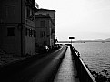
Critique By:
Henrik Hanselmann (K:658)
10/12/2006 6:59:59 PM
Well done! Nice panorama and well put together. Did you have a canoe there?
|
| Photo By: David Pereira
(K:160)
|
|
|
Critique By:
Henrik Hanselmann (K:658)
10/12/2006 6:55:20 PM
Interesting, nice colors. Would like to see more of the boy, and less of the sky. Could also be a bit sharper.
|
| Photo By: Gesine Bungi
(K:255)
|
|
|
Critique By:
Henrik Hanselmann (K:658)
10/12/2006 6:50:14 PM
Very good! Interesting composition. I like the devil in the backwindow. Foreground is a bit dark, but it's a hard one for exposure. 160 sounds about right on such a good road;)
|
| Photo By: Mohamed Reda
(K:204)
|
|
|
Critique By:
Henrik Hanselmann (K:658)
10/5/2006 6:28:49 PM
Thanks again Nick, you are too nice.
|
| Photo By: Henrik Hanselmann
(K:658)
|
|
|
Critique By:
Henrik Hanselmann (K:658)
10/5/2006 6:01:36 PM
Thanks Nick!
|
| Photo By: Henrik Hanselmann
(K:658)
|
|
|
Critique By:
Henrik Hanselmann (K:658)
9/26/2006 6:13:53 PM
Hello Clint! Welcome to usefilm! Great to hear you have some Norwegian blood in you! Hardanger is a beautiful place, have you been there?
|
| Photo By: Henrik Hanselmann
(K:658)
|
|
|
Critique By:
Henrik Hanselmann (K:658)
9/25/2006 6:46:13 PM
very nice. the light is beautiful.
|
| Photo By: Miladin Mare
(K:3384)
|
|
|
Critique By:
Henrik Hanselmann (K:658)
9/21/2006 9:15:47 PM
This is very good Radu! good focus, nice colors and most of all beautifull light. i also like the way you have put you're webaddress on the image, neatly done.
|
| Photo By: Radu Gruian
(K:1195)
|
|
|
Critique By:
Henrik Hanselmann (K:658)
9/21/2006 8:59:48 PM
Very good phil! nice mood, color and composition. and of course a beautiful girl. I think the flash is a bit strong, a weaker setting would have made the girl blend into the background better and it would look more natural.
|
Photo By: Phillip Filtz
(K:1792)

|
|
|
Critique By:
Henrik Hanselmann (K:658)
9/18/2006 8:16:06 PM
ok i see josh. Some people like the "grainy" look, i don't. Anyway, it's good picture, i really like the composition. It has a nice feel.
|
| Photo By: josh evilsizor
(K:1417)
|
|
|
Critique By:
Henrik Hanselmann (K:658)
9/18/2006 8:07:38 PM
Very good, it looks like it's from a movie. I can see the troubles you had with the lighting, tough one. But i think you used the wrong film. Kodak Portra 400 VC is good at bringing out the colors in you image. Ilford FP4 125 would've been a much better choice. It's is finer grain and also handle contrast better.
|
| Photo By: josh evilsizor
(K:1417)
|
|
|
Critique By:
Henrik Hanselmann (K:658)
9/18/2006 8:00:40 PM
Very good! There are so many interesting elements in this picture. I really love the background. But looks like it's been cropped, too much "noise" in the picture, a lower ASA would've been better. Also the focus could've been better. The colours are really good.
|
| Photo By: Giuliano Colliva
(K:1580)
|
|
|
Critique By:
Henrik Hanselmann (K:658)
9/18/2006 7:40:52 PM
I like this portrait a lot. Good lighting especially on her hair. Dont think you need a catchlight. Very good. But is it really in focus? Hard to see since you were shooting at 2.8.
|
| Photo By: Dizzy De Silva
(K:212)
|
|
|
Critique By:
Henrik Hanselmann (K:658)
9/18/2006 7:28:08 PM
hello! feel like being a bit critical, no-one else is. It's a good portrait, but far from perfect. the contrast is very good, the composition could've been better. I do not like what you have done to her skin, there is almost no detail there, or is it just the makeup? Also I dont get the title, i like pink floyd as well but do you mean that she is another brick in the wall, or is just a cool title?
|
| Photo By: Mohammad Porooshani
(K:20765)
|
|
|
Critique By:
Henrik Hanselmann (K:658)
9/16/2006 8:24:32 PM
Hello Skinner! This is really nice! Good balance in the image, the sunlight in the middle makes it.
|
| Photo By: Roger Skinner
(K:81846)
|
|
|
Critique By:
Henrik Hanselmann (K:658)
9/14/2006 7:24:06 PM
thanks Greg!
|
| Photo By: Henrik Hanselmann
(K:658)
|
|
|
Critique By:
Henrik Hanselmann (K:658)
9/4/2006 7:02:54 PM
impressive!
|
| Photo By: Rob Burgoyne
(K:-1207)
|
|
|
Critique By:
Henrik Hanselmann (K:658)
9/4/2006 7:01:39 PM
very good idea. but i think the background and the lighting could've been better.
|
| Photo By: Mahmoud Baha Sadri
(K:19634)
|
|
|
Critique By:
Henrik Hanselmann (K:658)
9/4/2006 6:59:52 PM
very nice! but dont like the framing, would prefer a plain white background.
|
| Photo By: Dave Arnold
(K:55680)
|
|
|
Critique By:
Henrik Hanselmann (K:658)
9/4/2006 6:57:33 PM
interesting, but i dont get the title. is the clock rusty, in that case i cant really see it.
|
| Photo By: mosti Farahat
(K:696)
|
|
|
Critique By:
Henrik Hanselmann (K:658)
9/4/2006 6:54:15 PM
it's a good image, but there is something wrong with it, not sure what. maybe the composition, or his expression.
|
| Photo By: Melanie Schembri
(K:1531)
|
|
|
Critique By:
Henrik Hanselmann (K:658)
9/4/2006 6:49:54 PM
very nice image. not sure if it's better in black and white.
|
| Photo By: Dave Stacey
(K:150877)
|
|
|
Critique By:
Henrik Hanselmann (K:658)
9/4/2006 6:48:10 PM
very good, but i think it lack some sharpness.
|
| Photo By: cessy karina
(K:14205)
|
|
|
Critique By:
Henrik Hanselmann (K:658)
9/4/2006 6:46:04 PM
very nice mood, composition could've been better.
|
| Photo By: Edward Ghoti
(K:5514)
|
|
|
Critique By:
Henrik Hanselmann (K:658)
8/30/2006 9:33:14 AM
excellent. really shows the action. wish i could surf like that. You must have been in the water taking ut.
|
| Photo By: Ryan Torres
(K:411)
|
|
|
Critique By:
Henrik Hanselmann (K:658)
8/22/2006 6:52:53 PM
very good Andrei! Looks beautiful on the sky. Really nice colors as well. Look like F-5s.
|
| Photo By: A Vas
(K:326)
|
|
|
Critique By:
Henrik Hanselmann (K:658)
8/22/2006 4:57:04 PM
thanks mohamed. yes i agree the cables are a bit distracting. dont what to remove it all in PS, already removed some branches. i liked the unfit flower and the dramatic sky.
|
| Photo By: Henrik Hanselmann
(K:658)
|
|