|
|
Critique By:
Kristupa Saragih (K:1031)
3/4/2002 4:14:06 PM
Good catch of a scene....
Maybe better if you bend your knees and go down a little bit
|
| Photo By: Siddharth Siva
(K:3327)
|
|
|
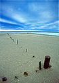
Critique By:
Kristupa Saragih (K:1031)
3/1/2002 5:46:35 PM
Great pic...
Nice use of wide angle lens and good composition...
A warmer color in the sand might be better...
|
Photo By: Tony Smallman
(K:23858)

|
|
|
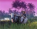
Critique By:
Kristupa Saragih (K:1031)
3/1/2002 8:32:03 AM
Interesting composition and nice blue color
It seems like that you used wide angle lens... that made a bit distracting distortion
Otherwise... you might use superwide angle or fisheye lens to make dramatic distorted pic...
|
| Photo By: © Javier Salmones
(K:0)
|
|
|
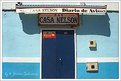
Critique By:
Kristupa Saragih (K:1031)
3/1/2002 1:26:53 AM
Great colors, nice composition and interesting use of shadow.
What disturbs me is the looks that the wall and door look a little bit tilted.
...hope you don't mind...
|
| Photo By: Michael Busselle
(K:221)
|
|
|
Critique By:
Kristupa Saragih (K:1031)
2/28/2002 4:56:08 PM
Good capture of raindrop
nice horizontal composition
|
| Photo By: ali al-tamimi
(K:389)
|
|
|
Critique By:
Kristupa Saragih (K:1031)
2/26/2002 5:20:05 PM
Interesting shot...
|
| Photo By: Jeroen Wenting
(K:25317)
|
|
|
Critique By:
Kristupa Saragih (K:1031)
2/26/2002 4:52:09 PM
Good choice of angle of view...
If you don't mind I'd suggest you to make the model's breast darker a little bit. Maybe the light is too harsh...
Anyway... you hava a good concept in this pic 
|
| Photo By: Cary Shaffer
(K:393)
|
|
|
Critique By:
Kristupa Saragih (K:1031)
2/26/2002 4:38:46 PM
Good capture of flower.
The background is blur, but --if you don't mind-- I'd suggest you to remove the white tree (?) to make a uniform-look background... just enough to isolate the main subject!
...I always have a morning walk with my dog (german sheperd dog) too...
|
| Photo By: Samuel Downs
(K:7290)
|
|
|
Critique By:
Kristupa Saragih (K:1031)
2/26/2002 5:58:33 AM
Hey Steve...
cool pics... welcome to usefilm
|
| Photo By: Steve Chong
(K:814)
|
|
|
Critique By:
Kristupa Saragih (K:1031)
2/25/2002 4:22:18 PM
Petros, Steve, Phillip and Lisa... thanks for all your comments.
When the first I made the contact print of the roll I saw that this new Ilford's color film has a magenta-based film.
Then I chose some shots and made enlargements to 5R and 10R prints, to see the grain, color separation and how the magenta color affects the print.
When I got the prints, I didn't like the flat white-sky in the original pic then I decided to add gradual-purplish tone for the sky using Photoshop 6.
That's how this picture made.
|
| Photo By: Kristupa Saragih
(K:1031)
|
|
|
Critique By:
Kristupa Saragih (K:1031)
2/24/2002 5:14:40 PM
Good catch of action
|
| Photo By: © Javier Salmones
(K:0)
|
|
|
Critique By:
Kristupa Saragih (K:1031)
2/24/2002 6:47:52 AM
Good catch of reflection
|
| Photo By: luis javier cota
(K:273)
|
|
|
Critique By:
Kristupa Saragih (K:1031)
2/21/2002 4:40:39 PM
Good choice of object
|
| Photo By: ROD COSTA
(K:909)
|
|
|
Critique By:
Kristupa Saragih (K:1031)
2/20/2002 9:56:53 PM
Good pic... well done
her pose seems a little bit "naughty"
|
| Photo By: Larry J. Rhodes
(K:2441)
|
|
|
Critique By:
Kristupa Saragih (K:1031)
2/19/2002 8:03:03 AM
Good choice of object
and nice composition
|
| Photo By: Bill Lange
(K:8)
|
|
|
Critique By:
Kristupa Saragih (K:1031)
2/19/2002 1:00:23 AM
Good details for fashion photo
|
| Photo By: Chris Lawrence
(K:124)
|
|
|
Critique By:
Kristupa Saragih (K:1031)
2/17/2002 5:00:16 AM
Nice coloring and good pose
|
| Photo By: Rene Asmussen
(K:138)
|
|
|
Critique By:
Kristupa Saragih (K:1031)
2/14/2002 5:57:25 AM
Dennis, good handle of 500mm lens (with 1.4 conv attached)
|
| Photo By: dennis chapin
(K:6)
|
|
|
Critique By:
Kristupa Saragih (K:1031)
2/13/2002 4:29:40 PM
Nice color
|
| Photo By: Bert J.L. Kuijer
(K:272)
|
|
|
Critique By:
Kristupa Saragih (K:1031)
2/13/2002 4:20:12 PM
This is much better than the previous one
And... the coloring effect works fine
I think you should add color "to balance" the blue color
like yellow, red, orange... or maybe the skin tone or the model's blonde hair
|
| Photo By: Phillip Filtz
(K:1792)
|
|
|
Critique By:
Kristupa Saragih (K:1031)
2/12/2002 5:46:21 PM
Good pose
and good choice of background and model's clotch
But her pose seems little bit unstable... looks like she's about to fall back down
And... have you tried to convert this to BW?
|
| Photo By: Phillip Filtz
(K:1792)
|
|
|
Critique By:
Kristupa Saragih (K:1031)
2/12/2002 5:37:48 PM
Nice coloring... an original idea
|
| Photo By: Mark Kowalski
(K:0)
|
|
|
Critique By:
Kristupa Saragih (K:1031)
2/11/2002 1:21:10 AM
Good pic
The reflection in the lower part is a little bit "busy". IMHO if the guy's feet weren't cut, this pic might be better
|
| Photo By: Ray Wearn
(K:1052)
|
|
|
Critique By:
Kristupa Saragih (K:1031)
2/9/2002 3:58:31 AM
Nanette: thx for re-categorizing this pic... I captured this pic in 1/3 composition and if I gave more room on the top I thought it would make this pic unbalanced
Maggie: thx for the cropping suggestion
Alisa: thx for commenting
Petros my man: you always give comment for my pic, thx buddy
Sabine and Samuel: thx
|
| Photo By: Kristupa Saragih
(K:1031)
|
|
|
Critique By:
Kristupa Saragih (K:1031)
2/9/2002 3:43:41 AM
Petros, thanks...
I shot this with 2 flashes, 1 with softbox and 1 with umbrella.
I tried to use reflector, but the light was too dim so reflector won't work
|
| Photo By: Kristupa Saragih
(K:1031)
|
|
|
Critique By:
Kristupa Saragih (K:1031)
2/8/2002 6:47:52 PM
This is great!
Nice color combination and good composition
|
| Photo By: © Javier Salmones
(K:0)
|
|
|
Critique By:
Kristupa Saragih (K:1031)
2/8/2002 4:27:31 AM
It's better not to cut her foot, isn't it?
|
| Photo By: Ninfa Z. Bito
(K:245)
|
|
|
Critique By:
Kristupa Saragih (K:1031)
2/7/2002 9:22:07 AM
Good pose and nice pic
But the background is better if it's blur and not separated... too bright and too dark
|
| Photo By: Trina Roy
(K:89)
|
|
|
Critique By:
Kristupa Saragih (K:1031)
2/7/2002 3:10:14 AM
Wow! Good catch of action
|
| Photo By: © Javier Salmones
(K:0)
|
|
|
Critique By:
Kristupa Saragih (K:1031)
2/7/2002 2:46:03 AM
Beautiful color
I you don't mind, I'd suggest you to make the background blur or at least looks uniform
|
| Photo By: Bert J.L. Kuijer
(K:272)
|
|