|
|
Critique By:
svend videbak (K:7376)
7/1/2005 6:41:09 AM
Characterful picture, from the subject, the worn man down on his luck, to the grizzled wooden bench, to the carved decorations in the massive stone wall behind.
|
| Photo By: Jeno Apu
(K:1318)
|
|
|
Critique By:
svend videbak (K:7376)
7/1/2005 6:38:53 AM
Not sure about the (assuming) computer toning but I like the light here. Fine rendition of spring-green leaves and light filtering through. Lovely detail throughout. I'm puzzled why your pictures aren't attracting more attention, they are all well-observed and technically very good. Rgds, Svend
|
| Photo By: Jeno Apu
(K:1318)
|
|
|
Critique By:
svend videbak (K:7376)
7/1/2005 6:35:25 AM
Excellent play of light and texture. Fine crop. The kind of subject B & W is great for.
|
| Photo By: Jeno Apu
(K:1318)
|
|
|
Critique By:
svend videbak (K:7376)
6/30/2005 8:30:38 AM
Ah, the Leica look, I wonder what does it. I guess this tired old pigeon has lived a full life and waits for the end in peace.
|
| Photo By: Rainer Pawellek
(K:1033)
|
|
|
Critique By:
svend videbak (K:7376)
6/30/2005 8:29:01 AM
Géniale photo. I like the dappled play of light and of course the warmth of love.
|
| Photo By: Rainer Pawellek
(K:1033)
|
|
|
Critique By:
svend videbak (K:7376)
6/27/2005 1:11:28 PM
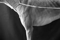
I like the crispness and full tonality of this picture from dark to white. Clever crop. Nice dog!
|
| Photo By: Marcza Ulan
(K:198)
|
|
|
Critique By:
svend videbak (K:7376)
6/25/2005 6:10:53 PM
Very painterly. Very busy, not sure all those planes and lines are working together but who says they have to? Fractal impression. Very interesting, explorative, different and thank goodness for that in a sea of sameness.
|
| Photo By: Jeannette Palsa
(K:128)
|
|
|
Critique By:
svend videbak (K:7376)
6/25/2005 6:06:26 PM
Always like layered photographic pictures when they're made the old-fashioned way. Guess this is a multiple-exposure during print-making. Graphically I like this a lot -- certain there's much to enjoy in the print, the interplay of grain and greys, distinctness playing with indistinctness. The subject is straight-forward, the interpretation here is the thing.
|
| Photo By: Jeannette Palsa
(K:128)
|
|
|
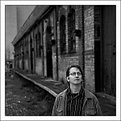
Critique By:
svend videbak (K:7376)
6/24/2005 8:21:53 AM
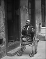
Excellent portrait. I find no sadness in this picture. Of course I feel sorry for the poor man who has lost his legs but there is nothing pathetic about him. I can't interpet the gesture he is making with his hands. I really like this and your pictures in general. Rgds, Svend
|
| Photo By: Jeno Apu
(K:1318)
|
|
|
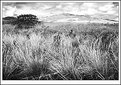
Critique By:
svend videbak (K:7376)
6/20/2005 7:04:02 PM
Really good, nature's symmetry all prickly and forbidding in this case. The thistle is an incredible plant -- they grow in abundance in the patch of forest behind my house. I think this picture of yours might prompt me to look at them more closely... Rgds, Svend
|
| Photo By: Stefan Engström
(K:24473)
|
|
|
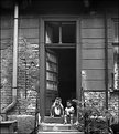
Critique By:
svend videbak (K:7376)
6/20/2005 2:37:51 PM
Very good indeed. Great how you've included the whole door and lots of building to loom over the two children. Good exposure control, developing, nice detail throughout. Charming picture.
|
| Photo By: Jeno Apu
(K:1318)
|
|
|
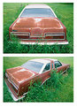
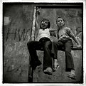
Critique By:
svend videbak (K:7376)
6/17/2005 10:06:31 AM
You made my Friday with this, Chris. "Fun, fun, fun 'til daddy took the T-bird away..." What strikes me in these pictures of the T-bird is how some farmer or municipal employee has lovingly mown the grass around the car, leaving a fringe of grass and weeds to grow and eventually cover it over I guess. It's part of that innate respect for the car that Americans have. I like the sad story that accompanies the pictures, too. I wish more people would take the time to think and write a little.
|
| Photo By: Chris Nichols
(K:7068)
|
|
|
Critique By:
svend videbak (K:7376)
6/15/2005 11:59:41 AM
Wow... let me get this straight: you made a light-tight box with a small hole, and you placed the camera into the box and opened the shutter so it could record the reversed camera obscura image? Wouldn't the camera get in the way? There sure is a special quality to this picture which I like. It has a bit of "painting with lightness" about it but with a deeper luminosity that is very attractive. There is a strange effect of depth, too particularly seen in the picture on the wall and how it seems to float against the wall rather than sit on it.
|
| Photo By: Stefan Engström
(K:24473)
|
|
|
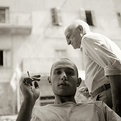
Critique By:
svend videbak (K:7376)
6/14/2005 9:47:39 AM
Aaaaaaaaah, there's nothing like a good smoke. Helps one think about life even as one is losing it. Nice contrast of youth vs. old age as others have pointed out. I like the insolent expression on Mr. M's face. Sepia toning works well. Cool photo! Rgds, Svend
|
Photo By: Giuliano Guarnieri
(K:36622)

|
|
|
Critique By:
svend videbak (K:7376)
6/14/2005 9:39:50 AM
Great timing! Like the silhouettes.
|
| Photo By: Ugur Bektas
(K:239)
|
|
|
Critique By:
svend videbak (K:7376)
6/12/2005 6:25:04 PM
Hello Angelo. I see you have been home, and brought back a suitcase of pictures to remind yourself of home when the mood strikes you! I like this one the most I think, for its range of textures, and sense of open space and light. I disagree with the others about the need for a dramatic sky. I generally don't like red-filter, "dramatic sky" photographs at all, they're tonally top-heavy and overworked. It's not a matter of "the sky doesn't look like that", it's a matter of graphical appearance. Tonality can be very very subtle and still be powerful. I think you have worked this well. It's all a matter of taste, though. Rgds, Svend
|
| Photo By: Angelo Villaschi
(K:49617)
|
|
|
Critique By:
svend videbak (K:7376)
6/6/2005 4:51:52 PM
A super series, simple, direct and effective. I think this one has the nicest light, somehow. Good sharpness, have you developed in D-76? Lovely sweeping tonality. Tri-X really has something special in tonality, don't know what it is. (It's made for denim!) A quality seen in Stefan Rohner's portraits too.
|
| Photo By: Andreas Hering
(K:1684)
|
|
|
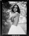
Critique By:
svend videbak (K:7376)
5/12/2005 5:58:06 AM
Well-drawn photograph, classic tonality with the dappled light behind contrasting with her white skirt. Important good details: how her highlighted hair on the left stands out against the patch of dark foliage. Looks like highlight detail in skirt holds up. Shadow detail in hair lost?
|
| Photo By: Pawel Staszak
(K:59)
|
|
|
Critique By:
svend videbak (K:7376)
5/12/2005 5:53:24 AM
Nice photo -- pity you had to crop the upraised leg.
|
| Photo By: Pawel Staszak
(K:59)
|
|
|
Critique By:
svend videbak (K:7376)
5/9/2005 11:10:15 AM
Wonderfully playful, theatrical, staged with an art director's eye. Such a pretty tiger tamer! And an air conditioner (I love them -- I always look for them in your urban pictures). I think what I like most about this fantastic series is how you make Shanghai an important character. In a way, the city is the main character holding all the others. And you choose gritty, out-of-the-way places to be your stage like this old courtyard. No-one has fun with photography the way you do, Maleonn. Bravo!
|
| Photo By: Maleonn
(K:3054)
|
|
|
Critique By:
svend videbak (K:7376)
5/9/2005 10:32:24 AM
I like your collage approach with this picture, how you haven't tried to hide the fact that it is made with two separate pictures. Lovely colour gradations, very painterly. A very simple subject open to many interpretations. Creative and graphically interesting.
|
| Photo By: Kiarang Alaei
(K:49415)
|
|
|
Critique By:
svend videbak (K:7376)
5/8/2005 5:34:30 PM
Hmmmm. I don't know, but if the subject is jazz then the thing to shoot for in a CD cover has to be coolness. I don't think this picture is very... cool. He looks kind of dorky and he's kind of lost in space. If jazz is about spontaneously creative improvisation, the photograph should be about that too. Tall order. I love the Blue Note vinyl covers of the 50s and 60s -- each and every one so incredibly cool and memorable. My favourite is the Blue Train cover, with Coltrane in pensive thought cast in blue. Pardon me, I'm not being helpful at all... Rgds, Svend
|
| Photo By: Mikael Leijon
(K:2224)
|
|
|
Critique By:
svend videbak (K:7376)
5/3/2005 1:39:37 PM
Vigorous graphical work, very much like the encaustic look -- or maybe wax crayons. A devilishly good picture, I always appreciate how you bring drawing into your photography.
|
| Photo By: vladimir antic
(K:3307)
|
|
|
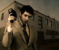
Critique By:
svend videbak (K:7376)
4/26/2005 8:34:24 PM
Cheesy real estate salesman! Would you buy a house from this man? I think not, but a picture, oh yes.
|
| Photo By: Marcus Claésson
(K:2179)
|
|
|
Critique By:
svend videbak (K:7376)
4/24/2005 5:04:38 PM
Oooooh. Such a sentimental sheen of colour to this picture.
|
| Photo By: Bea Friedli
(K:10189)
|
|
|
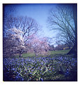
Critique By:
svend videbak (K:7376)
4/24/2005 5:01:00 PM
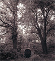
A bit of an overcast day, I guess. It has really helped to emphasize the sadness of mood. The little girl's figure stands out very well. The overhanging old trees are spectacular. Good choice of depth of field. Quite the photograph!
|
| Photo By: Bryan Miller
(K:3395)
|
|
|
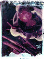
Critique By:
svend videbak (K:7376)
4/24/2005 4:47:18 PM
Wow, what a departure for you! It's in colour, for one thing. I don't think you've posted a colour picture before. It's a mess allright, but a lovable mess. Pomegranate and cinnamon, what a combination.
|
| Photo By: Giuliano Guarnieri
(K:36622)
|
|
|
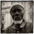
Critique By:
svend videbak (K:7376)
4/21/2005 6:45:27 AM
I like this portrait a lot. It is so very simple and direct and has a special presence. Tonally, I like how the light tones of the man's woolen cap work to encircle his head with the light tones in his beard and hair. There is great dignity and peacefulness about this African (?) man. I think this is the best portrait you have posted. Bravo!
|
| Photo By: gasior
(K:227)
|
|
|
Critique By:
svend videbak (K:7376)
4/21/2005 6:38:53 AM
Very nice and playful photograph.
|
| Photo By: gasior
(K:227)
|
|
|
Critique By:
svend videbak (K:7376)
4/20/2005 12:00:58 PM
Charming! The boy's face is well-modelled. Sharpness is good. Grain is very attractive. Most of all, his expression is adorable. I like it. Rgds, Svend
|
| Photo By: Chris Nichols
(K:7068)
|
|