|
|
Critique By:
John Charlton (K:5595)
6/11/2003 4:50:52 PM
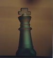
Fantastic. I hope he has a copy that he can look at when he is an old man. A really great shot!
|
Photo By: Tony Smallman
(K:23858)

|
|
|
Critique By:
John Charlton (K:5595)
6/11/2003 4:35:58 PM
The most interesting of the three. Better colours, better crop. Now get rid of the out of focus table top in the foreground and the light variations in the background.
|
| Photo By: Bjorn Beheydt
(K:12096)
|
|
|
Critique By:
John Charlton (K:5595)
6/11/2003 1:03:40 PM
That's definitely an improvement. Once you have your image scanned, do you have any photo editing software to adjust the brightness - contrast?
|
| Photo By: Bjorn Beheydt
(K:12096)
|
|
|
Critique By:
John Charlton (K:5595)
6/11/2003 11:39:38 AM
D'oh! I just uploaded your original file. Let me try that again.
|
| Photo By: Bjorn Beheydt
(K:12096)
|
|
|
Critique By:
John Charlton (K:5595)
6/11/2003 11:34:20 AM
Canvas may have been a bad choice of words.
What I meant was that the background on the left is much tighter to the subject than the background on the right. The top is greater still with a dead space hanging above the subject. If you think of the green out-of-focus background as a canvas, your subject's placement on that canvas is important to the composition. It could be cropped afterward as in the attachment or it could be cropped in-camera which is preferable.
Glad you are getting your scanner fixed. All your photos to date have a softness to them which I doubt is in the originals.
|
| Photo By: Bjorn Beheydt
(K:12096)
|
|
|
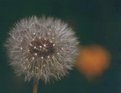
Critique By:
John Charlton (K:5595)
6/11/2003 4:58:57 AM
Hi Bjorn. This is total crap.
No, just kidding. I think you have something here, but it needs some work. I like the concept of the two stages of the flower together. (I assume that is what it is.)
What I don't like is how fuzzy and low contrast the picture looks. With closeups and macros, the bar is raised. Are you shooting on a tripod? If not, you might think of using one for this type of photograph. F:5.6 probably isn't going to do it for you here. It doesn't capture enough depth of field and the lens is not sharp enough at that aperture.
The composition is good with the blurred background and the yellow in the shape of a heart, but you need to arrange the space around your subject so it acts like a canvas. Attention to these details will raise your work from good to wonderful. This picture shows you have an eye, but your technique needs to be improved.
regards
John
|
| Photo By: Bjorn Beheydt
(K:12096)
|
|
|
Critique By:
John Charlton (K:5595)
6/10/2003 6:36:12 PM
The sign is located on a road inside Presqu'ile Provicial Park near Brighton, Ontario. The background was filtered through an Art Media brush stroke effect in Paint Shop Pro 8.
|
| Photo By: John Charlton
(K:5595)
|
|
|
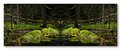
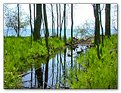
Critique By:
John Charlton (K:5595)
6/10/2003 4:36:22 AM
Not a problem John. I appreciate all comments as long as they are honest. There are currently two criteria I have for commenting on Usefilm photos. 1 - The photograph must grab me at an emotional level. 2 - The photographer must be able to give and take critiques in the spirit of community that is the upside of Usefilm.
Your opinion is; This doesn't work for you. On one level, it doesn't work for me either and your comment puts me in touch with that. Thanks. Photorealism was not a main component of this composition but on that level I agree with you.
On the other hand, I'm glad that others found the psychological subject matter which I was aiming for which is more archetypal (or mythical as Christian put it) than realistic. That's why I placed this image in the abstract category even though it is essentially a straight forward shot of a swamp. The Creature is about that psychological component of myself which I saw when I allowed myself to see it.
We all have a beast inside of us. For some, it is merely the opposite of our good natures and lies quiet and deep within our subconscious. For others, it is a daily struggle to hold back the beast that lurks just beyond the light of our consciousness. Where I am is not important. I feel content having done battle with the beast and being able to see him and know he is there. I wish that everyone took the opportunity to face their demons and shine a light upon them. Monsters can only live in the dark.
|
| Photo By: John Charlton
(K:5595)
|
|
|
Critique By:
John Charlton (K:5595)
6/9/2003 6:16:37 AM
Looking forward to it.
|
| Photo By: Chris Moore
(K:5591)
|
|
|
Critique By:
John Charlton (K:5595)
6/8/2003 3:21:59 PM
Thanks Luis and Christian. To grive credit where credit it is due, I must acknowledge Jeff Lynch's recent post http://www.usefilm.com/showphoto.php?id=146541 - I would not have dreamt of the picture above without the inspiration I got from Jeff's image.
|
| Photo By: John Charlton
(K:5595)
|
|
|
Critique By:
John Charlton (K:5595)
6/7/2003 9:54:49 AM
I liked this shot in the thumbnail but not as much blown up. Maybe its the titled window frame. The colours are good but this just isn't as strong as your previous post using the same technique. Love the old coffee pot. Do you have any more of this subject?
|
| Photo By: John Barclay
(K:3650)
|
|
|
Critique By:
John Charlton (K:5595)
6/7/2003 9:54:41 AM
Great use of this technique.
|
| Photo By: John Barclay
(K:3650)
|
|
|
Critique By:
John Charlton (K:5595)
6/7/2003 9:39:03 AM
Now this works. Man, this is great! It's like it's embossed. One of the best works I've seen from you yet and that's saying alot.
|
| Photo By: John Barclay
(K:3650)
|
|
|
Critique By:
John Charlton (K:5595)
6/7/2003 9:36:37 AM
Hi John. I think this almost works. The problem for me is that it's like two pictures in one. I keep going back between the composition on the left and the composition on the right.
|
| Photo By: John Barclay
(K:3650)
|
|
|
Critique By:
John Charlton (K:5595)
6/7/2003 9:30:41 AM
Doesn't work quite as well as the multiple exposures does it?
|
| Photo By: John Barclay
(K:3650)
|
|
|
Critique By:
John Charlton (K:5595)
6/7/2003 9:29:59 AM
You nailed it John. I love it.
|
| Photo By: John Barclay
(K:3650)
|
|
|
Critique By:
John Charlton (K:5595)
6/7/2003 9:27:49 AM
Okay, so I don't really want to just say WOW because.. well you know, but all the same... this is great.
|
| Photo By: John Barclay
(K:3650)
|
|
|
Critique By:
John Charlton (K:5595)
6/7/2003 9:17:57 AM
Hi Keith. This is a very nice portrait of your daughter. I am struck by her natural pose and the unusual but effective use of window light.
I think the vertical shadow on the left would have been better left out of the composition as would the slope of her arm and the little triangle of black. When I hold my hand over those elements, the graceful lines of her face come forward and the portrait (in my opinion) is improved. I know that makes for a rather narrow frame but a bit of dead air could also be cropped from above her head to maintain the original aspect ratio.
|
| Photo By: Keith Banham
(K:1306)
|
|
|
Critique By:
John Charlton (K:5595)
6/7/2003 8:45:32 AM
Chris, this composition rocks. The more I look at it the more I like it. It reminds me of one of those shots taken from the space shuttle looking down on earth's oceans.
My only complaint is the white pole in the top left of the frame which I find distracting and not supportive of the rest of the composition.
Your perspective and choice of lens have given this image a great sense of movement. The masts are positioned beautifully and I love that the whole thing feels as if it would topple over if not for being tied down by the lines at the very top and sides of the picture frame.
I do believe this picture could benefit from a bit of Photoshop. The clouds could be made a bit brighter and/or whiter and a bit of dodge and burn on some of the mast elements might give the image more substance. I wouldn't change the deep blue of the sky though.
Good exposure by the way. Any more and you would have blown out the highlights completely. Overall, this is a great photograph.
|
| Photo By: Chris Moore
(K:5591)
|
|
|
Critique By:
John Charlton (K:5595)
6/5/2003 3:09:21 PM
Well, you got my attention, that's for sure. I like the effect you have used on the sky but the light on the clock face is too processed to look good. The jaggies on the edge of the clock tower are also distracting, but the composition is great and the overall effect is tremendous. A bit more work and this will be a real winner.
|
| Photo By: Alberto Agnoletti
(K:12811)
|
|
|
Critique By:
John Charlton (K:5595)
6/5/2003 7:26:28 AM
Nice shot with good detail and well exposed. I think the border should be even from the top to the sides. The extra width at the sides draws too much attention to the frame which is otherwise very tasteful.
|
| Photo By: Christian Barrette
(K:21125)
|
|
|
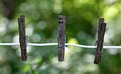
Critique By:
John Charlton (K:5595)
6/5/2003 6:44:20 AM
Glad your still hanging around here at Usefilm. Peg and I likes this one too. The background is worthy of the switch to colour but newer pegs would have been more colourful against the green.
I'm curious; just how far do you travel to visit this clothesline?
|
| Photo By: Mary Sue Hayward
(K:17558)
|
|
|
Critique By:
John Charlton (K:5595)
6/3/2003 4:39:30 AM
This is probably the most famous place I've ever photographed. When I posted the image to Usefilm days after our world changed, I was still shaking from the tragedy.
Several more comments have come and gone from below this picture as people have parted ways with Usefilm. None of them thought it was inappropriate in any way and so this image remains and is my memorial to the people who lost their lives.
Hope it stirs good memories rather than bad ones for you.
|
| Photo By: John Charlton
(K:5595)
|
|
|
Critique By:
John Charlton (K:5595)
6/2/2003 3:57:45 AM
Thanks everyone.
I have not had a chance to rephotograph this scene, but I did go back to my computer files to look for another shot to correct some of the problems associated with the first attempt. http://www.usefilm.com/showphoto.php?id=123658
I have attached the unmodified (except resizing) colour version of this photo complete with big dark spot from dirt on my lens (oops) and crooked horizon (one leg shorter than the other).
This photo is the result of some very deliberate choices made based on your wonderfully helpful comments. I know I have done a lot of bellyaching lately about Usefilm going to 'Hell in a Handcart' but you guys are great and I will continue to hang out here as long as I am learning from nice folks like youselves. Thanks again.
|
| Photo By: John Charlton
(K:5595)
|
|
|
Critique By:
John Charlton (K:5595)
6/1/2003 5:13:41 PM
Thanks everyone for your comments and suggestions. I have given this another try. See http://www.usefilm.com/showphoto.php?id=148969
|
| Photo By: John Charlton
(K:5595)
|
|
|
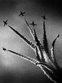
Critique By:
John Charlton (K:5595)
5/31/2003 6:45:03 AM
Madly off in all directions! Phenominal slice of time. Congrats.
|
| Photo By: Bernt Carlzon
(K:554)
|
|
|
Critique By:
John Charlton (K:5595)
5/30/2003 5:41:35 PM
Nice photo Emanual. I posted a similar photo here http://www.usefilm.com/showphoto.php?id=3241 several years back, taken in 1985 from almost the same location as this one. It is interesting to compare the two. Cheers.
|
| Photo By: Emanuel Melo
(K:166)
|
|
|
Critique By:
John Charlton (K:5595)
5/29/2003 2:40:13 PM
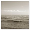
Hey Meirion. Welcome to Usefilm. I agree there is a bit too much featureless sky in this photo. Nice rural scene though.
|
| Photo By: Meirion Jones
(K:0)
|
|
|
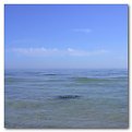
Critique By:
John Charlton (K:5595)
5/28/2003 4:42:11 AM
The sky was problematic in this photograph. I could not shoot any lower than I did as I was avoiding a road culvert in the foreground. Cropping the sky out completely seemed as harsh a soloution as the lighting. Maybe I will catch this scene again when the sky is more cooperative.
|
| Photo By: John Charlton
(K:5595)
|
|
|
Critique By:
John Charlton (K:5595)
5/18/2003 9:12:46 AM
Very nice Hayri. What camera did you use? What lens?
|
| Photo By: Hayri CALISKAN
(K:16195)
|
|