|
|
Critique By:
Gary Gantert (K:2104)
1/16/2004 8:03:48 AM
Great Shot. I'm sure you will cherish it later. They grow up too quick.
I like the lines the wood makes drawing you to the subject .
My only critique is that the subject is too centered.
I did a quick crop.
|
| Photo By: Teresa Moore
(K:11063)
|
|
|
Critique By:
Gary Gantert (K:2104)
1/6/2004 9:54:33 AM
I love all the lines in this picture. Great composition.
|
| Photo By: Muzaffer KURTOGLU
(K:4149)
|
|
|
Critique By:
Gary Gantert (K:2104)
1/5/2004 9:56:56 AM
Excellent photo.
Nice balance of light.
|
| Photo By: Teunis Haveman
(K:37426)
|
|
|
Critique By:
Gary Gantert (K:2104)
12/29/2003 7:58:15 AM
Great Still life.
Good composition and use of lines.
|
| Photo By: John Hatziemmanouil
(K:40580)
|
|
|
Critique By:
Gary Gantert (K:2104)
12/24/2003 11:24:40 AM
It's definately a Photoshop Xmas.
Nice Christmas card feel.
All I would do is add 'catch lights' to the eyes.
|
Photo By: SarahM none
(K:7836)

|
|
|
Critique By:
Gary Gantert (K:2104)
12/18/2003 9:10:43 AM
Great composition.
Good use of photoshop.
Keep experimenting.
|
| Photo By: Corey Mann
(K:0)
|
|
|
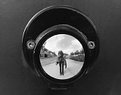
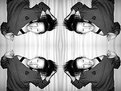
Critique By:
Gary Gantert (K:2104)
12/18/2003 9:08:25 AM
You should know all the rules so you can tell which ones your breaking.
Cool shot ... sort of M.C. Escher like.
Why not crop to a square? Your centered anyway.
A little lower angle might have been interesting too.
Nice self portrait.
|
| Photo By: marissa hkubhjkl
(K:157)
|
|
|
Critique By:
Gary Gantert (K:2104)
12/16/2003 9:09:18 AM
Nice tie.
With a cable release and a tripod I'm sure you took steady pictures.
Well composed. I like the left hand pointing.
|
| Photo By: Adelino Barreto
(K:12661)
|
|
|
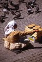
Critique By:
Gary Gantert (K:2104)
12/16/2003 9:01:51 AM
Great lines in this shot.
The light is good, throwing long shadows and giving detail to the beach.
I would crop the top just a hair. Get rid of that black line.
Then your eye is more drawn to the fishermen.
|
| Photo By: Elahe S. Ahmadian
(K:8695)
|
|
|
Critique By:
Gary Gantert (K:2104)
12/16/2003 8:12:13 AM
Funny how sunsets and nude women get all the hits on this site.
This image looks like it took time, thought and effort.
It's creative and nicely done.
I wish you put more info on what techniques were used.
The catch lites in the eyes make it work.
|
| Photo By: agata faraś
(K:155)
|
|
|
Critique By:
Gary Gantert (K:2104)
12/16/2003 8:04:16 AM
Composition is good.
The stems on the left back apple and yellow apple could be better placed.
You could get tighter on the image. Not as tight as Fruit #1 but you don't need all that top and you could crop just a little of the reflection.
The lighting is good. Maybe a little too open, could be slightly more dramatic.
Lastly, some kind of light on the background.
It would add depth and life to the image.
I hope you don't mind this candid critique.
You have the essence of a very good shot that just needs a little refininjg.
Keep shooting you are on the right track.
|
| Photo By: Nedim Muhic
(K:14362)
|
|
|
Critique By:
Gary Gantert (K:2104)
12/15/2003 1:34:11 PM
I love your city scapes and photoshop technique.
Outstanding images.
I love your attention to detail. The people in the photo are always well placed, no tangents.
This shot is a perfect example. The people add so much character and scale.
|
| Photo By: Alberto Agnoletti
(K:12811)
|
|
|
Critique By:
Gary Gantert (K:2104)
12/15/2003 1:27:28 PM
Beautiful picture. The composition is wonderful. I love the way everything flows to the right, (mountains, reflection...) and how the boat cuts your eye back through it so you wind up at the house.
My only minor changes would be electronic. I would clone out the bare branches coming in from the top of the frame and there is a small dark spot on the river above the boat. Minor blemishes. Great shot.
|
| Photo By: Alberto Rondalli
(K:0)
|
|
|
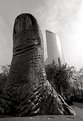
Critique By:
Gary Gantert (K:2104)
12/10/2003 10:23:14 AM
Unusual view.
I like the idea but I think this image could be cropped a little tighter and the corners could be darker.
Here's a quick edit. I hope you don't mind.
|
| Photo By: Allison Kuznia
(K:562)
|
|
|
Critique By:
Gary Gantert (K:2104)
12/10/2003 10:10:48 AM
I love the light andd colors, Great composition.
I like the dark triangles on each bottom corner split by the dark diagonal line.
Good use of shadows as a compositional element.
|
| Photo By: Ragnhildur Ragnars
(K:1573)
|
|
|
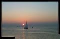
Critique By:
Gary Gantert (K:2104)
12/9/2003 10:19:36 AM
Ha ha.... Look out the sailboat is headed right for the falls!
|
| Photo By: Marc OLIVIERI
(K:177)
|
|
|
Critique By:
Gary Gantert (K:2104)
12/9/2003 10:17:55 AM
I like the light, nice texture on everything. The rusty colored background is great.
I think the composition is a little too centered, top to bottom, left to right.
The tombstone is kind of a bullseye, a little static. I might try getting in closer, using the rule of thirds. Show less of the background, cool as it is.
Maybe even bring a prop. Fresh flowers to contrast the age.
Just some ideas.
|
| Photo By: Chuck Freeman
(K:13616)
|
|
|
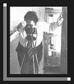
Critique By:
Gary Gantert (K:2104)
12/5/2003 11:22:48 AM
When I shoot copywork I put a softbox on either side far enough away that no reflections show.
The key is to meter. Make sure the light is even, side to side and top to bottom.
|
| Photo By: Paul Groff
(K:10)
|
|
|
Critique By:
Gary Gantert (K:2104)
12/3/2003 3:31:33 PM
I think what you need is some object in the middle.
Your eye is drawn to the center but it's empty.
I almost think the object should be round or quartered like the shot.
It might be cool if it was in color or a color to contrast the B&W.
|
| Photo By: Tracey MacFadden
(K:1066)
|
|
|
Critique By:
Gary Gantert (K:2104)
12/3/2003 8:17:52 AM
The light doesn't bother me.
It turns the photo into a 'set up shot' disspelling any sense that it wasn't posed.
If the light is there to show smoke you would be better served with a spot of raw light aimed right above the hand from behind.
Also I'd like to see some kind of background treatment.
Even subtle light on a background would give more depth.
I just find solid black backgrounds so dull.
|
| Photo By: Chris Blaszczyk
(K:610)
|
|
|
Critique By:
Gary Gantert (K:2104)
12/3/2003 7:48:53 AM
I love the light in this image.
Burning the corners made all the difference between an ordinary and extraordinary shot.
|
| Photo By: Harry Eggens
(K:14804)
|
|
|
Critique By:
Gary Gantert (K:2104)
12/3/2003 7:43:24 AM
Incedible sense of light and detail.
I love your style of Photoshop.
|
| Photo By: Alberto Agnoletti
(K:12811)
|
|
|
Critique By:
Gary Gantert (K:2104)
11/27/2003 8:50:06 AM
f8 and b there
Patience is a virtue.
|
| Photo By: Kenneth Kwan
(K:3084)
|
|
|
Critique By:
Gary Gantert (K:2104)
11/26/2003 3:05:37 PM
Great angle, nice light. I like the fingers and the band-aid.
My only suggestion is color balance. The shot seems a little green/yellow to me.
Adding a little magenta and blue might look nice.
Welcome to usefilm. I look forward to more pics of your niece. My girl is about the same age.
A very photographic age.
|
| Photo By: Samantha Walsh
(K:97)
|
|
|
Critique By:
Gary Gantert (K:2104)
11/25/2003 9:54:27 AM
Too Cool. In the thumbnail I thought it was photoshop.
|
| Photo By: uomo invisibile
(K:0)
|
|
|
Critique By:
Gary Gantert (K:2104)
11/24/2003 12:45:26 PM
Chris,
I apologize for such a rude welcome to usefilm.
I like the sun dappling through the trees, how the photo gets lighter twards the back. It really adds depth to the image.
I would crop some off the right. I feel that would make for a stronger composition.
|
| Photo By: Chris Goodman
(K:1078)
|
|
|
Critique By:
Gary Gantert (K:2104)
11/24/2003 12:36:38 PM
Great composition. Life is so much more interesting when viewed from above.
|
| Photo By: Roberto Lupini
(K:143)
|
|
|
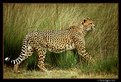
Critique By:
Gary Gantert (K:2104)
11/20/2003 7:16:19 PM
Nicely done. I wouldn't change a thing.
I don't think he looks mean but he does look like he has a plan.
|
| Photo By: David Yates
(K:4698)
|
|
|
Critique By:
Gary Gantert (K:2104)
11/14/2003 9:53:37 AM
Great shot. I like the composition and pose. Have you ever tried this kind of shot with a flash and slow shutter speed? It would have a completely different look but it might be fun to play around with.
|
| Photo By: Hassan Nemer
(K:1737)
|
|
|
Critique By:
Gary Gantert (K:2104)
11/14/2003 9:01:10 AM
Excellent shot. I like the contrast of blue sky and yellow stone. lighting is good to show detail and the shadow is a nice compositional element. I would crop the bottom a little, so you don't see that bar. And I would clone out the tree branches on the left.
|
| Photo By: Murat Kodan
(K:440)
|
|