|
|
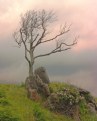
Critique By:
Peter McDonald (K:4951)
2/12/2007 10:37:16 PM
hi there,
a nice idea, i think they are called joiners.
nice colour and framing
cheers peter
|
| Photo By: Melissa Thorburn
(K:633)
|
|
|
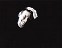
Critique By:
Peter McDonald (K:4951)
2/11/2007 7:54:03 PM
hi there,
nice use of soft focus and black and white
the soft focus for the happy family effect and the black and white for the timeless feel
excellent framing as usual.
cheers peter
|
| Photo By: Larry Fosse
(K:66493)
|
|
|
Critique By:
Peter McDonald (K:4951)
2/11/2007 7:50:40 PM
hi
excellent idea and framing
best way to show some of the locals up there
i hope it was a GM car and not a ford
cheers peter
|
| Photo By: Jacquie Lindsay
(K:3196)
|
|
|
Critique By:
Peter McDonald (K:4951)
2/11/2007 7:46:31 PM
hi there,
very interesting photo, nicely done in panoramic mode.
the hands and just flowers leave the viewer thinking what the women? looked like.
nice work.
cheers peter
|
| Photo By: Tabitha Woods
(K:8650)
|
|
|
Critique By:
Peter McDonald (K:4951)
2/9/2007 2:32:43 AM
hi there
nice found photo of a polar bear, you can wait a long time and nothing will happen
nice framing and colour.
cheers
|
| Photo By: Fernando Tasca
(K:1995)
|
|
|
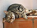
Critique By:
Peter McDonald (K:4951)
2/8/2007 3:19:28 AM
hi
very nice close up photo in black and white of a contented cat.
maybe a little bit of flash or reflected light to bring up the eyes more
still very nice
cheers peter
|
| Photo By: Ahmed naguib
(K:42)
|
|
|
Critique By:
Peter McDonald (K:4951)
2/8/2007 3:16:56 AM
hi there
good idea and nice photo, might need a little zap of contrast as to me it looks too flat.
ie no bite to the image
with good sky why not try altering it to black and white as well.
nice work.
cheers peter
|
| Photo By: Rebecca Raybon
(K:26654)
|
|
|
Critique By:
Peter McDonald (K:4951)
2/6/2007 9:35:23 PM
hi there
excellent use of a black background and good lighting.
nice relaxed pose
if i was slightly picky i would get closer to make better use of the great pose.
cheers peter
|
| Photo By: Nicoletta Zanuccoli
(K:-13)
|
|
|
Critique By:
Peter McDonald (K:4951)
2/6/2007 7:38:58 PM
hi there,
nice use of abstract colours and shapes
would make a excellent background for portraiture using rear curtain sync and just on its on.
cheers peter
|
| Photo By: Davide Anzalone
(K:1375)
|
|
|
Critique By:
Peter McDonald (K:4951)
2/6/2007 7:35:36 PM
hi there,
nice side lighted portrait
well cropped and good expession on a attractive young lady.
keep up the good work
|
| Photo By: Claudio Mejias
(K:4278)
|
|
|
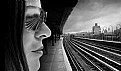
Critique By:
Peter McDonald (K:4951)
2/6/2007 7:33:14 PM
hi there,
nice use of wide and persective, the over large head and tracks leading away makes it almost 3D.
the black and white gives this reportage photo more grit, tone and texture than if it was in colour.
cheers peter
|
| Photo By: ADAM ORZECHOWSKI
(K:7957)
|
|
|
Critique By:
Peter McDonald (K:4951)
2/5/2007 12:50:55 AM
hi there
a typical posed for a nice old cat.
strenched out in the sun,and wondering if you the photographer has any treats for her to eat.
cheers peter
|
| Photo By: Meg Metcalfe
(K:6114)
|
|
|
Critique By:
Peter McDonald (K:4951)
2/5/2007 12:40:37 AM
hi there, thanks for your nice comment on the prisoners.
the sevens tournament goes for two full on days and everyone likes to get into the swing of things
its nice to see some people not afraid to show a sense of humour.
tooo many policaly correct people running around, to enjoy your self
cheers peter
|
| Photo By: jacques brisebois
(K:73883)
|
|
|
Critique By:
Peter McDonald (K:4951)
2/4/2007 10:13:06 PM
hi there,
the bird is a little dark, what happens is that the camera see's all the bright blue sky and exposes for that not the bird.
try spot metering on the bird if you have it or turn your camera on to manual
and take a light reading of your hand, ie the same light falls on your hand as the bird.
lock that into your camera and you will have a nicely exposed owl
as well as shooting in landscape mode, try portrait mode as well. you might be able to next time to remove some of the fence.
a well seen photo through, owls are usually very nervous around any people.
cheers peter
|
| Photo By: Lana M
(K:811)
|
|
|
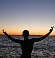
Critique By:
Peter McDonald (K:4951)
2/4/2007 10:00:09 PM
hi there
a nice sun rise/set photo to start with.
and photo is improved even more by the man
cheers peter
|
| Photo By: Blazenko Kramar
(K:90)
|
|
|
Critique By:
Peter McDonald (K:4951)
2/4/2007 9:02:58 PM
hi there
nice picture,excellent framing and colour.
you have been chasing these shy birds around for a long time
cheers peter
|
| Photo By: Tabitha Woods
(K:8650)
|
|
|
Critique By:
Peter McDonald (K:4951)
2/4/2007 8:59:38 PM
hello there,
thank you for your helpful comment
|
| Photo By: Peter McDonald
(K:4951)
|
|
|
Critique By:
Peter McDonald (K:4951)
2/4/2007 8:58:14 PM
hi thanks for your comment.
for all those prison reformers, heres another version
|
| Photo By: Peter McDonald
(K:4951)
|
|
|
Critique By:
Peter McDonald (K:4951)
2/1/2007 4:16:31 AM
hi very nice photo
just a simple colour and tone
the posts are on thirds grid lines and seem to be balanced in the photo.
keep up the god work
|
Photo By: Barbara Socor
(K:13559)

|
|
|
Critique By:
Peter McDonald (K:4951)
2/1/2007 12:34:34 AM
hi
very nice colour and framing
the exposure of the bridge and the surrounds is very good as you can still see detail in both.
nice work
cheers peter
|
| Photo By: Marcello Braga
(K:440)
|
|
|
Critique By:
Peter McDonald (K:4951)
1/30/2007 7:27:31 PM
hi
very nice photo, digital tends to blow out high contrasty photos like this.
so you have done very well with this
the photo has 2/3 land and 1/3 sky which makes for good balance, not just slapped into the center
did you use a grad filter as there is good contrast on sky and land
cheers peter
|
| Photo By: Giulio Rotelli
(K:28441)
|
|
|
Critique By:
Peter McDonald (K:4951)
1/30/2007 1:56:52 AM
hi very nice photo.
good subtle colours and tones
the framing of the people brings out the picture very nicely.
nice work
peter
|
| Photo By: jk chakharin
(K:23)
|
|
|
Critique By:
Peter McDonald (K:4951)
1/30/2007 1:46:15 AM
hi there dont worry
it can take years of practice as photoshop is a huge programme.
try just doing one thing like levels( lightening and darkening the photo ) and when you feel good with that try something else.
i find with digital cameras in photoshop you should only have to give a bit of contrast and a little unsharp mask, as most cameras give a softish photo.
cheers peter
|
| Photo By: Mary Jane
(K:5867)
|
|
|
Critique By:
Peter McDonald (K:4951)
1/29/2007 7:35:36 PM
hi there
interesting double exposure, i think though a little flat with no contrast.
i also think its been over exposed as there is only shades of grey. no strong blacks,, whites and greys.
b & w is famous for its tones and textures
when double exposing you half the exposure for two, ie keep the camera at f-22 for max depth of field and just half the shutter speed
i have cropped your photo added some more contrast ie bite to the image.
the crop is a panorama size i think it would make a nice postcard.
in all an excellent attempt at something different, keep up the good work.
|
| Photo By: Mary Jane
(K:5867)
|
|
|
Critique By:
Peter McDonald (K:4951)
1/29/2007 7:21:49 PM
hi there,
firstly the house is well framed and sharp,
but has a slight off putting lean on it.as well the wide angle lens tilt, ie its if the building was falling over.
this can be fixed by using a telephoto and standing back, or a tilt and shift lens.
but i like it this way as its very dramatic
it looks as thru you have used a red filter or tweaked it in photoshop.
this brings out the tone which black and white is famous for
if you had a chance to do this again, try adding a human for scale ie sitting on the front step or looking out an up stairs window.
nice work and good idea.
|
| Photo By: SORRENTE Patrick
(K:3307)
|
|
|
Critique By:
Peter McDonald (K:4951)
1/28/2007 11:50:44 PM
hi there,
another excellent pic, getting up before dawn does have its advantages for good photography
and you can always have a nana nap afterwards
nice work.
cheers peter
|
| Photo By: Tabitha Woods
(K:8650)
|
|
|
Critique By:
Peter McDonald (K:4951)
1/28/2007 7:17:49 PM
hi there,
nice 3/4 pose of the ornament and colour.
but i gave it a little tweak to improve your already good photo.
i cropped it to remove the gold and green as well as cloning out the flash make behind the elephant
keep up the good work.
cheers peter
|
| Photo By: Maryanne Murillo
(K:11617)
|
|
|
Critique By:
Peter McDonald (K:4951)
1/25/2007 7:39:20 PM
hi there
it looks like a little girls temper tantrum about not geeting her way
the black and white and wind blown hair brings it up nicely. ie the mood of the occassion.
nicely seen.
cheers peter
|
| Photo By: yavuz arslan
(K:-38)
|
|
|
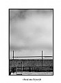
Critique By:
Peter McDonald (K:4951)
1/25/2007 7:35:52 PM
hi
interesting framing of a scaffold against the sky
the black and white helps the photo by using tonal and texture with the sky and building
cheers peter
|
| Photo By: René van Rijswijk
(K:63)
|
|
|
Critique By:
Peter McDonald (K:4951)
1/25/2007 7:32:49 PM
hi nice to see some one still using film.
the photo has a almost black and white film to it
very tonal and textural
nice work.
cheers peter
|
| Photo By: Nick Karagiaouroglou
(K:127263)
|
|