|
|
Critique By:
Marek Krol (K:9791)
3/8/2004 1:03:03 PM
Terrible!!! I can't believe people still wear shirts that terrible 
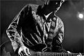
Jokes aside, this is a good stage shot. Just enough of the face to show that the musician is into it, without taking away from the music in his guitar and hands. The blown out stage light in the background is a distraction thjough, I'd consider burning / cloning it out. Cropping won't work as you lose his hand.
|
| Photo By: Adrian Nitu
(K:238)
|
|
|
Critique By:
Marek Krol (K:9791)
3/8/2004 12:58:54 PM
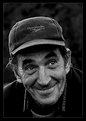
widac ze prawdziwa radosc wcale nie zalezy od kasy. Mozna bylo troche ciasniej wykadrowac tutaj, bardziej zdjecie by bylo skupione na wyrazie twarze i historii na niej wypisanej.
|
| Photo By: Pawel Karpienko
(K:-17)
|
|
|
Critique By:
Marek Krol (K:9791)
3/8/2004 12:39:27 PM
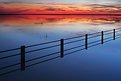
this is better than yesterdays Felipe - same beautiful colors and creamy texture but with the addition of a line for my eyes to follow across the scene. The sharpness fo the fence contrasts it nicely too.
|
| Photo By: Felipe Rodríguez
(K:9200)
|
|
|
Critique By:
Marek Krol (K:9791)
3/7/2004 3:15:21 PM
I concur with Tuenis, stunning b&w
|
| Photo By: Milo Hess
(K:220)
|
|
|
Critique By:
Marek Krol (K:9791)
3/7/2004 2:58:22 PM
nic nie robia, swiatlo sie nie pali... efektow nie widac. to chyba nasza polityka. mam cos wczytywac w balans pomiedzy lewa a prawa strona?
|
| Photo By: Michal Krakowiak
(K:87)
|
|
|
Critique By:
Marek Krol (K:9791)
3/7/2004 2:57:14 PM
with your eye you have done in one shot what should take many and hours in the darkroom blending them into something that would never be as seamless. even though this is b&w the winter 'grey' gives a bleak perspective on the little worlds we have built in our cities.
|
| Photo By: Fabio Keiner
(K:81109)
|
|
|
Critique By:
Marek Krol (K:9791)
3/7/2004 2:48:36 PM
the empire and hteir big ships indeed. what is this exactly? a couple of buildings?
|
| Photo By: Felipe Rodríguez
(K:9200)
|
|
|
Critique By:
Marek Krol (K:9791)
3/7/2004 2:47:57 PM
such beautiful eye candy Felipe. the colors and swirls are sublime.
|
| Photo By: Felipe Rodríguez
(K:9200)
|
|
|
Critique By:
Marek Krol (K:9791)
3/7/2004 2:45:45 PM
I don't mind the flatness of tones here, but they are a little dark overall (even considering the mood here), i'd brighten it up just a little. Otherwise fantastic, there is so much body langhuage beinbg conveyed here by the hand dreaming of a different time and a different place that is not governed by a set of spoked rubber wheels. the stone table top looks almost like perfectly still water - a kind of wishing well in this context. really interesting work.
|
| Photo By: Ronald Allen
(K:2934)
|
|
|
Critique By:
Marek Krol (K:9791)
3/7/2004 2:43:54 PM
beautiful in its absolute ugliness - by day an unassuming chemical plant, but by night a dancer twirling in the stagelights. (yes it looks like the smoke plumes are entwined in a dance..). I don't think the frame was at all necessary though.
|
| Photo By: Ursula I Abresch
(K:6515)
|
|
|
Critique By:
Marek Krol (K:9791)
3/7/2004 2:42:11 PM
this tight crop of the ships bow works a lot better than the wider one you uploaded later. I think you may have worked the saturation and contrast a lot here - the end effect is fantastic.
|
| Photo By: Christian Barrette
(K:21125)
|
|
|
Critique By:
Marek Krol (K:9791)
3/7/2004 2:41:01 PM
this seems to have been unfairly overlooked... although I think a less centred placing of the lamp's and person's reflections would have given this frame better blance, the stone and watery textures playing across the ground are great.
|
| Photo By: DON H
(K:770)
|
|
|
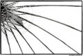
Critique By:
Marek Krol (K:9791)
3/7/2004 2:34:53 PM
somehow it reminds me of sketches that I have seen of the wing of DaVinci's flying machine
|
| Photo By: Dominikus BW
(K:500)
|
|
|
Critique By:
Marek Krol (K:9791)
3/7/2004 2:34:05 PM
My eyes follow the stairs down from the top for a nice surprise. Two suggestions - crop a bit tighter on the left of hte stork. Push up the contrast a bit mroe to make it more of a silhouette - atm the white feathers are just on the edge of looking underexposed I think. If you push them down more will give the right effect maybe?
|
| Photo By: Felipe Rodríguez
(K:9200)
|
|
|
Critique By:
Marek Krol (K:9791)
3/7/2004 2:31:40 PM
tender and beautiful. soft effect works very well here.
|
| Photo By: Ján HRONSKÝ alias ?ltý D
(K:1292)
|
|
|
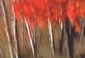
Critique By:
Marek Krol (K:9791)
3/7/2004 2:30:37 PM
a forest of brushes ready to apply a watercolor red to the canvas to record the passing of another autumn. great vision in putting this one together from a thought to the end resault.
|
| Photo By: Bill Morgenstern
(K:7157)
|
|
|
Critique By:
Marek Krol (K:9791)
3/7/2004 2:28:06 PM
dead, bleak barren. Awesome use of wide angle and high speed film. Really sets the mood. I think you made good use of the rule of thirds for the double horizon too - first is the ground horizon, second the distant forest's treeline. This shot would have great impact in a large format on the wall - I think we lose quite a bit of detail here...
|
| Photo By: Leslie Hancock
(K:910)
|
|
|
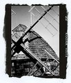
Critique By:
Marek Krol (K:9791)
3/7/2004 2:18:41 PM
Great tones and nice tight crop to give us something different that the 'beautiful old windmill in classic landscape' shot. Always good to see someone thinking outside the square.
BTw this seems very square on, but obviously is at some height - any perspective correction here?
|
| Photo By: Jonathan Soto
(K:0)
|
|
|
Critique By:
Marek Krol (K:9791)
3/7/2004 2:17:05 PM
Great 'reflection' 
|
| Photo By: Amna Al Shamsi
(K:21795)
|
|
|
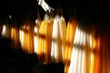
Critique By:
Marek Krol (K:9791)
3/7/2004 2:14:55 PM
Love it how the soft light streaming through the window ahs the same feel that the candles lit would give - soft and subtle. The repeating color pattern and the way the candles come in and out of the shadows really works the mood here. I would consider burning the strip of white fabric top centre - it's distracting.
|
| Photo By: William Francis
(K:365)
|
|
|
Critique By:
Marek Krol (K:9791)
3/7/2004 2:10:37 PM
The blend is not that visible, but something in the change of scale / perspective across the join is noticable. Would I have known without you telling me? Possibly not, but something looks a little out of place.
|
Photo By: KEVIN TEMPLE
(K:8657)

|
|
|
Critique By:
Marek Krol (K:9791)
3/7/2004 2:09:21 PM
The softness and high key light makes her already captivating eyes stand out all the more - with the left just peering out of the darkness.I'm not sure if you sshould have cropped out the knees or not - on the one hand they are somewhat distracting, but on the other they let the viewer know that she has them tucked up in a vulnerable foetal position - the positioning does look a little akward...
|
| Photo By: Tamara L
(K:1387)
|
|
|
Critique By:
Marek Krol (K:9791)
3/5/2004 10:34:03 AM
The interplay of different light sources comes out quite interesting here. I would like the ducks to be a little clearer thoughm, other than the whtie one they are indistinct blobs atm. Enough to stop the photo from being a pure abstract with just water and light.
All these night shots explain your late night commenting yesterday! Don't you have to go to work in the morning like the rest of us mortals Felipe?
|
| Photo By: Felipe Rodríguez
(K:9200)
|
|
|
Critique By:
Marek Krol (K:9791)
3/2/2004 2:04:13 PM
a full frame of joy. well except for tjhe right hand side! who let that border in.
magic moment Vlad. thjanks for sharing
|
| Photo By: Vladislav Hahn
(K:30)
|
|
|
Critique By:
Marek Krol (K:9791)
3/2/2004 2:01:26 PM
from the thumbnail this looks like a bellybutton and panty hip lines. loses the illusion in the fulsize, but manages to metamorphose into a great building abstract :P
|
| Photo By: WALT MESK
(K:10691)
|
|
|
Critique By:
Marek Krol (K:9791)
3/2/2004 1:57:40 PM
czy opowiesc o kazdym dniu zakonczy sie na trylogii?
|
| Photo By: Witold Spisz
(K:1293)
|
|
|
Critique By:
Marek Krol (K:9791)
3/2/2004 1:54:25 PM
Looks a bit like a long exposure shot of a highway at night with the orange and pale blue 'light' streaks. I guess the elements edit was to add the curvature to the wood grain? If so too bad it wasn't something natural, however the effect is effective all the same.
|
| Photo By: John Orban
(K:725)
|
|
|
Critique By:
Marek Krol (K:9791)
3/2/2004 1:52:33 PM
its a little soft but looks like that came from scanning fil. Also I think Hugo's suggested crop works better as you don't get the small black triangles distracting the viewer. I would suggest that you try shooting birds from lower down - it's a more intimatte and natural perspective if you can get to the animals eye level.
|
| Photo By: Roberto Arcari Farinetti
(K:209486)
|
|
|
Critique By:
Marek Krol (K:9791)
3/2/2004 1:50:33 PM
very fragile and alone. I like the way the darkness isolates the chick, and adds to the tension by making it completely alone in the frame.
|
| Photo By: Shyamal Addanki
(K:1009)
|
|
|
Critique By:
Marek Krol (K:9791)
3/2/2004 9:25:14 AM
Felipe Good technically, but nothing really stands out and grabs me in the composition.
|
| Photo By: Felipe Rodríguez
(K:9200)
|
|