|
|
Critique By:
Ed Dalton (K:280)
3/10/2003 7:35:53 PM
Lovely color, well composed, instead of centering the flower, next time try using the rule of 3rds and see what happens. I like the way you've kept the greens in the backgrounds.
|
| Photo By: Danny Provost
(K:812)
|
|
|
Critique By:
Matt Hardy (K:474)
3/3/2003 3:05:45 PM
I think you did an excellent job on your first attempt! Bravo.
|
| Photo By: Danny Provost
(K:812)
|
|
|
Critique By:
Former Member (K:2712)
3/3/2003 10:40:18 AM
Hi Danny, love the detial here nice job keep it up.
|
| Photo By: Danny Provost
(K:812)
|
|
|
Critique By:
Valeh B (K:890)
2/26/2003 6:01:56 PM
I love those three birds posing for you at the right moment!
|
| Photo By: Danny Provost
(K:812)
|
|
|
Critique By:
Richard Heid (K:71)
2/22/2003 9:05:51 PM
The comp is great, as well as the color, beautiful. However, the eye is a little soft.
|
| Photo By: Danny Provost
(K:812)
|
|
|
Critique By:
Danny Provost (K:812)
2/16/2003 2:13:11 PM
Martin, yes I agree this is much better. Sometimes I concentrate too much on the mechanics of setting up the shot and I fail to see certain things. That's why I like this site so others see what I don't. Thanks again.
Dan
|
| Photo By: Danny Provost
(K:812)
|
|
|
Critique By:
Lynn Moore (K:1059)
2/15/2003 6:06:14 AM
Ditto everything that has already benn commented. This is the most beautiful shot of a butterfly I have ever seen too. The motion on the wings adds to the beauty!
|
| Photo By: Danny Provost
(K:812)
|
|
|
Critique By:
Martin Fisher (K:5393)
2/15/2003 5:07:59 AM
Holy cow Danny:
You work fast. I think it's better. Kind of finishes the photo. I really like the clairty on the back of the camera. Do you like it better than the first?
Shyfox
|
| Photo By: Danny Provost
(K:812)
|
|
|
Critique By:
Maarten Venter (K:885)
2/9/2003 3:07:05 AM
Well done, Danny. Great reflection and colours. I love the vertical format.
|
| Photo By: Danny Provost
(K:812)
|
|
|
Critique By:
Andy Eulass (K:13435)
2/8/2003 7:43:54 PM
Beautiful colors and detail. I think the reflection is a big factor in providing some wonderful balance to the composition. Great work.
|
| Photo By: Danny Provost
(K:812)
|
|
|
Critique By:
paul durrant (K:1047)
2/8/2003 6:29:49 PM
i guess it would have been hard to achieve but i would
have liked the egret to have been seperated from the
greenery a little so that it stood out from the background.
of course, you can only take what's in front of you.
keep up the good work!
|
| Photo By: Danny Provost
(K:812)
|
|
|
Critique By:
Verna Absolutestockphoto (K:2836)
2/2/2003 6:54:21 PM
Very Good Timing!
|
| Photo By: Danny Provost
(K:812)
|
|
|
Critique By:
Jerry Ilo (K:49)
1/23/2003 8:56:37 PM
Great catch! I love the feather deteil and the catchlight.
|
| Photo By: Danny Provost
(K:812)
|
|
|
Critique By:
Susan Hartman (K:17)
1/21/2003 8:09:40 AM
Danny,
This is an awesome photo even with the background. I agree that minimizing the depth of field helps the photo. I absolutely love the photograph. I've taken some of the tiger here at the Phoenix Zoo, but they certainly didn't turn out as great as this one.
|
| Photo By: Danny Provost
(K:812)
|
|
|
Critique By:
Richard Ivan (K:512)
1/14/2003 7:24:13 PM
I love the reflection.
|
| Photo By: Danny Provost
(K:812)
|
|
|
Critique By:
Phillip Filtz (K:1792)

1/12/2003 3:31:00 PM
Sump'n like this maybe Marty ?
|
| Photo By: Danny Provost
(K:812)
|
|
|
Critique By:
Don Loseke (K:32503)
1/12/2003 3:25:25 PM
Danny, I would crop about up to the bend of her elbows or just below.. Also when you have the subject looking one direction have the face and eyes going the same way. In this case her head should have been turned to her left more. The pose and background are very good.
|
| Photo By: Danny Provost
(K:812)
|
|
|
Critique By:
R Pires (K:445)
1/11/2003 2:17:21 PM
Very pretty and simpatique your son!
Congrats.
Good picture, light in the point exact
|
| Photo By: Danny Provost
(K:812)
|
|
|
Critique By:
Mary Sue Hayward (K:17558)
1/9/2003 4:52:43 PM
Wonderful capture, Danny. This is an example of terrific use of negative space. The colors and contrast work well, and she is nicely lit. What an expression on her face! It looks so natural, I even like how the wind plays with her hair. Wonderful.
|
| Photo By: Danny Provost
(K:812)
|
|
|
Critique By:
Scott Grewe (K:541)
1/4/2003 6:09:04 PM
Such vivid color. i like how its the only thing in focus. Great photo.
|
| Photo By: Danny Provost
(K:812)
|
|
|
Critique By:
Scott Grewe (K:541)
1/4/2003 6:08:19 PM
Such vivid color. i like how its the only thing in focus. Great photo.
|
| Photo By: Danny Provost
(K:812)
|
|
|
Critique By:
Scott Grewe (K:541)
1/4/2003 6:04:42 PM
Great shot... Amazing how you got soooo close.
|
| Photo By: Danny Provost
(K:812)
|
|
|
Critique By:
John Black (K:1047)
12/26/2002 8:32:06 PM
I think your model is spot on perfect. She is well defined, looks slightly relaxed, she is very cute. You exposed very well for the girl.
I think maybe a slightly different background would make this stronger. The style of background is fine (she stands out well from it, it's a nice mesh of lines and textures without detracting from the model). I do think the lighting is bright on the background. It overwhelms a little where the sun is shining off of the yellow blades. I hope this makes sense and is helpful (it's not intented to be harsh).
I like the photo and she is a beautiful girl.
JB
|
| Photo By: Danny Provost
(K:812)
|
|
|
Critique By:
Andy Eulass (K:13435)
12/26/2002 8:05:24 PM
Very nice detail and skin tones on the subject. I'm not sure that the vignetting effect is real effective here. I think perhaps a wider aperture to shallow up the DOF might have worked a little more effectively. Nonetheless, this is a nice portrait and much better, imo, than the rating given by the three people who are either too unmotivated or perhaps too timid to explain why this has a rating of "4". As for me, I think its much stronger than that. I hope you find my comment helpful.
|
| Photo By: Danny Provost
(K:812)
|
|
|
Critique By:
Alex Avilov (K:634)
12/26/2002 8:58:31 AM
Very pleasant portrait, but unfortunatelly her face is either not in focus or your camera was moving during the shot or both. Another thing, probably related to the first one, is her eyes, I think thatmore defined eyes would improve that picture significantly. Regards, alex
|
| Photo By: Danny Provost
(K:812)
|
|
|
Critique By:
Jeff Dorn (K:14)
11/30/2002 7:34:11 PM
very nice coloring here, perhaps could have used a tad longer shutter speed? Either way, you achieved a nice image, congrats!
|
| Photo By: Danny Provost
(K:812)
|
|
|
Critique By:
Kim Green (K:12)
11/14/2002 1:44:17 AM
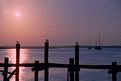
Danny - I just love this photograph - very nice! I'm from Jax and it really captures our city. Thanks
|
| Photo By: Danny Provost
(K:812)
|
|
|
Critique By:
Mark Peterson (K:3452)
11/9/2002 2:44:08 AM
Danny, this is a great shot! I really like night photos and this double exposure looks right to me. I think it would look great with the moon larger instead of smaller. Anyway you do it, I think you really know what you're doing.
Mark
|
| Photo By: Danny Provost
(K:812)
|
|
|
Critique By:
Debbie Groff (K:9569)
11/3/2002 2:56:51 AM
I agree with Russell in that you have a way with colors Cool colorful 'bed' for a 'bug' Cool colorful 'bed' for a 'bug'
|
| Photo By: Danny Provost
(K:812)
|
|
|
Critique By:
Kame Kame (K:92)
10/30/2002 12:34:46 PM
Wow. I love the blurry yellow and purple background behind the flower. Where did that purple color come from? What a great photo!
|
| Photo By: Danny Provost
(K:812)
|
|