|
|
Critique By:
Marek Krol (K:9791)
6/17/2004 4:17:35 PM
Backlit grasses always look stunning ( a view I always love), interesting here that you kept detail from the non-sunny side rather than normal silhouettes. Works well though. Could have kept a little more of the closest to camera one though. BTW looks like you are definately enjoying that Tamron.
|
| Photo By: Felipe Rodríguez
(K:9200)
|
|
|
Critique By:
Marek Krol (K:9791)
6/17/2004 6:28:15 AM
fire one! load torpedo, fire t... 
|
| Photo By: Felipe Rodríguez
(K:9200)
|
|
|
Critique By:
Marek Krol (K:9791)
6/16/2004 9:34:57 AM
Pieknie kolory przechodza z czerwieni na fiolet, tak stopniowo ze nie widac zmian. Symetryczna ramka drzew daje punkt zaczepki (zdjecia samego nieba nie zaleznie od chmur / swiatla sa malo ciekawe).
Mgla = wschod? Co tak rano ostatnio wstajesz? 
Co do moich. Zdjecie z Montmart jest raczej rowne - dziwne rzeczy sie dzieja z perspektywa przy 15mm A Kampinos - no coz najpiekniejsze rzeczy w zyciu sa zazwyczjaj jedynie mignieciem oka.
|
| Photo By: Monika Szymanska
(K:719)
|
|
|
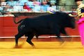
Critique By:
Marek Krol (K:9791)
6/14/2004 11:01:53 PM
The energy in the blur is fantastic espectially the prancing front hooves. However I'd shift the composition right - remove space behind the bull and give him room to move into the matador. Having the matador 'pushed up' against the wall half works but something in the balance is missing. Also, was the cape that color or did a channel blow out? The pink is a real distraction - I also noted some reds turning that color in a few other recent images.
|
| Photo By: Felipe Rodríguez
(K:9200)
|
|
|
Critique By:
Marek Krol (K:9791)
6/13/2004 8:13:44 PM
Technically its uninteresting - blown out whites on the van and flat midday light. Unfortunately emoptionally (for me) there is nothing there either  If so much is changing in your area why don't you show us a shot with contrasting before and after views - the effect of the development on what you consider 'normal' around there. If so much is changing in your area why don't you show us a shot with contrasting before and after views - the effect of the development on what you consider 'normal' around there.
|
| Photo By: Gabrielle Willson
(K:7978)
|
|
|
Critique By:
Marek Krol (K:9791)
6/13/2004 8:11:57 PM
If the mans expression was a little more mysterious then it'd look like illegal dealings in matchbox cars, as it is I'm perplexed as to what's going on!
|
| Photo By: Oliver Dienst
(K:452)
|
|
|
Critique By:
Marek Krol (K:9791)
6/10/2004 10:00:59 PM
I think you missed it with this one. Looks like the red channel has blown out leaving almost no detail in the petals (unless you've done that intentionally - can't really tell if its blur or not). I do like the stairstep composition, however the left most poppy is obscured by some grass.
|
| Photo By: Felipe Rodríguez
(K:9200)
|
|
|
Critique By:
Marek Krol (K:9791)
6/10/2004 4:35:03 PM
Fajna tonacja kolorow ale wszystko sie troche zlewa w jedna plaszczyzne z braku tonacji swiatla. Ciekawie sie zlozyly te dwie biale linie ktore lacza sie w srodku utwarzajac trojkat.
|
| Photo By: Monika Szymanska
(K:719)
|
|
|
Critique By:
Marek Krol (K:9791)
6/8/2004 10:24:43 PM
moze troche za duzo na jednym kadrze? mam lekki oczoplas patrzac na to - ale powinienem sie przyznac ze nie lubie efektow takich filtrow. sama 'miekka' woda i jeden bouy z mocnym obwodem mogly fajnie zagrac - nie probowalas tego przez przypadek?
|
| Photo By: Monika Szymanska
(K:719)
|
|
|
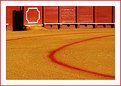
Critique By:
Marek Krol (K:9791)
6/8/2004 10:20:44 PM
just a detail of an arena - yet so abstract
|
| Photo By: Felipe Rodríguez
(K:9200)
|
|
|
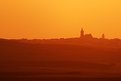
Critique By:
Marek Krol (K:9791)
6/8/2004 10:20:19 PM
scorched earth under the spanish sun. beautiful in its power Felipe. The way the tonation progresses frtom the darkes foreground to the sky allows you to break the rule of thirds vertically - though the church gives strong horizontal direction. Love the details in teh haze too )
|
| Photo By: Felipe Rodríguez
(K:9200)
|
|
|
Critique By:
Marek Krol (K:9791)
6/8/2004 10:18:55 PM
I wlasnie dlatego kochamy wiosne
Podoba mi sie ze uzywasz wielokrotne plany tutaj w ropznych poziomach ostrosci aczkolwiek pierwszego rozmazanego jest troche za malo (niezdecydowana ilosc w kadrze - po prostu troche zaslania drugi plan). Biale kwiatki sa bardzo mocne w ujeciu, ale jak dla mnie troche za centrralnie w kadrze - jakkiekolwiek inne mogly by tam byc ale biel zbyt jasna na to.
|
| Photo By: Monika Szymanska
(K:719)
|
|
|
Critique By:
Marek Krol (K:9791)
6/8/2004 10:16:04 PM
I never tire of these (though personally cannot match your false colors - maybe not this one though) regardless of what I do. Looks like your were fighting dynamic range here, also the specks ion the water are a little distracting.
|
| Photo By: Felipe Rodríguez
(K:9200)
|
|
|
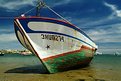
Critique By:
Marek Krol (K:9791)
6/8/2004 10:15:11 PM
Classic perspective Felipe. Though once you've seen a million of these the next one really needs to stand out. But here there are a few tjhings that bother me - the metal structure at top is cropped, line coming off the bow and the boat looks strangely 'stubby' (short) due to the anghle in relation to the camera. Maybe crop down for this perspective? Or shoot more from teh side to lengthen the boat
|
| Photo By: Felipe Rodríguez
(K:9200)
|
|
|
Critique By:
Marek Krol (K:9791)
5/18/2004 7:39:40 PM
piekny klimat z ta mglista ziemia. mozna by pomodz troche naturze podswietlic trawe i przyciac troche pierwszy plan (jest 50:50 niebo:ziemia a mysle ze inny balans by lepiej pasowal).
|
| Photo By: Monika Szymanska
(K:719)
|
|
|
Critique By:
Marek Krol (K:9791)
4/7/2004 2:31:05 PM
I do always think of that other 'religious' group from the US when I see these hoods. But great humor with the many arrows
|
| Photo By: Felipe Rodríguez
(K:9200)
|
|
|
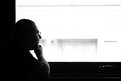
Critique By:
Marek Krol (K:9791)
3/17/2004 10:19:03 AM
Such a great lack of detail here, just the two tonal areas and the pensive face. Really focuses the viewer down. I'd burn out the little handle under teh window sill though.
BTW Self timer or cable release? You don't do many of these, I remember the two Felipes arguing shot loved that one.
|
| Photo By: Felipe Rodríguez
(K:9200)
|
|
|
Critique By:
Marek Krol (K:9791)
3/14/2004 2:53:14 PM
Two things strike me here, the scale of the person compared to the balloon. and the beautiful expanding spiral the yellow line makes.combined to make a great abstract.
|
| Photo By: Ari O
(K:990)
|
|
|
Critique By:
Marek Krol (K:9791)
3/14/2004 2:47:26 PM
what a defening crescendo of notes. splendid.
|
| Photo By: viktor nau
(K:175)
|
|
|
Critique By:
Marek Krol (K:9791)
3/14/2004 2:43:30 PM
Great action shot with a cool perspective (in difficult circumstances I might add! (would NOT trust myself to take pics while ice skating). Did you do something to the saturation of the sky? the colors seem oversaturated and overdone in the top half...
|
| Photo By: Stefan Sahlander
(K:117)
|
|
|
Critique By:
Marek Krol (K:9791)
3/14/2004 2:30:09 PM
I think your comparison between masages and orgasms isn't too far off but I don't see either captured in your shot. It misses on the sensuality and intensity of either.
|
| Photo By: photoandlight .com
(K:1362)
|
|
|
Critique By:
Marek Krol (K:9791)
3/14/2004 2:28:11 PM
Great tonality. However I don't like the way the roof of the pagoda lines up with the tree trunk. It doesn't seem to have been your intention here to show some sort of man-nature symbiosis so I can only judge it as one of those thigns that creeps in to a frame unexpectedly because we don't pay enough attention at the edges. If possible, moving out further right would have remedied the compositional issues.
|
| Photo By: Dmitry Pushilov
(K:214)
|
|
|
Critique By:
Marek Krol (K:9791)
3/14/2004 2:24:12 PM
When I first looked at this it screamed poor portrait with no though abouyt setting up studio conditions at home. But the more I look the more I like the idea (what Im seeing anyway). A businessman/office worker dressed in the usual serious looking grey suit, but surrounded by what he really is (comic book. colorful cushions, music), made to metamorphose every morning to meet social expectation. No idea if you intended that but thanks for showing it to me anyway
|
| Photo By: Denzil Jayasinghe
(K:704)
|
|
|
Critique By:
Marek Krol (K:9791)
3/14/2004 2:19:30 PM
it seems a bit grey and underexposed for something that needs to be bright and vibrant - I'd tweak the curves a little.
|
| Photo By: fokstrot .
(K:6560)
|
|
|
Critique By:
Marek Krol (K:9791)
3/8/2004 1:13:11 PM
safe but at what price? Look at all those bars. Love this one, its both quite clever and can be read into at a different level.
|
| Photo By: Scott Wilson
(K:23)
|
|
|
Critique By:
Marek Krol (K:9791)
3/8/2004 1:10:54 PM
looks like his horse ran out of gas
|
| Photo By: Ursula I Abresch
(K:6515)
|
|
|
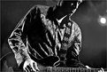
Critique By:
Marek Krol (K:9791)
3/8/2004 1:03:03 PM
Terrible!!! I can't believe people still wear shirts that terrible
Jokes aside, this is a good stage shot. Just enough of the face to show that the musician is into it, without taking away from the music in his guitar and hands. The blown out stage light in the background is a distraction thjough, I'd consider burning / cloning it out. Cropping won't work as you lose his hand.
|
| Photo By: Adrian Nitu
(K:238)
|
|
|
Critique By:
Marek Krol (K:9791)
3/8/2004 12:58:54 PM
widac ze prawdziwa radosc wcale nie zalezy od kasy. Mozna bylo troche ciasniej wykadrowac tutaj, bardziej zdjecie by bylo skupione na wyrazie twarze i historii na niej wypisanej.
|
| Photo By: Pawel Karpienko
(K:-17)
|
|
|
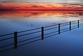
Critique By:
Marek Krol (K:9791)
3/8/2004 12:39:27 PM
this is better than yesterdays Felipe - same beautiful colors and creamy texture but with the addition of a line for my eyes to follow across the scene. The sharpness fo the fence contrasts it nicely too.
|
| Photo By: Felipe Rodríguez
(K:9200)
|
|
|
Critique By:
Marek Krol (K:9791)
3/7/2004 3:15:21 PM
I concur with Tuenis, stunning b&w
|
| Photo By: Milo Hess
(K:220)
|
|