|
|
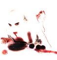
Critique By:
Scott McFadden (K:5663)
12/29/2002 4:14:49 AM
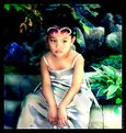
jonelle
There are many great ideas out there yours is one
For me I'd have left the brush b+w or partially coloured.
also I'd get rid of some white to the left of subject.
Great shot though and it kinda looks like a shot you would expect to find on a tutorial about digital.
|
| Photo By: Jonelle Cetin
(K:116)
|
|
|
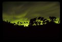
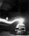
Critique By:
Scott McFadden (K:5663)
12/29/2002 4:08:54 AM
Hi James
The effects that you seem to have used meld quite well
and the tonal range although dark is resonable.
My problem with this is the stick seems to be running right down the middle of your shot.
maybe you could try a diffrent angle but use the same effects as the combo works with the subject.
|
| Photo By: James O'Donnell
(K:28)
|
|
|
Critique By:
Scott McFadden (K:5663)
12/1/2002 8:34:40 PM
Very Eye Catching Shot.
I like the background choice and the double exposure comes out brillianty.
There are some things I would like comment on
the top sneaker needs a tiny bit more light on the left hand side and if you could seperate these two by way of unseen glass or something there could be a little seperation of the two shoes.
I like it..Ilikeit a lot
|
| Photo By: Greg Suvino
(K:57)
|
|
|
Critique By:
Scott McFadden (K:5663)
11/23/2002 5:21:40 AM
Very Nice touch
this has been done so well , you seem to have given the background just enough to empthasize the subject.
Great choice of toning and that leaf seems to help.
Although some of your laces appear to be burning out.
on another note:
Just a tip for future use in regard to the light size:
using cardboard create a funnel to channel the light into a tight point this will enable better apertures for use.
|
| Photo By: piper lehman
(K:256)
|
|
|
Critique By:
Scott McFadden (K:5663)
11/14/2002 2:32:14 AM
I agree with you about the effect.
and I think you should try to crop some of the black out
and I have to ask :
was that really a lime sky in the first place ?
|
| Photo By: Quinn Koeniges
(K:109)
|
|
|
Critique By:
Scott McFadden (K:5663)
11/14/2002 2:24:56 AM
My first thought Whoa.
the impact you've made is remarkable.
I can spot one thing I'd prefer diffrent
like the burn out of the sky area.
|
| Photo By: Brian osullivan
(K:2)
|
|
|
Critique By:
Scott McFadden (K:5663)
11/14/2002 2:07:28 AM
Howard ,
I like the general composition of this shot.
The colour seems to blend well and I like the placement of the black horse.
im not sure but maybe the color needs a little saturation
but then its proably just my monitor
|
Photo By: Howard M. Parsons
(K:3496)

|
|
|
Critique By:
Scott McFadden (K:5663)
11/14/2002 1:54:55 AM
Jean ,
I really like how you laid out the models hair on this pic
and the placement of your disk it seems interesting.
personally I'd prefer to see the models face.
and the arm seems a little burnt out.
|
| Photo By: Jean-François Dupuis
(K:70)
|
|
|
Critique By:
Scott McFadden (K:5663)
10/15/2002 5:50:16 AM
Great effect donald ,
The sepia toning really adds to this shot as does the grain.
It is almost ok but i just cant help but feel your pain about the big arse fence in the way.
Maybe you could get a ladder...?
|
| Photo By: Donald Holman
(K:884)
|
|
|
Critique By:
Scott McFadden (K:5663)
8/11/2002 6:18:39 PM
I really enjoy this shot.
Kind of resembles a phenix and seems to go well in the colours provided.
The only nit pick is the little wash of white in your lower left corner.
|
| Photo By: Pete Kinser
(K:106)
|
|
|
Critique By:
Scott McFadden (K:5663)
5/3/2002 3:12:38 AM
Great work
looks really nasty too, way to show up all the digtal hoha.
seems that anything they can do you can do too.
My only gripe about the image is that the head isnt outlined slightly so letting it bleed into background...but you probably wanted it to bleed so It really works.
|
| Photo By: dimitris theocharis
(K:-276)
|
|
|
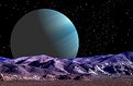
Critique By:
Scott McFadden (K:5663)
4/22/2002 1:21:13 AM
Hi Frank.
I really like your space photos and would like to know...
what is that zoom you use ?
or better yet what would I need if I wanted to photograph the planets ect ?
|
| Photo By: Frank Hettick
(K:119)
|
|
|
Critique By:
Scott McFadden (K:5663)
4/16/2002 4:00:40 AM
I really like the sharp detail here.
How did you manage the Depth here ?
Great Pic love the bee but where's it wings ?
|
| Photo By: R Pires
(K:445)
|
|
|
Critique By:
Scott McFadden (K:5663)
4/16/2002 3:47:07 AM
Very unusual angle and its got its charms.
just didnt quite get enough depth of field.
Youve subdued the colors nicely although
the pillow at the face obscures a bit too much.
Did I mention the angle is good ?
|
| Photo By: Vincent Paul Toscano
(K:78)
|
|
|
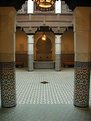
Critique By:
Scott McFadden (K:5663)
4/12/2002 6:55:43 AM
I had to have a closer look
The backdrop you see its amazing and it doesn't distract from the main subject at all.
seems to be a seperate photo although hard to tell
your subject is good with the exception of that nasty jumper which I must say jumps at me every time I want to admire this pic. I think its the stark white with triangle patterns that does it.
maybe you could paint the white jumper bits brown ?
neat image great backdrop.
|
| Photo By: Tim Downs
(K:0)
|
|
|
Critique By:
Scott McFadden (K:5663)
4/6/2002 4:30:30 PM
Hi Phil
This is why I hate no overide options.
the images are out of focuss because the damn cameras intenal focuss circut tries to refocus as things move
even when taking a shot!
they also focuss on the thing closest to the camera in the middle( as I found out after stalking a bush turkey and getting a focussed blade of grass and out of focuss turkey)
The other problem is bluring from wind which has moved the leaves and made the entire image out of focuss.
|
| Photo By: Philip
(K:0)
|
|
|
Critique By:
Scott McFadden (K:5663)
4/6/2002 4:50:36 AM
Hi congratulations on your baby.
Unfortunately your image seems to have a lot of distortion from use of a wide angle lens.
I suggest next time you try it would be a good idea to put
your baby near a window and use a longer focal length lens.
this should reduce the problem.
also try moving the camera level with center of interest to get sharpness where you need it. + get your partner to wear white and stand to reflect the light back.(as a human reflector but just dont let em in on the secret.)
hope this helps. 
|
| Photo By: Samuel Downs
(K:7290)
|
|
|
Critique By:
Scott McFadden (K:5663)
4/5/2002 3:51:17 AM
Good choice in toning.
But your shovels are in need of more light.
maybe they should be the other way up.
nice and sharp but needs detail in the shadow.
|
| Photo By: Melissa Mullins
(K:0)
|
|
|
Critique By:
Scott McFadden (K:5663)
4/5/2002 3:31:37 AM
Facinating yet really morbid.
looks sharp and has a lot of grit.
the only thing is if you hadnt have told me it was a deer
Id have never have known.
seems to lack a centre of interest.
|
| Photo By: Lisa Brainard
(K:743)
|
|
|
Critique By:
Scott McFadden (K:5663)
4/2/2002 4:29:09 AM
Can I start your fan club ?
Good image better idea.
I would have prefered a touch more sky.
|
| Photo By: Charles Morris
(K:5969)
|
|
|
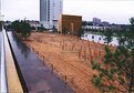
Critique By:
Scott McFadden (K:5663)
4/2/2002 4:25:26 AM
This could be a great shot
just cut off the top and whola.
Your words are inspiring and the detail is absoulute.
The message is clear the photo also has the potential.
Great to see that someone is using photography in a way thats more than just art.
Keep up the efforts.
|
| Photo By: Charles Morris
(K:5969)
|
|
|
Critique By:
Scott McFadden (K:5663)
3/24/2002 3:54:48 AM
I really Like this shot the colors you changed have given this photo a very charming aspect.
although the purple above the glasses is a little distracting.
|
| Photo By: ws b
(K:62)
|
|
|
Critique By:
Scott McFadden (K:5663)
3/22/2002 7:37:26 AM
The seperation of tones is well controlled and subtle.
Which makes an extra impact with the subject.
My personal view is that the subject is a little small and the annoying three dots that appear to be a small view of a black paw at the left of the cat or not ?
|
| Photo By: Andy Graham
(K:38)
|
|
|
Critique By:
Scott McFadden (K:5663)
3/3/2002 4:22:57 AM
I Like this shot
very simple yet quite appealing.
one shot ive seen with light trails uses a circular pattern
ever thought about giving it another go and getting a halo effect ?
|
| Photo By: Daniel Gies
(K:39)
|
|
|
Critique By:
Scott McFadden (K:5663)
3/3/2002 4:05:02 AM
Nice and big moose you got there
the placement of the background is exceptional as is the use of the frame.
I would however have loved to see what fillin flash and the slightly faster shutter speed would have done to this pic.
....i'd have probably bought a copy
great photo.
|
| Photo By: CJ McKendry
(K:1388)
|
|
|
Critique By:
Scott McFadden (K:5663)
3/1/2002 2:48:36 AM
Excellent timing with the shot.
made me laugh a little too.
love the positioning in the photo just a pity about the lamp in the background.
|
| Photo By: Jason Frey
(K:6)
|
|
|
Critique By:
Scott McFadden (K:5663)
2/25/2002 2:42:10 AM
Inspiring shot.
The way you framed the cannon with the sun burst is truly remarkable makes it all blend so nicely.
almost has a peaceful feeling to it all.
on the other side i wonder what this shot would have looked in verticle format ?
|
| Photo By: Kostas Kyriacopoulos
(K:42)
|
|
|
Critique By:
Scott McFadden (K:5663)
2/4/2002 2:37:13 AM
Nice Shot sharp and clear - well done
I wonder did you use color b&w film ,color or tint a black and white print ?
|
| Photo By: Tony Smallman
(K:23858)
|
|
|
Critique By:
Scott McFadden (K:5663)
1/25/2002 4:00:36 AM
Great Detail and nicely presented.
Which poem do you feel it matches with ?
I like the Crisp apperance and the symetry.
works well.
|
| Photo By: Kirkland Anderson
(K:75)
|
|