|
|
Critique By:
Herman Pieters (K:508)
4/16/2006 9:26:47 PM
good work, very impressive model and lighting!
|
| Photo By: Tom Gdalski
(K:24)
|
|
|
Critique By:
Herman Pieters (K:508)
4/9/2006 7:54:11 AM
nice work, great colors and exposure
|
| Photo By: Scott Tylor
(K:407)
|
|
|
Critique By:
Herman Pieters (K:508)
4/7/2006 7:37:02 PM
would make a nice postcard
|
| Photo By: martijn wams
(K:6351)
|
|
|
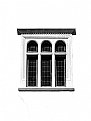
Critique By:
Herman Pieters (K:508)
4/7/2006 7:36:44 PM
nice frame and composition
|
| Photo By: martijn wams
(K:6351)
|
|
|
Critique By:
Herman Pieters (K:508)
4/7/2006 7:35:12 PM
ooh nice, with the rain and stuff, don't like the frame tho and would have possible taken a lower angle, check out my cows on my portfolio, they nice crop too
|
| Photo By: martijn wams
(K:6351)
|
|
|
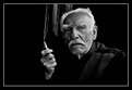
Critique By:
Herman Pieters (K:508)
4/7/2006 7:33:49 PM
like the crop and the features of the face, very cool
|
| Photo By: martijn wams
(K:6351)
|
|
|
Critique By:
Herman Pieters (K:508)
4/7/2006 7:32:41 PM
wa wa wee wa, great image, love the smoke
|
| Photo By: martijn wams
(K:6351)
|
|
|
Critique By:
Herman Pieters (K:508)
3/24/2006 12:35:36 PM
let me think..
no
|
| Photo By: Hugo de Wolf
(K:185110)
|
|
|
Critique By:
Herman Pieters (K:508)
3/24/2006 10:03:18 AM
Nice, not great, just nice, I don't understand how they can rate this a photo of the day tho, nothing that special about it.
|
| Photo By: Hugo de Wolf
(K:185110)
|
|
|
Critique By:
Herman Pieters (K:508)
3/12/2006 7:16:48 PM
wow, everything here works, this is absolutely stunning work, you are very good indeed!
|
| Photo By: Harry Eggens
(K:14804)
|
|
|
Critique By:
Herman Pieters (K:508)
3/12/2006 6:09:29 PM
oh my word, this is beautiful, wish we had bears! and snow!
bye
|
| Photo By: Harry Eggens
(K:14804)
|
|
|
Critique By:
Herman Pieters (K:508)
3/12/2006 6:07:03 PM
bad photoshop job
|
| Photo By: Claudio Mejias
(K:4278)
|
|
|
Critique By:
Herman Pieters (K:508)
3/12/2006 6:58:08 AM
great tones and good crop...like the perspective also, basically you got yourself a very good shot there!
|
| Photo By: Tina baker
(K:870)
|
|
|
Critique By:
Herman Pieters (K:508)
3/11/2006 7:39:25 PM
wow, this is really a piece of art! great work !!!
|
| Photo By: Kiarang Alaei
(K:49415)
|
|
|
Critique By:
Herman Pieters (K:508)
3/11/2006 5:18:31 PM
detail is magnificent, wish i had a f 2.8 lenz!
|
| Photo By: Karadag Metin
(K:2939)
|
|
|
Critique By:
Herman Pieters (K:508)
3/11/2006 5:18:29 PM
stunnig photograph!!!
|
| Photo By: Karadag Metin
(K:2939)
|
|
|
Critique By:
Herman Pieters (K:508)
3/11/2006 5:18:22 PM
woweee
great work
|
| Photo By: canses
(K:1048)
|
|
|
Critique By:
Herman Pieters (K:508)
3/11/2006 5:14:40 PM
nice ps work and end result is fab1
|
| Photo By: canses
(K:1048)
|
|
|
Critique By:
Herman Pieters (K:508)
3/11/2006 5:13:59 PM
nice work shadow against wall just about makes it perfect.
|
| Photo By: canses
(K:1048)
|
|
|
Critique By:
Herman Pieters (K:508)
3/11/2006 4:50:56 PM
ooh i like, nice colors!
|
| Photo By: Mihai Ragea
(K:762)
|
|
|
Critique By:
Herman Pieters (K:508)
3/11/2006 4:47:51 PM
Ooh I like, but rather a squary crop for this cos u don't really need the white space at the top and the bottom, as u prefer....
|
| Photo By: Mihai Ragea
(K:762)
|
|
|
Critique By:
Herman Pieters (K:508)
3/11/2006 4:42:58 PM
thanks hey, you got a great portfolio..!
|
| Photo By: Herman Pieters
(K:508)
|
|
|
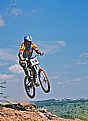
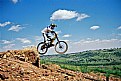
Critique By:
Herman Pieters (K:508)
3/11/2006 4:38:48 PM
would say too much space at the top, you've already got breathing spcae for the biker on his right, which is perfect cos you want the photo to illustrate that the biker is going in that direction
*more contrast..
I know there isn't usually enough time to get the perfect composition, but you can always crop it afterwards
cheers Herman
|
| Photo By: Diane Logie
(K:809)
|
|
|
Critique By:
Herman Pieters (K:508)
3/11/2006 4:33:39 PM
don't like this at all
cheers
|
| Photo By: Diane Logie
(K:809)
|
|
|
Critique By:
Herman Pieters (K:508)
3/11/2006 4:33:26 PM
ja no this is a bit over the top
cheers
Herman
|
| Photo By: Diane Logie
(K:809)
|
|
|
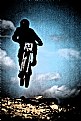
Critique By:
Herman Pieters (K:508)
3/11/2006 4:29:45 PM
very cool action shot, well done!
cheers Herman
|
| Photo By: Diane Logie
(K:809)
|
|
|
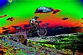
Critique By:
Herman Pieters (K:508)
3/11/2006 4:28:19 PM
nice effect
Herman
|
| Photo By: Diane Logie
(K:809)
|
|
|
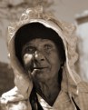
Critique By:
Herman Pieters (K:508)
3/11/2006 4:26:37 PM
very cool photo hey, like the highlights on the face, ads more life to what it has already, unfortunately i can see that you basically deep edged the namaqualander and blurred the background, which I wouldn't suggest...i would have liked to see where she is standing, what the background was, is it a house?where she stays? or is it at a café?
cheerio
Herman
|
| Photo By: Diane Logie
(K:809)
|
|
|
Critique By:
Herman Pieters (K:508)
3/11/2006 4:17:57 PM
I think that you save the images at a too low quality that is why it displays bad on here, i've seen this as you know, and it looks much better in real life...
cheers, Herman
|
| Photo By: Diane Logie
(K:809)
|
|
|
Critique By:
Herman Pieters (K:508)
3/11/2006 4:12:19 PM
Nice idea, would've liked more DOF, that's probably why the photo overall looks semi out of focus..
cheers
Herman
|
| Photo By: Diane Logie
(K:809)
|
|