|
|
Critique By:
Gary Gantert (K:2104)
7/25/2005 3:39:09 PM
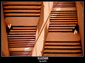
Nice light. The side light really gives shape to the domes.
I like the composition. The black line is interesting.
I think you need something there.
|
| Photo By: mosti Farahat
(K:696)
|
|
|
Critique By:
Gary Gantert (K:2104)
7/18/2005 5:14:18 PM
I see death... and beauty.
|
| Photo By: sandy c. hopkins
(K:17107)
|
|
|
Critique By:
Gary Gantert (K:2104)
7/7/2005 8:47:08 PM
I like this alot.
A good fusion of photographer and painter.
Great colors.
|
| Photo By: Zelda Zabrinsky
(K:3036)
|
|
|
Critique By:
Gary Gantert (K:2104)
6/30/2005 6:12:15 PM
Nice composition, very graphic.
|
| Photo By: Jocelyn Fong
(K:1380)
|
|
|
Critique By:
Gary Gantert (K:2104)
6/30/2005 5:42:01 PM
Beautiful day to shoot.
The sky looks perfect. It really adds alot to the shot.
|
| Photo By: Jim Greenfield
(K:5172)
|
|
|
Critique By:
Gary Gantert (K:2104)
6/30/2005 2:51:03 PM
very well done
|
| Photo By: Tamara N
(K:2617)
|
|
|
Critique By:
Gary Gantert (K:2104)
6/28/2005 6:39:22 PM
The composition is sensual.
|
| Photo By: Michael Kanemoto
(K:22115)
|
|
|
Critique By:
Gary Gantert (K:2104)
6/28/2005 5:29:42 PM
Great Shot.
I wonder what would happen if you put some things in the vase/bowl? Maybe some flowers or marbles or liquid.
This could be a fun series.
|
| Photo By: Michael Kanemoto
(K:22115)
|
|
|
Critique By:
Gary Gantert (K:2104)
6/16/2005 5:19:52 PM
Nice translucency
I use PS to blur my edges.
|
| Photo By: Gaja Snover
(K:4462)
|
|
|
Critique By:
Gary Gantert (K:2104)
6/15/2005 7:51:11 PM
Post modern.
graphic
nice sky.
I might burn the lower corners just a bit
|
| Photo By: Guido Fulgenzi
(K:6076)
|
|
|
Critique By:
Gary Gantert (K:2104)
6/15/2005 7:03:34 PM
Great use of complimentary colors.
The contrast with the background makes the petals jump off the screen.
The sidelighting brings out great texture.
|
| Photo By: Humayun Rizwan
(K:3235)
|
|
|
Critique By:
Gary Gantert (K:2104)
6/15/2005 6:32:16 PM
Beautiful Sky.
Good composition, I even like the person silhouetted.
It gives scale and balances the ship. Keeps your eye from leaving the image.
|
| Photo By: Ricardo Villafuerte
(K:1345)
|
|
|
Critique By:
Gary Gantert (K:2104)
6/15/2005 6:15:46 PM
I was wondering if it was projection or photoshop.
Well done. This is my favorite of the series though they are all nice. Great concept.
|
| Photo By: Marco Arzilli
(K:931)
|
|
|
Critique By:
Gary Gantert (K:2104)
6/15/2005 6:11:08 PM
My family loves renaissance faires.
Nice composition. I like all the triangles in the background.
|
| Photo By: Fabrizio Fiorucci
(K:4871)
|
|
|
Critique By:
Gary Gantert (K:2104)
6/13/2005 2:45:41 PM
Excellent use of contrasting colors.
Very graphic composition.
The sun couldn't be at a better place.
This looks like a 'caught' shot.
I would go back with a model at the same time of day and do a series.
My only critique is the tangent formed by wall and arm.
I would also burn the corners in photoshop.
|
| Photo By: frédéric SALVERT
(K:1020)
|
|
|
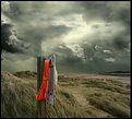
Critique By:
Gary Gantert (K:2104)
5/21/2005 1:03:45 AM
I really like this one.
The juxtaposition of the white dot (lighthouse?)in the background and the white shape on the front of the board (life preserver) is exquisit.
The orange cord is such a strong element.
Showing just enough information to tell a story.
|
Photo By: KEVIN TEMPLE
(K:8657)

|
|
|
Critique By:
Gary Gantert (K:2104)
5/20/2005 9:14:39 PM
Compositionally there is something here.
But it could be cropped much tighter.
The lighting is flat.
|
| Photo By: Ethan .
(K:881)
|
|
|
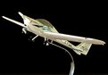
Critique By:
Gary Gantert (K:2104)
4/22/2005 2:48:56 PM
Dynamic angle.
Nice light on the plane, shows all the detail and lettering.
I personally have a problem with black backgrounds.
They seem so dead.
The tires also get lost which is a shame because they look like they would be nice and shiny.
Even a simple glow in the background to seperate the subject and add depth to the image would enhance the photo.
|
| Photo By: Dave Stacey
(K:150877)
|
|
|
Critique By:
Gary Gantert (K:2104)
4/21/2005 2:26:05 PM
Great tonal range.
The composition is wonderful.
|
| Photo By: Tony Smallman
(K:23858)
|
|
|
Critique By:
Gary Gantert (K:2104)
4/19/2005 2:29:59 PM
Nicely done.
Man if you like PS6 you have to get PS8 or CS as they call it.
I'm not one to rave or give product indorsements but it is really worth the upgrade.
|
| Photo By: Mitchell Miller
(K:3009)
|
|
|
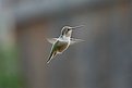
Critique By:
Gary Gantert (K:2104)
4/14/2005 2:58:47 PM
Very cool.
You could even strip the hummingbird out and insert in any background.
|
| Photo By: Rich Swanner
(K:-3732)
|
|
|
Critique By:
Gary Gantert (K:2104)
4/14/2005 2:57:04 PM
Very much like M.C. Escher.
Seemless.
|
| Photo By: mustafa ilker helvacioglu
(K:3825)
|
|
|
Critique By:
Gary Gantert (K:2104)
3/24/2005 5:53:16 PM
Great fog shot. I love the composition.
I like the muted blue and green boat covers.
The only thing I might play with in PS is desaturating the front green boat cover a little. Just dull it down some.
|
| Photo By: Faruk Tunca
(K:329)
|
|
|
Critique By:
Gary Gantert (K:2104)
3/24/2005 5:50:05 PM
Great shot. It's very intriguing.
|
| Photo By: Baris
(K:16)
|
|
|
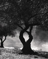
Critique By:
Gary Gantert (K:2104)
2/15/2005 9:03:35 PM
This reminds me of hieroglyphics or images carved in sandstone that the wind has worn.
|
| Photo By: Aris Michalopoulos / OsirisiS
(K:1916)
|
|
|
Critique By:
Gary Gantert (K:2104)
2/3/2005 5:58:40 PM
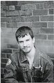
I like the shot.
Good detail, open light.
Why show so much brick wall?
If the subject is John crop in closer.
Here is a quick edit
|
| Photo By: Samantha Smead
(K:109)
|
|
|
Critique By:
Gary Gantert (K:2104)
2/3/2005 5:49:38 PM
looks like you would have a nice view from inside.
|
| Photo By: Mia
(K:188)
|
|
|
Critique By:
Gary Gantert (K:2104)
2/2/2005 9:16:10 PM
Beautiful light. You do very nice portraits.
I love my Fuji also. Do you shoot in the RAW setting?
I shoot my jobs in it but just shoot people in the .jpg.
I love this shot. Two small critiques.
I wish the bear was turned around so I could see its face. Also I'd like to see ithe shot with the fill light retouched out of the eyes.
I know this is very minor but to me it makes a shot seem more natural.
When I see the fill light in the eyes it screams studio.
I've added a quick edit.
|
| Photo By: Louise Vessey
(K:13862)
|
|
|
Critique By:
Gary Gantert (K:2104)
2/2/2005 8:30:12 PM
Good use of negative space
|
| Photo By: Patrick Ziegler
(K:21797)
|
|
|
Critique By:
Gary Gantert (K:2104)
12/30/2004 6:31:08 PM
Happy Ho Hos
|
| Photo By: Daniel Silva
(K:2512)
|
|