|
|
Critique By:
Scott McFadden (K:5663)
7/9/2004 9:16:19 AM
Great choice of framing.
I would prefer focus on the eyes though.
For a Cheats approch I'd think a good expression facial photo from the same angle would really make the frame sparkle.
|
| Photo By: ahmed refay
(K:665)
|
|
|
Critique By:
Scott McFadden (K:5663)
7/9/2004 9:01:37 AM
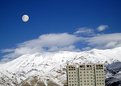
I always love night shots.
The problem of course is the best night shots are not really taken at night.
Light is never balanced enough see.
better to take at just after sunset.
Anothter way is to add more light with handheld flash in several spots but this is difficult and a pain in the butt.
there seems to be two interesting things going on here a vertical panoramma and a horizontal people shot.
the trees are too dark though.
|
| Photo By: Michael Holm
(K:7931)
|
|
|
Critique By:
Scott McFadden (K:5663)
7/9/2004 8:45:01 AM
Love the title.
Good Image of a difficult subject.
|
| Photo By: Hassan Ahmed
(K:2995)
|
|
|
Critique By:
Scott McFadden (K:5663)
6/13/2004 7:14:45 AM
Good border choice combined with a great
partial coloring using a strong color.
the red really helps balance the image.
Interesting use of composition.
I would appreciate it better if the arm didnt dissappear partway.
|
| Photo By: Jessica Jang
(K:233)
|
|
|
Critique By:
Scott McFadden (K:5663)
6/13/2004 7:06:03 AM
Good story here.
Love the placement of the balloon just at the edge of frame.
The limited use of color variation really helps the child jump out of the clutter.
a very light trim accross the top may increase this impact by removing the extra color that draws undue attention from the child.
|
| Photo By: Paul Bear
(K:6)
|
|
|
Critique By:
Scott McFadden (K:5663)
5/1/2004 8:23:24 AM
Interesting concept.
Great color choices.
My problem is that the hand gets lost a bit into the background.
I see some sort of trail though I feel its too subtle.
An image worth perfecting but not there yet.
|
| Photo By: Stephen Rogers
(K:43)
|
|
|
Critique By:
Scott McFadden (K:5663)
5/1/2004 8:09:26 AM
hey joseph ,
This would work as a panorama quite well.
I would also remove the partial car to give it the best punch .
|
| Photo By: Joseph Page
(K:0)
|
|
|
Critique By:
Scott McFadden (K:5663)
1/23/2004 10:57:32 PM
Be buggered if im staying at that hotel !
Nice image
|
| Photo By: Elahe S. Ahmadian
(K:8695)
|
|
|
Critique By:
Scott McFadden (K:5663)
1/23/2004 10:49:18 PM
Great clarity.
Better subject and good seperation.
One small perception problem I have with this stunning shot is the left ear.
Im guessing that a mask was used for it but its just not right.
of course if im wrong then the dof needed the whiskers on the ear to be sharper.
|
| Photo By: Bill Ciavarra
(K:10216)
|
|
|
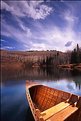
Critique By:
Scott McFadden (K:5663)
1/23/2004 10:33:58 PM
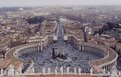
On the Bottom is a very good pano.
as is the top detracts from the images percieved sharpness.
very symetrical made worse by squarish format.
|
| Photo By: Sailesh R
(K:155)
|
|
|
Critique By:
Scott McFadden (K:5663)
1/23/2004 10:27:39 PM
Nicer in the thumbnail.
The chairs I feel are just half a touch too big in frame.
Lovely choice of merging wood and snow line.
|
Photo By: Dave Stacey
(K:150877)

|
|
|
Critique By:
Scott McFadden (K:5663)
11/18/2003 3:32:55 AM
controlling and shaping your light could really help here.
I Know easier said then done especially with natural light shots.
introducing more is always going to be easier
but then its the shaddows that matter in lighting so either way will work.
|
| Photo By: Bjorn Beheydt
(K:12096)
|
|
|
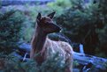
Critique By:
Scott McFadden (K:5663)
11/18/2003 3:15:06 AM
Looks better than some of my relies 
aside from that think of an animal as a person or people.
Using that as a rough guide will greatly enhance pictures
esp if you get on thier level and continue to focuss on the eyes if seen.
|
| Photo By: Bjorn Beheydt
(K:12096)
|
|
|
Critique By:
Scott McFadden (K:5663)
11/18/2003 3:08:02 AM
if you crop off to the left you'll get an intresting triangle.
Good subject matter and good sharpness is great to see.
|
| Photo By: Bjorn Beheydt
(K:12096)
|
|
|
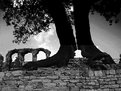
Critique By:
Scott McFadden (K:5663)
11/7/2003 2:02:39 AM
Love this shot.
Great foreground and good balance with the triangle created by the trees.
|
| Photo By: Bill Akata
(K:2929)
|
|
|
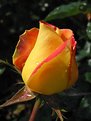
Critique By:
Scott McFadden (K:5663)
11/7/2003 1:57:39 AM
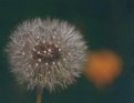
Love the drops of water on the bud.
Just gives it that little extra.
|
| Photo By: Bill Akata
(K:2929)
|
|
|
Critique By:
Scott McFadden (K:5663)
11/7/2003 1:52:20 AM
Strong work , my guess is the slide would look way better.
|
| Photo By: Bill Akata
(K:2929)
|
|
|
Critique By:
Scott McFadden (K:5663)
11/7/2003 1:39:51 AM
I like the diffrent lighting setout.
The problem is I feel the green thing on the left
is overpowering the shot
|
| Photo By: Bill Akata
(K:2929)
|
|
|
Critique By:
Scott McFadden (K:5663)
11/7/2003 1:35:45 AM
good subject and difficult to do.
not quite there due to contrast problems with the overly lit bldgs.
several exposure and join may fix or dodge while taking the two with a finger blocking for partway the burn outs.
good try.
|
| Photo By: Bill Akata
(K:2929)
|
|
|
Critique By:
Scott McFadden (K:5663)
11/7/2003 1:22:28 AM
Pretty contrasty light jt.
good choice of background and subject though.
|
| Photo By: Jeroen Wenting
(K:25317)
|
|
|
Critique By:
Scott McFadden (K:5663)
10/20/2003 3:18:10 AM
Sand in the hand is there ?
Its just too hard to tell...selective toning may well help.
I dislike the grain but then thats what you get with 800 iso.
Great Dodging for the vignette.but if you want the effect faster simply make two prints one slightly smaller than the other and cut out the desired parts of the photo then place onto glass above the space for the second paper then expose.
on a special note to double expose in a enlarger this method also works.as do cokin filters in a meopta but thats another story.
|
| Photo By: Lexie Summers
(K:2027)
|
|
|
Critique By:
Scott McFadden (K:5663)
10/20/2003 2:01:38 AM
Sanyukta ,
Photoshop is popular because it makes use of a feature called layers.
To add the rectangle without putting it in a seperate layer just causes more work for later so since this may still be fresh in you would be best to use the feature duplicate layer in layers and show layers in the windows section.
Then simply click the box on the left most side with the eye in it and it will make that layer dissappear.its still there just hidden.
Next add the rectangle on the copyed layer.
then use the distort or liquefy tool to bend the rectangle.
then delete around the rectangle with the eraser and selection box with delete.
then click the box in the layers window to show the underneath layer again.
to make it wispy just turn the opacity slider down in the top layer to suit.
save as something in photoshop then flatten image then save as a jpeg.
that way if you need to come back to it you will find it easy to fix up.
|
| Photo By: Sanyukta Sharma
(K:269)
|
|
|
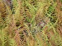
Critique By:
Scott McFadden (K:5663)
10/20/2003 1:46:55 AM
Hi Byron ,
I like the idea behind this shot and yet feel distant from this subject.
The problem is of course the weeds poking through
and the rocks that over power this image
despite their somewhat small part in this picture.
Also you seem a little hazy on the choice of aperture.
I feel you should make a choice have something completly fuzzed or everything tack sharp for myself there just isnt an inbetween so if you want to show texture - get it sharp by using a higher aperture like f8 or even f11 and mount the camera on something.
of course with enogh photoshop work you could make this photo salvageable but why bother spending two hours croping off the whole left side and the rock off the top cloning in an extra to remove the weed in the centre and solarizing via curves selectivly desaturating then sharpening just to get an image in the same time as it would take as a lesurly stroll to your local garden centre to take a fern shot just after sprinkling it with water.
hope this helps you understand that sometimes its more sense to take more than one shot/angle of something that sparks your interest especially since you only keep the best ones.
|
| Photo By: Byron Dillard
(K:6)
|
|
|
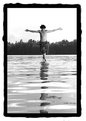
Critique By:
Scott McFadden (K:5663)
10/15/2003 5:17:37 AM
Great Start to a excellent image.
I would feel more if I saw some sort of eye.
like the saying goes the eye is the window to the soul.
|
| Photo By: Du Xin
(K:3)
|
|
|
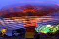
Critique By:
Scott McFadden (K:5663)
10/6/2003 3:24:02 AM
The ride to the right looks great.
Do you know the name of it ? if so please tell.
I'd really recommend you trie to reshoot 1 ride rather then two.
and let it be the one to the right if possible.
|
| Photo By: Mark Peterson
(K:3452)
|
|
|
Critique By:
Scott McFadden (K:5663)
10/6/2003 3:02:26 AM
Great Clarity.
seems like a toad evolving into a frog the swirling water helps this too
the light on its back is a little hot.
|
| Photo By: Mark Peterson
(K:3452)
|
|
|
Critique By:
Scott McFadden (K:5663)
10/6/2003 2:54:17 AM
There are always ways to get around a cheapie digital if you've some time to play.
Since you've bothered to suggest help for me heres some things I tried with my cheapie
before I upgraded ...
on board flash force fire can help if not got this option there will generally be a sensor located near the lens that looks like a little hole that you can block to force it to fire. slave cells attached to a cheap flash really add power to the onboard and is very directional. I got great results with one behind subject and onboard mixed.
turn the camera upside down !!! for great looking sunsets.try it worked for me.
A lot of these will allow use of tripod if you can use one if not tape the camera to one.
well I hope I've helped you get an extra wind.
|
| Photo By: Erdem Calisgan
(K:4050)
|
|
|
Critique By:
Scott McFadden (K:5663)
9/30/2003 3:02:47 AM
Great sharpness and exposure.
not that great a photo
especially with the tree growing out of the young ladies head (2nd on left).
good range of tones though.
|
| Photo By: Kevin Bjorke
(K:960)
|
|
|
Critique By:
Scott McFadden (K:5663)
9/30/2003 2:55:03 AM
Ted I was drawn to the pretty colours in the thumb like a moth
to flame and I too noticed burning but only in this print.
A great idea if you have access to places like this and the control over the light switch
would be to turn off the light part way through to reduce the burn out.
I think should you trie this again with that and use a selftimer to reduce mirror slap.
|
| Photo By: Ted D'Ottavio
(K:18)
|
|
|
Critique By:
Scott McFadden (K:5663)
9/20/2003 7:05:14 AM
Great composition and good posing have help this image.
The border you have choosen has helped this image
but has also been a double edged sword as it shows up
the lack of a pure black or anthing close really.
adjusting the brightness lower should assist in reducing the
obivious nature of this.
|
| Photo By: Tobiah Deutsch
(K:2432)
|
|