|
|
Critique By:
Gerhard Hoogterp (K:4863)
5/6/2006 11:34:17 PM
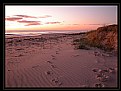
While I'm a big fan of negative space I still think that some composition should go with it too..Rule of thirds in this case. The image definitely has something, but it's offset by a feeling of unbalance.
|
| Photo By: delete my account
(K:3679)
|
|
|
Critique By:
Lori Stitt (K:75282)

6/4/2006 12:58:01 AM
Think I see one that's badly in need of a root canal.
LOL......great macro, I like this one also!
(again, got that 'teeth thing' going on though)
Power of suggestion is not always a good thing.
I like the jazzy presentation!
Good job,
Lori 
|
| Photo By: Dave Arnold
(K:55680)
|
|
|
Critique By:
John Loreaux (K:86210)
6/4/2006 3:42:25 AM
Excellent composition narabia!
I do like the long stems leading up to the beautiful delicate flowers so shyly turning away from the camera!
The dof and background could not be better! Very nice image!
CONGRATS on the DOD!!!
My best.............................John
7 !
|
| Photo By: narabia
(K:9563)
|
|
|
Critique By:
Olga-Eva Krajciova (K:19240)
6/4/2006 3:57:36 AM
this is excellent image and right now becomes my favourite one
full of emotion, great tones, nice atosphere, describes the situation and very nice black and white
documentary as well as artphoto
great, so so great
regurds
olga
|
| Photo By: Nicolas Iordănescu
(K:3193)
|
|
|
Critique By:
Gayle's Eclectic Photos (K:91109)
6/4/2006 4:13:13 AM
ok,i just did a quick scan of most of your floral images and the comments...nobody says anything about your tendency to center most,if not all,of your flowers which often puts them in the "just another floral image" category...don't get me wrong,the colors, dof and techs seem pretty good for most,but composing can make a big difference...are ya wishing me bad things right now?...LOL...hope you are open to honest crits...photo-art is very subjective and i can only comment about what i like,but traditional shots leave more room for crits..
This flower has gorgeous deep purple color and contrasts very well with the BG color...i love the light,dof and that it has a 3-D look...lacks sharp focus,as you already mention,and the placement within the framing is too centered...
regards,gayle
|
| Photo By: Chris Boivin
(K:9030)
|
|
|
Critique By:
Sandra Berry (K:8352)
6/4/2006 4:28:06 AM
Greeting Danielle,
Lighthouses are one of my favorite subjects and this one is a little beauty,
I must agree with kay, photo is showing a slight tilt, love the presective and the tonely blue is great, there is just something odd about the glow and coloring of the light.
best regards, sandra
|
| Photo By: Danielle Toews
(K:1035)
|
|
|
Critique By:
Dave Arnold (K:55680)
6/4/2006 4:34:11 AM
Wow, this brings back memories of going to a summer camp in southern Illois as a kid. They had all these old strip coal mines that were filled with waters, one right next to another. We canoed constantly and hunted frogs. They were the biggest I've ever seen, before or since. Maybe four times bigger than this, but that memory may be because I was a kid.
We had to hit them on the head with a paddle and then bring them back for the counselors to have a big frog leg cookout. They were the size of turkey legs. Of course, us kids wouldn't eat 'em.
Thanks for the memories.
|
| Photo By:
(K:12494)
|
|
|
Critique By:
Michael Fox (K:3180)
6/3/2006 7:41:34 PM
Howie -- Two things I really like about this image: 1) the channel of reflected sky that leads my eyes deeper into the image, and 2) the transition from the foreground gold in the water to the lavender and bluish hues at the horizon and in the sky. My only criticism would be the softness at the horizon; however, one could argue that the softness adds to the almost dreamy feeling invoked by the other elements of technique and composition employed in this image. Well done.
Best Regards,
-Mike.
P.S. I've been enjoying a stroll through you very diverse portfolio. Keep shooting!
|
| Photo By: Howie Mudge
(K:27933)
|
|
|
Critique By:
Joggie van Staden (K:41700)
5/26/2006 6:21:08 PM
Hi Avishek - I played with it quickly to try and creat a more dreamy, softer effect, not sure if it worked - you be the judge. Followed the following steps.
* Use the distort/diffuse glow tool too add glow (grainines - 0, Glow amount - 5, Clear amount 15)
* Use a deep yellow photo filter - 25%
* Use Shadow/highlight tool 10%
* Use Distort/Lens correction tool - Vignette,darken 15%
Kind regards
Joggie
|
| Photo By: Avi
(K:70138)
|
|
|
Critique By:
Doyle D. Chastain (K:101119)
5/26/2006 9:28:23 PM
Jeroen:
I like the rich, well saturated colors in this - the horizon line and focus seem perfect. I do think that the beach walker would have enabled you to get much more imact if you had managed to capture him going the other direction, though. I am, also, intrigued by the way the wet sand seems to be circling around a slightly higher sandbar--almost like the viewer is about to get wet. Not knowing what was to the left, I can only speculate but (what if) you could have done a slight left-ward pivot. The contrail from the aircraft would be eliminated and the beach opened in front of the beach walker, not behind him. Very good shot all in all though.
Regards,
Doyle I <~~~~~
|
| Photo By: Jeroen Wenting
(K:25317)
|
|
|
Critique By:
Cathy Carroll (K:28144)
5/29/2006 1:00:17 PM
This image feels like it was created with a paint brush rather than a camera. I like the 3 strong trunks in contrast with the wispy reeds. The lighting is beautiful and the mist and reeds give the image dimension. Love what I have seen of your work. Keep them coming!
Cathy
|
| Photo By: Phillip Minnis
(K:13131)
|
|
|
Critique By:
Robert Chin (K:22282)
5/29/2006 1:21:30 PM
Excellent portrait Laura,love the crop on this one.The background enhances the image a lot and the exposure is just right.My only nitpicking is the two blue verticals in the background.That is what you get when you do an excellent job that can be improve a little,me nitpicking.Love the catchlights.
Well done Laura.
|
| Photo By: Laura Spell
(K:24080)
|
|
|
Critique By:
Mary Brown (K:71879)
5/25/2006 4:26:31 AM
This is a fabulous picture. The framing and light suggesting the silhouetted children are coming out of a cave into the light and unknown is superb. The uneven nature of the steps and railings and ominous sky add to the mysterious mood. The body language of the children hepls tell the story. The crispness of the B&W is wonderful. Awesome.
MAry
|
| Photo By: Xunilek
(K:717)
|
|
|
Critique By:
Rona H. (K:71)
5/25/2006 4:29:20 AM
Hi Keith !
what a beautiful portrait for
this charming young lady !!
great lighting & clarity ,
very well presented ,
I like framing too !
Excellent work my dear .
Inji Amer
|
| Photo By: Keith Saint
(K:13784)
|
|
|
Critique By:
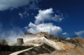
Partha Pal (K:11619)
5/25/2006 3:38:10 AM
I must appriciate for this photograph. The composition, colour tonality, compositional balance and colour balance everything is excellent.
Have u reach there by trekking?
Your photograph insists me tyo visit the same, may I am able to go there some day.
Partha
|
| Photo By: arijit(ratul) talukder
(K:6029)
|
|
|
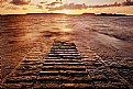
Critique By:
Ciprian Ilie (K:13571)
5/5/2006 10:54:00 AM
Sounds like you put a bit of effort into this one; the result was definatelly worth it, everything is correctly exposed, the warm colours are lovely and the texture of the slipway really makes this shot a good one.
Finally the low angle and the long exposure helped to make this shot perfect. Bet it would look lovely as a print on your wall.
Regards,
Ciprian
|
| Photo By: Mike Bonsall
(K:79)
|
|
|
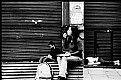
Critique By:
stingRay pt.4 . (K:250401)
5/5/2006 10:32:33 AM
Wonderful street shot dear friend showing three subjects caught in three different emotional attitudes. For me a worker taking a break, a tourist also on a break and then a street person sleeping the day away. Another very excellent monochrome composition Leonardo....All the best....Ray
|
| Photo By: Leo Régnier Я£
(K:67696)
|
|
|
Critique By:
Lubi Star (K:3903)
5/5/2006 10:57:29 AM
Hi Hugo…
First of all I have to congratulate you for the whole concept of depicting a journey in the wild and yet transcend at a higher level towards an inner soul searching experience… as such, the choice of long roads traveling trough empty landscapes towards an infinite end holds a strong symbolism… The use of partial blur increases the feel of “searching”… only when something isn’t clear, one tries to clarify it and put effort in it… my personal opinion is that the first and last image work better towards that direction… especially the latter due to the incorporated sign has another message… the urge to make a turn in the course of things… maybe sometimes – when everything else is unclear – a radical turn or another point of view may give the solutions needed… the car appearing in the second pic impo somehow detracts from the overall magic of the journey… too much technology? Too restricting by showing the medium of transportation? I can´t quite put my finger on it… As for the 3rd, think is too clear… too obvious despite the good framing of the landscape…
Still the overall result conveys the message and even more… Best regards…
Lubi
|
| Photo By: Hugo de Wolf
(K:185110)
|
|
|
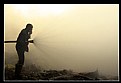
Critique By:
m , (K:15872)
5/3/2006 9:48:32 PM
Concerning to the technical-view it is an ideal image indeed! The colours, background, perspective, environment are looking great! At the same time it is a thoughtful symbolic image which gives an option for interpretation. The definition of picture, the serious face of a fireman, the garbage, the fire and the blur background tell me about your deep mind dear friend! The garbage and the inferno! The responsibility on the shoulder of an old man! But who is really behind (responsible for) the huge rubbish and in particular the flames?
My best complement
Best wishes: Maxime
|
| Photo By: 1301307 60
(K:44058)
|
|
|
Critique By:
Mohamed Hussien (K:8371)
4/30/2006 6:48:05 PM
well snap shot Hatem!
I like it being B&W beside the red colors as the motion blur that you've done in background , it gives the power of people happiness after a long time of nervousness.
although there was no need to flash cause I think that the exposing is a little high on your friend's face, but this moment can never be lost! congratulations for this great work, so interesting.
regards
|
| Photo By: hatem yehia
(K:3232)
|
|
|
Critique By:
AJ Miller (K:49168)
4/19/2006 9:19:38 AM
Ah yes, the benefits of going digital! Though even with film there's nothing (except cost, perhaps) against using a range of settings. And I find that the onboard monitors of digital cameras are generally not sufficient to fully judge the result and so end up taking shots with a range of settings anyway. I just don't have to print them all...
What surprises in this image is the sharpness of the leaves on either side and the softness of the leaves in the middle. This is a nice touch that might be emphasised with a slightly tighter crop, leaving these leaves along the diagonal and eliminating those at top right. I like the strong pink tones against the green.
John
|
| Photo By: Roger Williams
(K:86139)
|
|
|
Critique By:
martijn wams (K:6351)
4/15/2006 3:05:03 PM
the tones and colors just ooze peacefullness that goes well with the idealic sunset beach shot that you've captured here. I like the fact you've used a shutter speed of 1s, it especially shows in the tranquility of the sea now, no rough waves to spoil the peacefullness. the only problem I have with shots like these are the lightspots of the sun in the sky. I now it can't be helped, but still. Great work, kind regards, martijn
|
| Photo By: Stephen Davey
(K:413)
|
|
|
Critique By:
DELETE ACCOUNT (K:5655)
4/14/2006 9:33:59 PM
Interesting composition. I like the deep dark colors throughout the image. I'm having a hard time focusing on a specific image in this shot. The title suggests one subject, but it seems to be the least dominant of those present.
|
| Photo By: Francesco Martini
(K:12249)
|
|
|
Critique By:
Mary Brown (K:71879)
4/15/2006 4:59:29 PM
For me, the panormama form for this makes it more closely ressemble the wider expanse what one would see in reality. YOu know I can not comment on your techniques because I really would have no idea where to begin trying them. What I do see is a beautiful splash of colour and flower variety. I can almost smell them. I am looking at this on my son-in-law's monitor which does not show the detail and colour that my new one does. So, my figuring is if it looks this good here, it would look even better at yhome. The other thing is though, my monitor shows up more detail and I see more things in mine like picture quality etc that I was not able to see before.
Mary
|
| Photo By: Roger Williams
(K:86139)
|
|
|
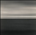
Critique By:
svend videbak (K:7376)
4/13/2006 8:16:34 AM
Magnificent. Would very much like to see, in person, Lines 1, 2 and 3 hanging together in good, clear light. These are not "minimalist" pictures at all to my mind, on the contrary they're full of tonal action and form. I'm sure the mixed selenium and sepia toning works very well. The graphical presence of these pictures comes through the barrier of the WWW so strongly. Anastasia, in addition to having the most beautiful name you are making beautiful pictures! Rgds, Svend
|
| Photo By: Nonna Moersch
(K:-287)
|
|
|
Critique By:
digoy (K:-478)
4/11/2006 10:49:11 AM
hi gramma robin, this is a great PS job. nice surreal effect you did on the tree(?) and the colors too. did you use the wave filter? looks like you took it from the bottom of an icy lake/pond/body of water. nice job, keep it up!
this is a day shot...
|
| Photo By: Robin W
(K:16308)
|
|
|
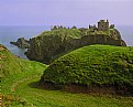
Critique By:
Annemette Rosenborg Eriksen (K:55244)
4/11/2006 11:34:06 AM
What a magnificent landscape and amazing old castle. I adore the colours in this photo and the composition. Scotland is a wonderful country!
Best wishes,
Annemette
|
| Photo By: Ian Cameron
(K:1163)
|
|
|
Critique By:
Mary Slade (K:40338)
4/11/2006 12:58:33 PM
Great to be able to do this image in itself. But brilliant- you got me thinking and learning again! In the film, was it discovering tools led to evolution, but then modern trips to planet with computer could lead to danger. Is that the idea? And the base of the your image is the old age, the rest movement to modern?
|
| Photo By: Mark Sherman
(K:15669)
|
|
|
Critique By:
Andrzej Pradzynski (K:22541)
4/11/2006 12:48:49 PM
Frederic, this is very mesmeric creation. Great indeed, my eyes are dancing and I feel dizzy. Nice pattern and great tones. Cool, Cheers, n.j
|
| Photo By: Frédéric Gaillard
(K:425)
|
|
|
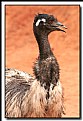
Critique By:
Billy Bloggs (K:51043)
4/11/2006 12:51:39 PM
Nice work, plain background and good depth of field frames the bird well. This one looks young. I can attest to the sharpness of their beaks, having been chased and pecked by one I encountered with her chicks early one morning while jogging in the SA bush!
|
| Photo By: Ann Van Breemen
(K:13399)
|
|