|
|
Critique By:
Joe Brown (K:23213)
8/19/2008 3:04:26 AM
This shot is just begging to be brought to life with a big boost in brightness/contrast and saturation. Something like this.
Regards,
Joe
|
| Photo By: Sue O'S
(K:12878)
|
|
|
Critique By:
Sue O'S (K:12878)
8/18/2008 10:02:31 PM
Hi Nick, Just now I double-checked the exif data on this shot, and I am very surprised to confirm the f4.5 aperture. Many of the other frames in the series are f22 which is how I remember shooting it, giving hyperfocus a try. I'm not quite certain why this is so crisp to infinity. Now I'm pretty puzzled. Pleased, but puzzled.
|
| Photo By: Sue O'S
(K:12878)
|
|
|
Critique By:
Sue O'S (K:12878)
8/18/2008 9:34:27 PM
Hi Stan,
Truth be told, I use the 20D a lot more than the 5D. I like the 5D a lot, but I have PS7 which doesn't process RAW files AND I like the EOS utility for the 20D much better although it won't process 5D RAW files (no clue why). Long story, I know, but the crux is that I shoot the 5D with both RAW and Lfine files (which eats storage) and I shoot the 20D with RAW only. I love RAW and once I commit to an editting software update, I will shoot RAW on both without hesitation. :-)
Cheers!
SueO
PS: I tend to use the 5D for 70-200 and 100-400 wildlife/aviary photography and keep the 16-35 on the 20D all the time.
|
| Photo By: Sue O'S
(K:12878)
|
|
|
Critique By:
Sue O'S (K:12878)
8/18/2008 9:26:08 PM
Hi Saad!
Thanks for taking the time to comment!
I had not thought about what the thumbnail looks like, but you're right - the adherence to the rule of thirds (or really strong suggestion of thirds) makes this rather look like a flag.
Mostly I'm concerned with the subtle shading showing up in a print. Posting on Usefilm is all well and good, but hanging it full sized as a printed work of art, a created effort, is what matters to me. If the depth of the different tones ridges doesn't show up in a print, then the whole image doesn't work for me.
But your obversation is of great use to me; it's the stripey-ness (not a real word!) of it is what has been bothering me. If I cropped this as a long postcard, it wouldn't have that 2:3 ratio as most flags do and it wouldn't niggle at me. I do have another frame which shows a silhouette of some pine trees that might work better with a standard crop.
Thanks! You've been a big help!
|
| Photo By: Sue O'S
(K:12878)
|
|
|
Critique By:
Nick Karagiaouroglou (K:127263)

8/18/2008 11:45:42 AM
A good view under the chosen perspective, Sue! The ebdless DoF seems to enhance the "journey" westward by allowing the leading lines to be still fully clear as they seem to be getting lost in the distance. The pattern of stones that gets smaller and smaller toward the depth supports this impression too.
The contrast of the railway against the green and the blue does much work for bringing also some of that look of being "lost" somewhere out there. The intensiv blue of the sky is also good to see as it starts exhibiting some kind of glow near the lines of the horizon - a very realistic impression.
I wouldn't change anything on this one!
Nick
|
| Photo By: Sue O'S
(K:12878)
|
|
|
Critique By:
Saad Salem (K:89003)
8/18/2008 7:39:03 AM
looking at thumbnail of the photo,I thought it could be a flag of some nation,I ma telling you this just if you interested to crop it,or to edit it in some way to do so,my regards,Saad.
|
| Photo By: Sue O'S
(K:12878)
|
|
|
Critique By:
Stan Hill (K:35352)
8/18/2008 4:59:58 AM
Like your style Sue, I find the form a little annoying as well, just not as creative as you. My rebel is not quite as hungry as the 5D. My step son is a portrait professional and loves his 5D. Do you shoot mostly in RAW? Looking forward to seeing more.
be well, Stan
|
| Photo By: Sue O'S
(K:12878)
|
|
|
Critique By:
Sue O'S (K:12878)
8/18/2008 4:54:22 AM
Well, like I said, it looks fine on my monitor until it's posted onto Usefilm. I guess the compression for posting is just too hard on the subtly of the shades and hues.
The real test will be printing. We're living in a rental house while we find the house to buy (we just moved to Colorado from the Midwest of the US), and I haven't unpacked the good printer. Right now, anything I want to print goes to Costco via online. :)
Again, thanks for taking the time. I'll try playing with the curves and NOT changing it from 16-bit to 8-bit and see how it come out. Those foreground mountains are there! I swear! :-)
Cheers!
SueO
|
| Photo By: Sue O'S
(K:12878)
|
|
|
Critique By:
Joe Brown (K:23213)
8/18/2008 4:43:16 AM
Hi Sue,
I used primarily the Shadows/Highlights adjustment with a touch of brightness/contrast to try to match your settings for the sky and clouds. Working with the original full size image I suspect your could do something similar with much less noise/pixelation.
Regards,
Joe
|
| Photo By: Sue O'S
(K:12878)
|
|
|
Critique By:
Sue O'S (K:12878)
8/18/2008 4:31:47 AM
Hi Stan!
The question in the upload form "Name of film" makes me bonkers. So I've taken to naming my CF cards. There's Sarah, Millie, Gertrude (named after the duck in Journey to the Center of the Earth), and yet undisclosed is Michelle. I should have named them after famous photogs (Dorothea, Diane, Lisa), but that will have to wait until I buy more CF cards. I have found out that the 5D is a hungry beast and needs larger and larger cards. Talk about all your eggs in one basket!
Cheers!
SueO
|
| Photo By: Sue O'S
(K:12878)
|
|
|
Critique By:
Sue O'S (K:12878)
8/18/2008 4:26:55 AM
Hi there, Joe. Looks like you found my mountains! My original on my PC looks like yours online, except without the pixelation/noise. Since I'm here to learn, what process did you do, other than just adjust brightness/contrast (cuz I noticed my clouds have lost a little something by the upper edge.
Thanks for taking the time to run the image through PS CS3. I have been using PS7, partly out of frugality and partly because it still works well.
|
| Photo By: Sue O'S
(K:12878)
|
|
|
Critique By:
Joe Brown (K:23213)
8/17/2008 10:15:30 PM
I love this shot. I used PH CS3 to bring out the layers of mountains that your speak of. Is this close to what you were hoping it would look like?
Regards,
Joe
|
| Photo By: Sue O'S
(K:12878)
|
|
|
Critique By:
Stan Hill (K:35352)
8/17/2008 9:34:28 PM
Sarah did a good job for you with the file format. The color saturation of the clouds is great. The outlines of the mountains are a nice contrast to the cooking reds and pastels that go along with it. Well done, be well, Stan
|
| Photo By: Sue O'S
(K:12878)
|
|
|
Critique By:
Stan Hill (K:35352)
8/17/2008 12:20:37 AM
I see proof of your Big Sky knowledge, you have been within 90 miles of Norris, Mt. Is not the Old Faithful Inn incredible. The log work and size is very impressive. I like your crop and POV on this. Be well, Stan
|
| Photo By: Sue O'S
(K:12878)
|
|
|
Critique By:
Sue O'S (K:12878)
8/16/2008 5:37:14 PM
Thank you, Lars, for taking the time to comment. This was evening; my husband was working hard setting up camp while I was "doing the artist thing" and trying to capture the light.
The original image did not have the horizon directly in the center and was compliant to the "Rule of Thirds" but if didn't seem to emphasize the subject of the layers of mountains as I liked. Can it be forgiven for cutting the image in half between light and dark? I know what the "Rule" is but I like to think of it as the "Really Strong Suggestion of Thirds" and decided to break the "Rule".
Cheers!
SueO
|
| Photo By: Sue O'S
(K:12878)
|
|
|
Critique By:
Lars Dahlin (K:610)
8/16/2008 5:14:11 PM
Hi Sue!
I really like your postcard like photo. You have framed it in a clever way and with almost just blue and gray colors it's a place that I just could sit and contemplate a while.
Is it morning or evening?
Regards!
/Lars
|
| Photo By: Sue O'S
(K:12878)
|
|
|
Critique By:
Sue O'S (K:12878)
8/15/2008 7:20:28 PM
I think a heavy cropping of this photo would have improved it. As much as I like the yellowish clouds to the right, it looks a little blown out. What do you think?
|
| Photo By: Sue O'S
(K:12878)
|
|
|
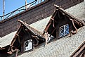
Critique By:
Saad Salem (K:89003)
8/15/2008 4:25:34 PM
very beautiful composition,and excellent lighting,the windows seems to be renewed lately,regards,
Saad.
|
| Photo By: Sue O'S
(K:12878)
|
|
|
Critique By:
Sue O'S (K:12878)
8/10/2008 4:03:32 AM
Hi, Chris.
Your advise about the split neutral density filter is well advised. I didn't *want* to spend for that 77mm sized filter, but I did and am glad. We just returned from Yellowstone (two hours ago!) and am anticipating an improvement in my distance between stops.
|
| Photo By: Sue O'S
(K:12878)
|
|
|
Critique By:
Chris Lauritzen (K:14949)
8/7/2008 2:11:54 PM
Very nicely done on this one Sue!
|
| Photo By: Sue O'S
(K:12878)
|
|
|
Critique By:
Chris Lauritzen (K:14949)
8/7/2008 2:11:07 PM
Sue, your exposure of the mountain is fine but your losing too much detail in the foreground. A split ND filter would have helped here or an HDR.
|
| Photo By: Sue O'S
(K:12878)
|
|
|
Critique By:
Mike Cook (K:4389)
8/1/2008 4:01:28 AM
Nice picture - lovely colours and well framed
|
| Photo By: Sue O'S
(K:12878)
|
|
|
Critique By:
Hussam AL_ Khoder (K:79545)
7/30/2008 5:01:32 PM
¨)
. ¸.´ ¸.*´¨) ☆.(¯`.´¯)
(.¸.´ (¸.` ☆ ¤º.`.¸.´ ☆Great Picture! ¸.*¨)☆☆
|
| Photo By: Sue O'S
(K:12878)
|
|
|
Critique By:
Sue O'S (K:12878)
7/30/2008 4:49:06 PM
Hi there!
Interesting rework. It does indeed have an ansel adams feel. Thanks for taking the time.
Please explain the process! Straight b&w converstion in photoshop or what?
SueO
|
| Photo By: Sue O'S
(K:12878)
|
|
|
Critique By:
神 風 (K:10665)
7/30/2008 8:22:08 AM
Aloha Sue from long ago - Member #11,438 ...
I hope you like the attached for an Ansel Adams' feel ...
Best of Regards!
~Sunset Man~
|
| Photo By: Sue O'S
(K:12878)
|
|
|
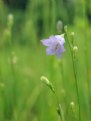
Critique By:
Susie Waldren (K:273)
7/29/2008 10:30:13 AM
Beautiful Harebell
|
| Photo By: Sue O'S
(K:12878)
|
|
|
Critique By:
Anindya Chakraborty (K:12765)
7/29/2008 9:42:29 AM
The colors are really nice and the bokeh too.
|
| Photo By: Sue O'S
(K:12878)
|
|
|
Critique By:
Hussam AL_ Khoder (K:79545)
7/29/2008 8:19:27 AM
This is realy nice photo.
(¨`.´¨)
`.¸(¨`.´¨ )
(¨`.´¨)¸.´
`.¸.´ All the best.
|
| Photo By: Sue O'S
(K:12878)
|
|
|
Critique By:
Sum ob (K:4665)
7/29/2008 8:13:03 AM
A nice work..
|
| Photo By: Sue O'S
(K:12878)
|
|
|
Critique By:
Jim Loy (K:31693)
7/29/2008 7:56:44 AM
Geesh... a "Hemingway" pun/title.... well done!!
|
| Photo By: Sue O'S
(K:12878)
|
|


 Das")