|
|
Critique By:
svend videbak (K:7376)
5/19/2006 6:10:02 AM
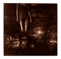
Very nice, good illustrated look. I've seen too much of this type of "simulating painting" photographic work on this site and others, though, to appreciate it much. It's seen an awful lot in magazines that use illustration these days. I don't know what it is, I guess it's the fact that everyone's using Photoshop filters, layering and textural effects, but most of these digitally treated pictures look like they're made by the same hand regardless of the subject. And the big question: Why try to simulate the appearance of a painting in a photograph? Doesn't this show a distinct lack of imagination in this digital age, where computers are supposed to make anything and everything possible? Whatever... this isn't directed at you so much as at the whole boring phenomenon. This is indeed an effective picture, nice earthen colours and mood.
|
| Photo By: Lars Raun
(K:1701)
|
|
|
Critique By:
svend videbak (K:7376)
5/18/2006 2:01:57 PM
A very lovely portrait.
|
| Photo By: Saad Jasim
(K:305)
|
|
|
Critique By:
svend videbak (K:7376)
5/12/2006 8:49:09 AM
New Yorkishness oozes out of this. An eloquent candid!
|
| Photo By: Timothy Schirmer
(K:7201)
|
|
|
Critique By:
svend videbak (K:7376)
5/12/2006 8:46:45 AM
Miguel's right, you should scoop up a decent 6 x 6 camera second-hand and see where it takes you. Of course there's more expense... developing, scanning and so on, but the results are at another level. I don't know, I wrote that because I'm biased. An old 35 mm camera can also work wonders. There's a gentle and searching feel to this self-portrait. Many of your pictures have real feeling, and that's rare you know.
|
| Photo By: Timothy Schirmer
(K:7201)
|
|
|
Critique By:
svend videbak (K:7376)
5/12/2006 8:43:06 AM
Drunk and on your bed... with your reputation? Sharpness isn't everything, and here the softness adds to the velvet underground feel of it all.
|
| Photo By: Timothy Schirmer
(K:7201)
|
|
|
Critique By:
svend videbak (K:7376)
5/12/2006 8:41:36 AM
Like the punkiness of this. Ah, youth... I remember it well. No I don't. Rgds, Svend
|
| Photo By: Timothy Schirmer
(K:7201)
|
|
|
Critique By:
svend videbak (K:7376)
5/12/2006 8:27:39 AM
Ha! This photo proves beyond a shadow of a doubt that Brosnan was never a suitable Bond! Bond would never aim at a child like that! Rgds, Svend
|
| Photo By: Jiri :-)
(K:681)
|
|
|
Critique By:
svend videbak (K:7376)
4/10/2006 7:54:12 AM
Greetings Andreas. Wonderful picture! I'm very curious about the salt treatment. Let me see if I understand what you've done... You've used ordinary table salt? You made the print and selenium-toned it, and then before it was dry you sprinkled salt lightly on certain parts of the picture? I have used this technique with watercolour painting where it's commonly known. The salt grains suck up the water and colour into themselves, doing a kind of localized bleaching. And then you did a second, sepia toning after washing off the salt? Is this description accurate? Rgds, Svend
|
| Photo By: Andreas Hering
(K:1684)
|
|
|
Critique By:
svend videbak (K:7376)
4/6/2006 8:42:47 AM
Certainly has the "period feel". The piercings give an ironic feeling. Hats off to you for exploring all those time-consuming old techniques in defiance of efficiency and productivity! Rgds, Svend
|
| Photo By: Jeannette Palsa
(K:128)
|
|
|
Critique By:
svend videbak (K:7376)
4/6/2006 8:08:34 AM
No, no, stop him, because solving the Rubik's cube would destroy the universe! So cinematographic, so fun! Rgds, Svend
|
| Photo By: Maleonn
(K:3054)
|
|
|
Critique By:
svend videbak (K:7376)
1/31/2006 9:34:19 AM
Yes, the low winter sunlight caressing the stones on the road. Nice. The middle section of the road which is most bathed in sun looks a little jagged, pixelly to my eye. That's surely a result of JPEG compression. The feeling of cold touched by warmth is what's important here, it works.
|
| Photo By: Carsten Ranke
(K:14476)
|
|
|
Critique By:
svend videbak (K:7376)
1/31/2006 9:30:46 AM
Fog is so tonally delicate, which is why it's so great to photograph in fog! One can never get bored by it. The work you have done is certainly not over the top. Colour saturation is the first thing one notices if it is boosted abnormally (Velvia, ugh!). The next most noticeable thing I guess is contrast. This is a very fine colour study of a tree with fog.
|
| Photo By: Carsten Ranke
(K:14476)
|
|
|
Critique By:
svend videbak (K:7376)
1/23/2006 2:56:58 PM
Really good colour here. The lighting has given a lovely saturation (not too saturated). Excellent sharp detail throughout.
|
| Photo By: J Dillon
(K:1426)
|
|
|
Critique By:
svend videbak (K:7376)
1/11/2006 11:29:11 AM
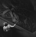
Really like this picture, with the naturally dramatic light on the tour guide and the monumental art work looming over him in receding darkness.
|
| Photo By: Chris Blaszczyk
(K:610)
|
|
|
Critique By:
svend videbak (K:7376)
1/11/2006 11:21:44 AM
You seem to like taking photographs at night. Me too. Here you have portrayed moonlight splendidly. I have tried a number of moonlit pictures, long exposures, with no success. The exposures have been too long, and the moon has dribbled across the frame unpleasantly. I haven't given up, you prove it can be done.
|
| Photo By: Rick Sowerby
(K:1782)
|
|
|
Critique By:
svend videbak (K:7376)
1/11/2006 11:17:36 AM
Mood befitting a Wilkie Collins novel. Wind-slashed, tempestuous, ominous. I would dearly love to visit Scotland some day, with time enough to explore -- camera in hand of course. There are plenty of photographs of bracken and lochs, though. So you are a student? Lucky you. How I wish I'd known photography back in my own student days. I didn't, and have almost no pictures now to look at and get sentimental about. Afterwards we always know. Rgds, Svend
|
| Photo By: Rick Sowerby
(K:1782)
|
|
|
Critique By:
svend videbak (K:7376)
1/10/2006 2:05:11 AM
Lovely stuff. Like poetry from the subconscious.
|
| Photo By: Bogdan Zwir
(K:-186)
|
|
|
Critique By:
svend videbak (K:7376)
1/10/2006 1:47:13 AM
Just plain beautiful. A classic.
|
| Photo By: ol an
(K:-248)
|
|
|
Critique By:
svend videbak (K:7376)
1/10/2006 1:32:29 AM
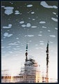
A gorgeous "puddle picture" if you'll excuse the phrase. Surreal how the minarets are contrasted with the foam patches.
|
| Photo By: Ahmet Baki Kocaballi
(K:13618)
|
|
|
Critique By:
svend videbak (K:7376)
1/6/2006 9:58:06 AM
Excellent. Graphically beautiful, interesting. It seems digital photography can be used to create really nice long-exposure pictures portraying movement. Congrats.
|
| Photo By: Carsten Nørgaard
(K:581)
|
|
|
Critique By:
svend videbak (K:7376)
12/9/2005 1:46:20 PM
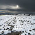
Well this is a magnificent winter landscape photograph, however it was produced. It isn't grand in the least -- but I at least have seen enough pictures of Utah badlands and Rocky Mountain ranges of the Velvia school to last ten lifetimes. The "emanating from below" luminosity through the snow is beautiful. Most of all, colour is handled about as well as it's possible to handle with photography. Of course there is no colour without light, so maybe it would be better to say that light is handled about as well as it can be handled. Very surprising that this was made with a "pocket" digital camera. My eye is led to that distant rectangular field of green. Calligraphic interest is all around -- winter landscapes are the calligrapher's delight. As for the sharpness here of the depth-of-field from absolute foreground to absolute background, you know, I don't think this is always necessarily the best way to achieve a feeling of great depth and distance in a picture. This was a great concern of Leonardo da Vinci's, who developed a technique of painting called "sfumato" which describes a way of applying paint in the most delicate build-up of layers so as to eliminate all edges in the parts of a painting which recede from the viewer into the distance -- in his hands, an astonishingly subtle dissolving into nothingness. This is one of the greatest tools a photographer has as well: deciding what shall be sharp and what shall not be sharp. When the eye "reads" a picture which is perfectly sharp throughout the frame, it is led by the lines and shapes of the picture in an up-and-down, right-to-left way around the frame. When the eye "reads" a picture which contains sharpness in relation to "dissolvingness to nothingness" it is led forward and through, into the picture, so that the edges of the frame are left behind. Generally, though, "fine art" landscape photographers follow the rule of absolute depth-of-field and sharpness, perhaps because of Ansel Adams and his F64 group, I don't know. It's a strange fact that the eyes of most people revolt against foreground unsharpness leading to background sharpness. I'm blathering on... Always a pleasure to drop in and see the advances you're making, Carsten. Rgds, Svend
|
| Photo By: Carsten Ranke
(K:14476)
|
|
|
Critique By:
svend videbak (K:7376)
11/21/2005 5:41:34 AM
Nice. I wish more people would use many exposures to work against photographic sameness: all those long-exposure glassy seas, all those misty waterfalls, etc. Bryan I really like the foliage here, the play of light is beautiful and the painterliness wonderful. Definitely territory to explore more, I'd say! I've tried Neopan too, it's a nice film -- nice tight grain, good contrast, exposure latitude. Quite similar to Tri-X I think. Rgds, Svend
|
| Photo By: Bryan Miller
(K:3395)
|
|
|
Critique By:
svend videbak (K:7376)
11/18/2005 12:40:21 PM
Seating him in the tracks was a good idea, lends dynamism. I like the depth of field. Tonality a bit lifeless, guess this is a function of an overcast day + scanning? Rgds, Svend
|
| Photo By: meewosh
(K:448)
|
|
|
Critique By:
svend videbak (K:7376)
10/20/2005 4:58:35 PM
The thin white shirt makes it. Looks like you exposed and developed well.
|
| Photo By: Joern Stubbe
(K:65)
|
|
|
Critique By:
svend videbak (K:7376)
10/20/2005 4:47:36 PM
It's a very fine line, the difference between cool and stupid.
|
| Photo By: lubomir
(K:938)
|
|
|
Critique By:
svend videbak (K:7376)
10/12/2005 5:25:43 PM
What manner of Holga is this which gives such fine sharpness of detail? Lovely melancholic portrait, a corn field does it every time.
|
| Photo By: Andreas Hering
(K:1684)
|
|
|
Critique By:
svend videbak (K:7376)
10/12/2005 5:22:06 PM
So very straight-forward... the definition of it.
|
| Photo By: Andreas Hering
(K:1684)
|
|
|
Critique By:
svend videbak (K:7376)
10/12/2005 5:05:22 PM
Lovely portrait. Why have you blackened the "air" behind the building and wall? With the sun falling so forcefully on the subjects from the left, this is most unnatural and jarring.
|
| Photo By: Zelda Zabrinsky
(K:3036)
|
|
|
Critique By:
svend videbak (K:7376)
10/11/2005 8:17:52 AM
Very neat idea, her trying to reach herself. Well-realized, manipulation is well-hidden. Is all that foreground needed? The two cast shadows make for some clutter, is the shadow cast by the larger figure needed?
|
| Photo By: Geoffroy Demarquet
(K:186)
|
|
|
Critique By:
svend videbak (K:7376)
10/11/2005 8:00:02 AM
Nice. This is a subject, though, which should really have a level horizon.
|
| Photo By: Zelda Zabrinsky
(K:3036)
|
|