|
|
Critique By:
Marek Krol (K:9791)
2/9/2005 3:16:50 PM
I think this is better - though I would still like tosee some shadows of detail in the background. But Im picky 
|
| Photo By: Felipe Rodríguez
(K:9200)
|
|
|
Critique By:
Marek Krol (K:9791)
2/8/2005 7:53:02 PM
I like the way how his music steps out to greet us from the shadows, overall it works well but...
Some shadow outlines of the bg would help to give context and 'fill out' the frame - no annoying details just variations on grey. As it stands, it's a bit like a studio shot that got spliced with a pavement. Also, you've lost some saturation doing burning on his forehead - needs some correction.
|
| Photo By: Felipe Rodríguez
(K:9200)
|
|
|
Critique By:
Marek Krol (K:9791)
2/5/2005 4:19:44 PM
The area feels very vast and open, driven by the way leading lines from every component of the image converge to a point distant on the horzion. However Felipe, you have posted a number of photos recently in this vain, water reflecting a blazing sky with leading lines to the horizon, and without wanting to detract from any one of them (as they are mostly very good photos) I think you should try doing something different in the same area. Look for a new perspective, do not let yourself drift into a comfort zone following the same techniques time and time again.
|
| Photo By: Felipe Rodríguez
(K:9200)
|
|
|
Critique By:
Marek Krol (K:9791)
2/4/2005 7:13:17 PM
Pewnie fajne miejsce ale tak srednio sie przenioslo na film.
|
| Photo By: Monika Szymanska
(K:719)
|
|
|
Critique By:
Marek Krol (K:9791)
2/2/2005 7:26:28 PM
a little bit sharper a little bit deeper - the tip really needs to be razor sharp here. Blend out into the frame is great though - blurring into a mass of shape and color. Has good balance t it
|
| Photo By: Felipe Rodríguez
(K:9200)
|
|
|
Critique By:
Marek Krol (K:9791)
2/2/2005 6:56:31 PM
zbliezenie skrzydlatej waszki - fajnie. troche mozna poprawic pionowe linie
|
| Photo By: Monika Szymanska
(K:719)
|
|
|
Critique By:
Marek Krol (K:9791)
2/1/2005 11:30:21 AM
Super - bardzo sie podoba. Pierscien ognia otaczajacy dwie wierze, a reszta poza zylami w czarnej otchlani.
|
| Photo By: Monika Szymanska
(K:719)
|
|
|
Critique By:
Marek Krol (K:9791)
1/31/2005 10:33:31 AM
Faktycznie podobno - aczkolwiek Ci sie lepiej udalo, lepiej componuja sie ksztalty; rowniez pomiedzy soba jak i uklad w kardze.
|
| Photo By: Monika Szymanska
(K:719)
|
|
|
Critique By:
Marek Krol (K:9791)
1/30/2005 11:02:48 PM
I';ve seen you do this sort of thing before and very well. but this one doesn't work for me at all. despite the long shadwos the bricks look very flat over mostof the frame and teh shadow itself is akwardly cropped
|
| Photo By: Felipe Rodríguez
(K:9200)
|
|
|
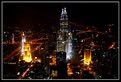
Critique By:
Marek Krol (K:9791)
1/30/2005 10:22:26 PM
niby pocztowkowa wista - ale swietnie skomponowana i ciekawe swiatlo. skad robiona? wydaje mi sie ze widze obydwie wierze petronas
|
| Photo By: Monika Szymanska
(K:719)
|
|
|
Critique By:
Marek Krol (K:9791)
1/28/2005 7:26:30 PM
hey you
swietna kompozycja - takie odzwierciedlenie wgladu do duszy przez oko (w tym wypadku prostokatne i szklane).
|
| Photo By: Monika Szymanska
(K:719)
|
|
|
Critique By:
Marek Krol (K:9791)
1/27/2005 8:59:21 PM
fajna sztuka uliczna
Troche przeszkadzaja uciete rogi i ogolnie trudna scena do upozadkowania ale niezle wyszlo.
|
| Photo By: Monika Szymanska
(K:719)
|
|
|
Critique By:
Marek Krol (K:9791)
1/25/2005 8:38:51 PM
Such wonderfully soft tonality. I wish it was only the foremost leaf that had the drops
|
| Photo By: Felipe Rodríguez
(K:9200)
|
|
|
Critique By:
Marek Krol (K:9791)
1/24/2005 11:03:10 PM
Trafnie zauwazone - pomimo faktu ze wszystkie sa inne i malo co sie powtarza nie ma chaosu - tylko wlad i geometria. Ciekawe..
|
| Photo By: Monika Szymanska
(K:719)
|
|
|
Critique By:
Marek Krol (K:9791)
1/13/2005 11:14:19 PM
Nie mozna sie oprzec dobremu zdjeciu z Sukkienic. Pamietam ze robilem z niemal identycznego miejsca podobna kompozycje.
|
| Photo By: Monika Szymanska
(K:719)
|
|
|
Critique By:
Marek Krol (K:9791)
1/13/2005 9:19:06 PM
A real sweetie Felipe. High key look suits the strength of the red color too.
|
| Photo By: Felipe Rodríguez
(K:9200)
|
|
|
Critique By:
Marek Krol (K:9791)
1/12/2005 7:48:31 PM
It's a good perspective with points of interest creeping in on all sides, however the vibrant colors don't set any sort of mood. I would add that I have some bias for this subject matter - I keep thinking back to one of the first scenes in apocalypse now where Sheen is in a dingy hotel watching fan blades morph in and out of chopper blades.
|
| Photo By: Felipe Rodríguez
(K:9200)
|
|
|
Critique By:
Marek Krol (K:9791)
1/11/2005 7:10:52 PM
Klimat i swiatlo jak z ksiazki z 19 wieku. Moze troche poprawic piony?
|
| Photo By: Monika Szymanska
(K:719)
|
|
|
Critique By:
Marek Krol (K:9791)
1/10/2005 11:45:09 PM
Fajne i przypomina zboze, ale pomimo mocno podswietlonego strumienia po lewej troche brak zaczepki na oko.
|
| Photo By: Monika Szymanska
(K:719)
|
|
|
Critique By:
Marek Krol (K:9791)
1/9/2005 9:06:48 PM
Swietne - duzo prostoty i faktury. Nie przemawia do mnie na jakims glebszym poziomie ale troche wspominam te setki ksiazek odlozonych na pozniej zaznaczajac strone w ten sposob. Ciemny rejon po prawie za ksiazka troche przeszkadza.
|
| Photo By: Monika Szymanska
(K:719)
|
|
|
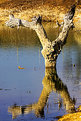
Critique By:
Marek Krol (K:9791)
1/4/2005 10:05:22 PM
Thought you mightn't have I see a reflections theme today - see how nature mirrors itself at least twice in this photo?
|
| Photo By: Felipe Rodríguez
(K:9200)
|
|
|
Critique By:
Marek Krol (K:9791)
1/4/2005 10:03:08 PM
Finding humor or meaning in reflections is always very pleasing. Very 'sunburnt' colors - any filtering here?
|
| Photo By: Felipe Rodríguez
(K:9200)
|
|
|
Critique By:
Marek Krol (K:9791)
1/2/2005 11:42:31 PM
Ciekawsze od tego drugiego - nic nie zakluca oku a wszystkie przekatne b. fajnie schodza sie do jednego punktu.
|
| Photo By: Monika Szymanska
(K:719)
|
|
|
Critique By:
Marek Krol (K:9791)
1/2/2005 11:36:38 PM
a desert mirage. great how both the lines and buildings fade out in the distance haze.
|
| Photo By: Felipe Rodríguez
(K:9200)
|
|
|
Critique By:
Marek Krol (K:9791)
1/2/2005 11:34:14 PM
To prawie moje podworko. Czy to ten maly sciek przed mostem Sikierkowskim? Zdjecie sie calkiem udalo pomimo bardzo mocnego slonca - tonacja w wodzie i niebie jest piekna a zarysy otoczenia mocne. Uwagi: urwana galaz zbyt dominuje w srodku, wolal bym zobaczyc nieprzerwane luk brzegu po prawej.
|
| Photo By: Monika Szymanska
(K:719)
|
|
|
Critique By:
Marek Krol (K:9791)
12/30/2004 9:48:05 AM
Po namysle - mozna pociagnac w druga strone, tzn oddac przytulnosc tego miasteczka. W jednym i drugim wypadku przeszkadza mi uciety szczyt u gory po lewej
|
| Photo By: Monika Szymanska
(K:719)
|
|
|
Critique By:
Marek Krol (K:9791)
12/30/2004 8:02:04 AM
Fajna wiocha gorska. Ale brakuje mi dwoch elementow. 1) szerszy kadr na gory zeby skala pomiedzy natura a budynkami byla bardziej wyrazna 2) troche wiecej ciepla w swietle (czy to poranek?)
|
| Photo By: Monika Szymanska
(K:719)
|
|
|
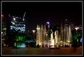
Critique By:
Marek Krol (K:9791)
12/28/2004 10:20:28 PM
Can't really see much that I like in this one, but there is a fair bit that bothers me. Overexposed sign in the background drawing attention, off kilter verticals. Maybe more could have been made in the contrast of moods between the fountain and couple?
|
| Photo By: Felipe Rodríguez
(K:9200)
|
|
|
Critique By:
Marek Krol (K:9791)
12/28/2004 8:09:30 PM
Piekny widok (jak chyba wszystki w Alpach) ale na moim ekranie troche za bardzo zapada ciemna tonacja w czarny - nie widac szczegolow. Czy uzywalas filtr (szklany lub w PS'ie)?
|
| Photo By: Monika Szymanska
(K:719)
|
|
|
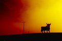
Critique By:
Marek Krol (K:9791)
12/14/2004 6:27:32 AM
Never tire of these beasts. Love the hazy effect in the fiery sky.
|
| Photo By: Felipe Rodríguez
(K:9200)
|
|