|
|
Critique By:
Scott McFadden (K:5663)
2/8/2005 6:48:09 AM
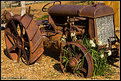
Such a lovely tracktor.
Is it local to you ? if so why not revisit in less contrasty light and even try new techniques out on it.
should really be good to display your progress as a photographer.
|
| Photo By: Eric Simpson
(K:2348)
|
|
|
Critique By:
Scott McFadden (K:5663)
2/2/2005 9:26:11 AM
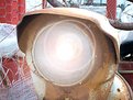
Pyrotechnics are always a favourite subject.
trouble is they are very difficult to photograph predictably.
|
| Photo By: V Dewan
(K:79)
|
|
|
Critique By:
Scott McFadden (K:5663)
12/7/2004 7:22:34 AM
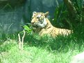
Sure your all tough now but just wait til you look into his big brown eyes later.
Mine step all over me also.
|
| Photo By: Shawn McCammon
(K:172)
|
|
|
Critique By:
Scott McFadden (K:5663)
12/7/2004 7:19:14 AM
Well at least your learning something constructive about use of photoshop.
Perhaps next time you'll include something we can reckognise as a scooter cuase if I were not told Id never know what it was.
Not too bad a Rendition of lens flare though if you shaped it a little more like a lens iris it'd look more real.
Try joining two photos together in a weird place
thats always fun to do.
If you've got portraits of people its really nasty fun just to go into the liqify section an mess them up a bit. Go on give it a try I know you want to.
|
| Photo By: Shawn McCammon
(K:172)
|
|
|
Critique By:
Scott McFadden (K:5663)
12/7/2004 7:09:41 AM
Cappa once said that if this picture isnt that good enough youre not close enough , of course this was clearly ambigous statement as the unfortunate soul was killed getting closer for the perfect war shot.
Sometimes its pays to back off a little lol.
Beware of shiny things in photos as they tend to steal the show a little, an odd choice of shoe for the outfit.
Does the subject like this shot ?
|
| Photo By: Nicolae Stinghe
(K:10)
|
|
|
Critique By:
Scott McFadden (K:5663)
10/1/2004 7:52:22 AM
Its really difficult at times to get a shot when there are lots of people in a shot.
This is when you need to shoot extra photos.
Group shots I feel are an excellent candidate for b+w conversion.
|
| Photo By: jose albearto
(K:0)
|
|
|
Critique By:
Scott McFadden (K:5663)
10/1/2004 7:44:37 AM
Definatly an interpretive artwork piece.
hard to say whats going on here
The splash makes an intresting statement but a muddled one as there is a horizontal one with a empathsis on diagonals.
Personally softness of subject bothers me when its to this degree.
|
| Photo By: Gertrud Gozner
(K:14222)
|
|
|
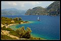
Critique By:
Scott McFadden (K:5663)
10/1/2004 7:35:05 AM
Certainly a beautiful place.
the most attractive and unrelentingly so is the light upon the foliage which glows with such warmth and dignity all else seems cold and harsh.
I feel no doubt when saying this photo needs a small deception. A trick if you will to make the reality of it less cold and uninviting.
often reality looks fake on film and this may be one instance of such.
Explaining my meaning in clearer terms the attractive foliage could do with dumbing down to give the overall print a more exceptable vibe.
So too may be an extra crop off the top to reduce the content of the cold uninviting outside and the sky seems so average it really doesnt add a great deal.
Placement of the boat has added depth to this image.
|
| Photo By: iNNOCENt
(K:3)
|
|
|
Critique By:
Scott McFadden (K:5663)
9/20/2004 9:10:06 AM
I certainly agree with the standing out of the artist hands are enhanced.
The abstract feature also adds.
Unfortunately the hand I most respond too is not sharp.
a good effort worth another shot.
|
| Photo By: Amy Hoover
(K:76)
|
|
|
Critique By:
Scott McFadden (K:5663)
9/17/2004 6:38:55 AM
Great control of background.
one of the best baseball photos Ive seen.
too bad about the foot being out of focuss.
Almost perfect.
|
| Photo By: Rachelle Biggs
(K:628)
|
|
|
Critique By:
Scott McFadden (K:5663)
9/17/2004 6:35:34 AM
I like the triangular composition in this shot.
probably would have looked better without the catcher in it at all.
thats mainly because once noticed its hard to look anywhere else.
Great timing to get the kid in mid air like that.
I particularly like the color saturation in this photo and the way its controlled to keep attention on the runner.
Backgrounds are always hard to keep good but try to look out for verticals as they are very deceptive .
|
| Photo By: Rachelle Biggs
(K:628)
|
|
|
Critique By:
Scott McFadden (K:5663)
9/1/2004 9:37:15 AM
Much Nicer.
|
| Photo By: Maggie Rodriguez
(K:215)
|
|
|
Critique By:
Scott McFadden (K:5663)
8/31/2004 10:53:36 AM
The whole photo has the worst colour cast problem Ive seen.( probably the Labs fault)
A small crop across the base might help make this photo look even better.
Of course its always good to choose a popular subject thats well liked.
|
| Photo By: Maggie Rodriguez
(K:215)
|
|
|
Critique By:
Scott McFadden (K:5663)
8/31/2004 10:48:39 AM
Very mysterious pose.
It'd be very easily missinterpreted if you didnt give it away in the description.
Great seperation and simplification for a documentary shot.
Overall I think its great.
|
| Photo By: Cesar Augusto Carvalho
(K:982)
|
|
|
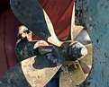
Critique By:
Scott McFadden (K:5663)
8/31/2004 10:39:54 AM
The detail in this shot is superb.
unfortunately the prop bolt is competing for attention and also unwanted highlights.
|
| Photo By: William Francis
(K:365)
|
|
|
Critique By:
Scott McFadden (K:5663)
8/31/2004 10:36:28 AM
Very brave comparing to ansell adams.
Such a diffrent format is just too difficult to compete with and why set an emotive hurdle when theres no need for it.
I feel that the rocks are the biggest problem for me. Darkening may help.
best of luck in future efforts
|
| Photo By: Huw Ge
(K:1033)
|
|
|
Critique By:
Scott McFadden (K:5663)
8/31/2004 10:30:45 AM
It actually does look like a sky in my thumbnail.
Great idea and not a bad effort allround.
The middle of the plant let you down just a little though so I hope you took a few more where the leaves are in a more favourable position to get the dof.
|
| Photo By: Fern
(K:2509)
|
|
|
Critique By:
Scott McFadden (K:5663)
8/31/2004 10:22:50 AM
If only you had a bigger umbrella 
seriously though an interesting fountain that looks like a tomb decoration.
The title kinda of put me too as I assumed it was a tomb tap.
I could be wrong of course.
|
Photo By: Marian Man
(K:80636)

|
|
|
Critique By:
Scott McFadden (K:5663)
8/23/2004 8:52:15 AM
A strong image you've made and well handled.
Very brave choice in the shiny fabric and you have almost pulled it off with very little flairing.
The model seems relaxed especially for a squatting position like this one.
Clothing choice as stated was exceptional down to the hat.
Detail is being lost at the edges as you have to expect with such a low speed film though its probably on the neg.
Tonal range is superb as too the sharpness.
Watch the elbows and knees as they seem a little bright.The hair could be burnt in a bit.
About the chest it seems an odd at the nipples.
|
| Photo By: Bill Long
(K:3306)
|
|
|
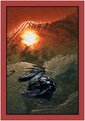
Critique By:
Scott McFadden (K:5663)
8/23/2004 8:34:08 AM
I really dont see a photo as much as digital artwork.
The symbolisum of the sun just above the bird seems indicative toward afterlife or similar.
Those lines made by water really add a depth of tranquility over the sun whilst at the same time dramatically changing the appearance of the fallen bird.
Technically it would be a good idea toning down the edit marginally has lost the integrity of the photographic truth and so seems at least to me to have lost its point.mainly due to the bird type being unrecognisable in a sea of noise.
The seperate feather also distracts marginally though may add a sense of truth.
|
| Photo By: Kimmy Magino
(K:2457)
|
|
|
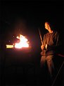
Critique By:
Scott McFadden (K:5663)
8/19/2004 10:03:45 AM
I Love unusual stuff especially flames.
For me though I found the biggest problem was not the image but the added features above detract from a well composed shot.
The paper roll really doesn't look great above as there isnt enough space for it.
Copyright too is important though I would prefer a more discreet approch.
I like the sparkle effect you've added into the lighter as it adds a depth.
though its easy to tell as the light color doesnt fade.
|
| Photo By: Yunus TOY
(K:0)
|
|
|
Critique By:
Scott McFadden (K:5663)
8/19/2004 9:53:42 AM
Hard critters to catch those birds.
just getting the whole thing in frame though is half the battle.
Congrats your halfway there.
Im not so Im getting back out there see ya.
|
| Photo By: Timothy Schirmer
(K:7201)
|
|
|
Critique By:
Scott McFadden (K:5663)
7/30/2004 9:17:39 AM
What a great expression.
Not sure I'd let him cook again though looks burnt.
The dark location really doent help get enough detail but you chose a good enough exposure combo to get this one.
|
| Photo By: Huw Ge
(K:1033)
|
|
|
Critique By:
Scott McFadden (K:5663)
7/9/2004 9:16:19 AM
Great choice of framing.
I would prefer focus on the eyes though.
For a Cheats approch I'd think a good expression facial photo from the same angle would really make the frame sparkle.
|
| Photo By: ahmed refay
(K:665)
|
|
|
Critique By:
Scott McFadden (K:5663)
7/9/2004 9:01:37 AM
I always love night shots.
The problem of course is the best night shots are not really taken at night.
Light is never balanced enough see.
better to take at just after sunset.
Anothter way is to add more light with handheld flash in several spots but this is difficult and a pain in the butt.
there seems to be two interesting things going on here a vertical panoramma and a horizontal people shot.
the trees are too dark though.
|
| Photo By: Michael Holm
(K:7931)
|
|
|
Critique By:
Scott McFadden (K:5663)
7/9/2004 8:45:01 AM
Love the title.
Good Image of a difficult subject.
|
| Photo By: Hassan Ahmed
(K:2995)
|
|
|
Critique By:
Scott McFadden (K:5663)
6/13/2004 7:14:45 AM
Good border choice combined with a great
partial coloring using a strong color.
the red really helps balance the image.
Interesting use of composition.
I would appreciate it better if the arm didnt dissappear partway.
|
| Photo By: Jessica Jang
(K:233)
|
|
|
Critique By:
Scott McFadden (K:5663)
6/13/2004 7:06:03 AM
Good story here.
Love the placement of the balloon just at the edge of frame.
The limited use of color variation really helps the child jump out of the clutter.
a very light trim accross the top may increase this impact by removing the extra color that draws undue attention from the child.
|
| Photo By: Paul Bear
(K:6)
|
|
|
Critique By:
Scott McFadden (K:5663)
5/1/2004 8:23:24 AM
Interesting concept.
Great color choices.
My problem is that the hand gets lost a bit into the background.
I see some sort of trail though I feel its too subtle.
An image worth perfecting but not there yet.
|
| Photo By: Stephen Rogers
(K:43)
|
|
|
Critique By:
Scott McFadden (K:5663)
5/1/2004 8:09:26 AM
hey joseph ,
This would work as a panorama quite well.
I would also remove the partial car to give it the best punch .
|
| Photo By: Joseph Page
(K:0)
|
|