|
|
Critique By:
Fred Lord (K:4844)
3/7/2007 2:59:56 AM
Jacques: Lovely, lovely, lovely. I may have to go down there someday. I don't think I can improve on this one though. Thanks for your comments on my Great Blue Heron shot.
|
| Photo By: jacques brisebois
(K:73883)
|
|
|
Critique By:
Shirley D. Cross-Taylor (K:174199)

3/7/2007 2:55:07 AM
Oh yes, dear Luis...you can hardly go wrong with your passionate tango art.:) Love the 'bandoneon'(?) and the lovely magenta and violet colors!:)
|
| Photo By: Luis Steinberg (EFIAP)
(K:21250)
|
|
|
Critique By:
Audrey Reid (K:5872)
2/22/2007 7:25:05 PM
Hello Becky,
Compositionally this is text book perfect, hard for anyone to find fault. This is a scene one has come to expect of beautiful BC (and Alberta - I was once ticked off for not mentioning Alberta!).
Since this is 'suppose to be' a critique site.....while the mid/upper half of the picture is perfectly exposed, I find the near half slightly too dark.
One of these days, I'll need to find out from you where all these pretty places are in and around Vancouver :)
|
| Photo By: Becky V
(K:9699)
|
|
|
Critique By:
Tim Schumm (K:29196)
2/27/2007 5:41:02 AM
I hope you don't mind but I find that there is so much sky and foreground in this composition to my eye that the elements of your photo do not help my eye focus on what I would suggest is the main interest of this image. So if I could be so bold as to crop top and bottom to help direct the eye more forcefully towards the mountain top without letting my eye vacillate with parts of the image that are not needed and dilute the potential power of this shot. This is just my opinion and you may not agree, but I thought I would put my 2 cents worth in anyway.
Cheers, Tim
|
| Photo By: Eb Mueller
(K:24960)
|
|
|
Critique By:
Olga-Eva Krajciova (K:19240)
2/12/2007 8:48:39 PM
Paolo, wonderful work. I love many small points about this images. Like for example the fact all of them have covered their heads. (Maybe because I love to cover mine as well :)) Each of the used a way how to cover it in a "symphony" with his roots, nationality r just a life style. Each ot them is typical.
Maybe it is just my feeling, but there are some similarities in their faces and way how they look..how they look on a world around. Like the lady on the picture in the middle...she has really the same "look" like a girl in upper right picture. Or the man in a middle down picture has the same (bit sad) look as the lady on the picture on the right from him. They both look down. And why did only one woman gave you her look? Why just she looked into your camera? Why do people smile less as they used to?
Such tone, such atmosphere...as only such peson as you is able to give to pictures.
Many hugs for you Paolo, once again you gave me many reasons to think and many reasons to look around more carefully.
Bacio
|
| Photo By: Paolo Corradini
(K:59552)
|
|
|
Critique By:
Annemette Rosenborg Eriksen (K:55244)
1/26/2007 10:32:20 AM
Ah yes- I´ve always been crazy about sackpipemusic for some reason:-) Also men in kilts are just so handsome and masculine.
Thanks for posting this and bringing good vibes:)
I would have liked seing it in colours though because of the different patterns and clancolours on the kilts.
Best wishes
Annemette
|
| Photo By: Gianes Ma
(K:26069)
|
|
|
Critique By:
Leonie Fitzpatrick (K:40551)
1/26/2007 10:46:15 AM
All the different interesting pieces waiting for that extra rush of water to take them over and down to the next level... :)
This is a nice visual Alan...:)
Onie...
|
| Photo By: Alan Shaffer
(K:5873)
|
|
|
Critique By:
Leonie Fitzpatrick (K:40551)
1/26/2007 10:38:37 AM
Love the multiples Alan...:)
Can feel the suede like texture with my eyes... :) Ready to explode by the look of this rush... send the *family* out to spread joy... :)
Onie...
|
| Photo By: Alan Shaffer
(K:5873)
|
|
|
Critique By:
Annemette Rosenborg Eriksen (K:55244)
1/26/2007 10:51:14 AM
Dear Konstantin
This is a great narrative and documentary shot full of atmosphere. Interesting aboutsection. Incredible that this dog lives on so well - maybe because his other senses are increased.
I read that dogs can scent cancer at all stages in a human and much better than any technique. Any domestic dog can learn this within five weeks - amazing.
Had this dog been a sleddog I would have thought this was from Greenland with the sweet girls looking a bit like the inuit.
Take care
Annemette
|
| Photo By: Konstantin Yudintsev
(K:3253)
|
|
|
Critique By:
vanessa shakesheff (K:68840)
1/26/2007 11:15:26 AM
Beautiful seascape ..lovely reflections in the water and like the line of the horizon dividing the sea and sky..lovely colour and tone..7/7..nessa
|
| Photo By: j esford
(K:13518)
|
|
|
Critique By:
Bob Brins (K:4130)
1/26/2007 11:51:55 AM
Yes, magnicicent color! The composition has energy as well. The strong diagonal of the foilage plays against the more subtle opposing lines of the petals.
Bob
|
| Photo By: Barbara Socor
(K:13559)
|
|
|
Critique By:
Leonie Fitzpatrick (K:40551)
1/26/2007 11:44:24 AM
What can I say that hasn't already been said Riny... :)
Wonderful soft light... On my screen a soft gentle lavender tone... Not sure but it is absolutely beautiful... The barn and your placement in the frame, excellent... :)
A winter scene which is indeed Perfection Riny...:)
Onie...
|
| Photo By: Riny Koopman
(K:102911)
|
|
|
Critique By:
vanessa shakesheff (K:68840)
1/26/2007 11:41:52 AM
Oh bless her ..she looks like a lovely old woman with a smile for everyone ..i want to take her home and care for her ..lovely shot ..nessa 7
|
| Photo By: Leo Régnier Я£
(K:67696)
|
|
|
Critique By:
p e t a . (K:18700)
1/11/2007 1:14:05 AM
Wow, one of the best b&w landscapes I've seen! Love how all lines lead us to that wonderous mountain line in the valley. There are two strong moods - the cold wet boat in the shadows contrasting with the sunny warmth in the distant mountains. Brilliant. Look forward to seeing more!
|
| Photo By: maciek duczynski
(K:129)
|
|
|
Critique By:
AJ Miller (K:49168)
1/8/2007 9:45:28 AM
This works so well, with the colours against the background. And I like the way the snow seems to fade into the UF background. This is a marvellous image which must have involved a major stitching effort.
AJ
|
| Photo By: Valerij Reznikov
(K:3367)
|
|
|
Critique By:
Teemu Luoma (K:647)
1/8/2007 9:55:54 AM
Very harmonious. Good composition and contrast. I like the yellow tone a lot. Airy and light, fresh point of view. 6.
|
| Photo By: Michalis P.S.
(K:10136)
|
|
|
Critique By:
Partha Pal (K:11619)
1/8/2007 9:42:22 AM
Hi Nhat,
Great shot. Nice colour tone and softness, well chosen background and wonderful expressive face of the mountaingirl,
Regards.
partha:) :)
|
| Photo By: nhat nguyen
(K:460)
|
|
|
Critique By:
Abolfazl Erfani (K:7431)
1/8/2007 10:17:44 AM
Bravo dear Louise! Really nice portrait, superb images captured of very beautiful girl. The technically and idea is amazing .focus is best and minimal DOF is great, sharpness and color tones is well done. Her color skin is really great and nice. Crop is very well. Details is very good clear. Framing is very good match with her pose. I like her look to the camera, her look very good contact with viewer.
Thanks for sharing
Warm Regards,
I'm "Abolfazl Erfani"

|
| Photo By: Louise Vessey
(K:13862)
|
|
|
Critique By:
Gary Dyck (K:12834)
1/8/2007 9:57:26 AM
Very nice, Janet. I think i agree with Saintz about having a tad more sharpness in the foreground... but then this is probably more like what ones eye would see. Nice low angled perspective and composition... almost feel like I'm lyin' on the beach here! Cheers, Gary
|
| Photo By: Janet Marie ;-)
(K:-2076)
|
|
|
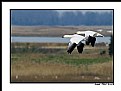
Critique By:
Gary Dyck (K:12834)
1/8/2007 10:22:42 AM
Great shot, John! I don't really see anything to critique about this one. Excellent clarity on the geese with an ideal dof that makes them stand out so well. And I also like the location within the frame as it looks like they are flying into view. The only very minor thing I notice, and it's probably mostly due to lower resolution for posting here, is the faint "ghost" around the edge of the birds. Very nicely presented! Cheers, Gary
|
| Photo By: John-Eric Lemieux
(K:3045)
|
|
|
Critique By:
Elizabeth MVW (K:25)
1/4/2007 8:27:43 PM
Boom. Frozen clouds. A body poised betwixt buildings. The body mass is being held in place by impossible bookends. Falling in on her. She is aligned with the sky, unattached to the ground, unlike these grounded monuments of greed. Only the railing keeps her from dominating the composition. It holds her back, gently laying her dark form down upon the battlefield of the background, where a silent war rages between these dark edifices. A balance of power.
The enormous difference in hue between the sky and the architecture makes the clouds seem wonderfully distant, if we assume the clouds to be the background. Yet as our eyes wander about inside the image, our mind does battle over what is closer - a conflict that is constantly resolving - as it must remind itself repeatedly that the architecture is the primary graphic mass, not the vivid sky. This figure-ground conflict, brought about by heightened contrast, adds shades of complexity to an otherwise basic composition.
Powerful vertical lines demand contextual resolution through horizontal lines, and here the railing provides it. But it is slightly tilted up to the right, creating the subtle tension that underlies the theme. Without it, the image becomes conservative and ordered, as if it was a computer rendering of reality.
The conflict-resolving detail of the buildings in the top half of the composition contrasts nicely with the shadowy purpose-of-concept in the bottom half. The marriage of the two halves is a little off-center, though. This skews the balance away from the idea of the individual and into the idea of the threatening skyscrapers. Then, attacking the leaning threats by leveling the railing seems useful. But that only further defeats the individual by removing both the conceptual focus and the tension derived from the tilt of the all-important railing.
The slant of the whole image is not the problem; in fact, the buildings' respective tilts are appropriately proportioned to their apparent heights. However, the magnetism of the frame is balanced precisely at the included corner of the building on the left. To maximize the distribution of power in the composition (a.k.a. balance), that corner should be at the vertical center, but it is slightly below it. Also, the horizontal thickness of these two infinite bookends should be identical at that point. Yet, at that point, the building on the left is marginally thicker.
Cropping can solve these problems. The left side and the top side can be clipped, placing the corner at the vertical center and evening up the primary graphic masses at that point. Simple enough. But every bit of the building detail is essential for the healthy survival of the figure-ground illusion. So, a much better solution would be to add some blackness (or the original cropped image data, if it still exists) just below the frame and to the right of it. In that way, the problems with the corner and with the graphic masses becomes resolved, the amount of the building detail remains intact, and there's the added benefit of allowing the model's legs to not seem awkwardly truncated.
Such a stark image comments on the place of humans inside a world formed by their own ambitions of immortality. Things seem so much larger when trying to chart a course through them. The model here has found a balanced spot to rest her own overshadowed ambitions. But she cannot stay there long, for the looming buildings and the movement implied by their angles and the railing brings a smothering tension rocketing to the surface. She must be ready to move.
|
| Photo By: Kim Flowers
(K:770)
|
|
|
Critique By:
rebecca claassen (K:12904)
12/27/2006 12:22:51 AM
Beautiful portrait Sascha! The light is perfect and I just love the expression on his face. The nice detail adds depth to this image and makes me wonder what he is thinking as his portrait is being made.
Lovely,
cheers, Bek
|
| Photo By: sascha jonack
(K:19715)
|
|
|
Critique By:
Bill Voizin (K:78)
12/27/2006 2:34:42 AM
Wonder-filled portrait Ferdinando! The infant appears to be in awe of what is happening, and can't wait to acknowledge that spiritual change. A very special portrait...Best regards--Bill Voizin
|
| Photo By: Ferdinando Gorga
(K:682)
|
|
|
Critique By:
Peter De Rycke (K:41212)
12/23/2006 2:08:38 PM
What a great scene, so well captured in a gorgeous composition .. landscape working well together with an awesome sky, having great light on the grass .. the contrast in the sky might have been a little higher to my taste, but otherwise perfect !
Peter
|
| Photo By: brian underdown
(K:-960)
|
|
|
Critique By:
Giuliano Guarnieri (K:36622)
12/23/2006 7:38:07 PM
Hello Jeannette,
I like your old and unusual technics.
A more creative and unique approach to photography, really a nice example of how the artistic language is apart
Bye
GG
|
| Photo By: Jeannette Palsa
(K:128)
|
|
|
Critique By:
James Cook (K:38068)
12/23/2006 8:14:37 PM
Great capture. He does look dead, doesn't he. The thumbnail really doesn't do this shot justice. Very rewarding upon seeing the large image.
|
| Photo By: John Hatz
(K:156973)
|
|
|
Critique By:
Giuseppe Guadagno (K:34002)
12/23/2006 8:25:48 PM
The angle of shadows and geometric shapes surround and squeeze the figure cutted out of the world. Very emotive, Filipe.
Warm wishes for a serene and happy Christmastime and a beautiful 2007.
Giuseppe
|
| Photo By: filipe franco
(K:731)
|
|
|
Critique By:
Michele Carlsen (K:146013)
12/23/2006 2:49:55 AM
Hi Phillip,
I like the light, the shadows, reflections and the contrast in this lovely well balenced composition.. Oh and the fog... Smokey light I guess.. it's excellent.
Michele~
|
| Photo By: Phillip Minnis
(K:13131)
|
|
|
Critique By:
Srna Stankovic (K:172232)
12/23/2006 2:33:27 AM
Dear Anastasia, your portfolio is very interesting.
This portrait with a great composition and so many details ... and balance between "dark" and red tones is good and well presented. SHE is sparkling :) Her eyes are beautiful, skin tones smooth, hear perfect, well, exellent done my dear ! All the best wish you SRNA :)
|
| Photo By: Anastasia R.
(K:778)
|
|
|
Critique By:
Cathy Carroll (K:28144)
12/23/2006 3:02:39 AM
This is an amazing image, I am hoping this is play and the outcome for both was favourable. A well captured action shot, I like the predominance of white in the photograph. CC
|
| Photo By: Dickens Charles
(K:245)
|
|