|
|
Critique By:
Matej Maceas (K:24381)

9/23/2004 1:21:01 PM
I thought you didn't like 'artistic' titles :-)
This is the sort of image I call an anti-photo; a sort of insider photographic joke that offers quite a splendid visual & mental experience. Cool :-)
|
| Photo By: João Magalhães
(K:2067)
|
|
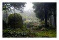
|
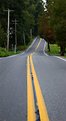
Critique By:
Matej Maceas (K:24381)
9/18/2004 3:55:12 PM
Excessive detail in a landscape photo? I wonder what would Ansel say ;-)
I'm not sure if you had intended to have any kind of "main subject" in this photo, but for me the part that draws my attention most is the bright area in the middle. Thanks to the mist, the quality of light on the stones and the greenery beyond is very interesting.
|
| Photo By: João Magalhães
(K:2067)
|
|
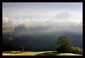
|
Critique By:
Matej Maceas (K:24381)
9/18/2004 3:54:22 PM
Just the sort of photo I would have wanted to take :-)
|
| Photo By: João Magalhães
(K:2067)
|
|
|
Critique By:
Matej Maceas (K:24381)
9/14/2004 7:57:26 PM
I found this photo when I got to work this morning and it was a really nice image to behold, the title also cheered me up.
|
| Photo By: Christian Barrette
(K:21125)
|
|
|
Critique By:
Matej Maceas (K:24381)
9/11/2004 2:04:32 PM
I've also been getting Xs lately when previewing attachments, but the image has always appeared correctly when I posted the comment.
|
| Photo By: Kostas Tzanetos
(K:22012)
|
|
|
Critique By:
Matej Maceas (K:24381)
9/10/2004 5:43:35 PM
Potentially interesting pair of subjects but all those filters have not improved the photo.
|
| Photo By: Jürgen Reinold
(K:1651)
|
|
|
Critique By:
Matej Maceas (K:24381)
9/10/2004 5:21:14 PM
I like it, but in spite of being a full frame fanatic for my own work, I would consider a crop.
|
| Photo By: Tobiah Deutsch
(K:2432)
|
|
|
Critique By:
Matej Maceas (K:24381)
9/10/2004 5:09:40 PM
This 15mm lens of yours is crazy ;-)
I don't care much for the blur, could you attach the original?
|
| Photo By: Kostas Tzanetos
(K:22012)
|
|
|
Critique By:
Matej Maceas (K:24381)
9/10/2004 5:09:31 PM
Excellent. Do a series of these.
|
| Photo By: Christian Barrette
(K:21125)
|
|
|
Critique By:
Matej Maceas (K:24381)
9/10/2004 5:09:21 PM
For some reason (probably has to do with the light and the historical settings) this reminds me of Robert Doisneau's work.
On the one hand it would have been nice to see the woman's face, on the other hand that would require going *from* the candy shop (at least from this angle), which would not create such a strong compositional connection between the figure and the background.
|
| Photo By: Christian Barrette
(K:21125)
|
|
|
Critique By:
Matej Maceas (K:24381)
9/10/2004 5:08:35 PM
Admittedly I like the 'story' more than the photo, but hey, what does it matter as long as I am glad I cliked on the thumbnail :-)
|
| Photo By: Aurore Lynch
(K:1687)
|
|
|
Critique By:
Matej Maceas (K:24381)
9/10/2004 5:08:20 PM
This image has a sharpness/focusing problem - there doesn't seem to be anything clearly in focus. I don't know for sure what focal length you used, but 1/60s was probably too slow for it. Then there's the aperture, which, even under sufficiently fast shutter speeds, will not give you a very large depth of field. A tripod would let you stop down considerably, while not having to worry about camera shake. Alternatively, using a higher ISO setting should at least let you handhold safely at the aperture you used.
|
| Photo By: matthew hoffman
(K:658)
|
|
|
Critique By:
Matej Maceas (K:24381)
9/10/2004 5:07:09 PM
I've come to this photo several times, and my impressions can be summed up in two points:
1) I like the view. As your title says, it's a classic view, showing this part of the city in a very clear manner.
2) From a strictly visual point of view (I've just browsed through the comments and found your reply to Elisa; your intended symbolic meaning of leaving the trees green would never have occurred to me), I don't like the partial desaturation. However, after some thought, I think it's not related to this particular image, but rather down to my very general dislike for partial desaturations :-)
|
| Photo By: Christian Barrette
(K:21125)
|
|
|
Critique By:
Matej Maceas (K:24381)
9/8/2004 4:34:08 PM
It's not staged. If it were, the wall lamp growing out of my friend's head would be inexcusable. Now it's just vaguely annoying ;-)
|
| Photo By: Matej Maceas
(K:24381)
|
|
|
Critique By:
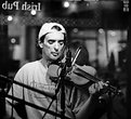
Matej Maceas (K:24381)
9/7/2004 7:03:50 PM
A very enjoyable series, full of emotion.
Did you use a tripod or lean against a table, or are you incredibly good at handholding? :-)
|
| Photo By: Stefan Engström
(K:24473)
|
|
|
Critique By:
Matej Maceas (K:24381)
9/7/2004 6:48:29 PM
This photo seems best viewed with the head inclined 100 degrees to the left :-)
Her expression is very pleasant but I don't really understand the choice of the pose, there doesn't seem to be any rational reason for her to be lying down in that position.
|
| Photo By: Harvey Guikema
(K:313)
|
|
|
Critique By:
Matej Maceas (K:24381)
9/5/2004 6:24:24 PM
Very nice. You should put it in the Magic Light project.
|
| Photo By: Don Martel
(K:551)
|
|
|
Critique By:
Matej Maceas (K:24381)
9/5/2004 6:24:09 PM
Surely a modern DSLR is not considered limited equipment :-)
Some will also argue that the choice by the photographer of correct equipment, i.e. one that will not cause technical difficulties, should be a matter of course. Bringing ISO 25 film to an evening party would be the photographer's fault, not the film's ;-))) In this case, one stop extra exposure might have been enough (with a higher ISO setting if handholding were problematic).
Anyway, I checked the image in PS, the shadow underneath the bench can be opened up by a simple levels adjustment so at least the man's legs can be separated from the background. The histogram also reveals that the structure of highlights is a bit strange; there are some whites in the top right corner, but in the rest of the image there are only medium-light greys at best. Manual dodging/burning or selective area levels/curves adjustment might be a good way to deal with this.
One unfortunate thing that may also play a role here is monitor calibration. It always tends to annoy me when I view the same photo on three different monitors and see three different images. Not much can be done about that :-(
|
| Photo By: Ben Johnson
(K:140)
|
|
|
Critique By:
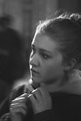
Matej Maceas (K:24381)
9/5/2004 4:28:28 PM
I like this, the woman has an expression of curiosity, expectation or even apprehension that makes me wonder what she's looking at, whom or what she is waiting for. I agree with Ali about the train station atmosphere, enforced by the blurry, shadowy figure in the background.
The photo is surprisingly grainy (not a fault, quite the contrary) for a Delta 100, did you rate it at a higher ISO or give it some special development?
|
| Photo By: Ben Johnson
(K:140)
|
|
|
Critique By:
Matej Maceas (K:24381)
9/5/2004 4:20:38 PM
George, why do you consider this "a telling decisive moment"? Is there something special going on in the photo that would have been gone if Ben shot it a split-second earlier or later, or five seconds earlier or later? I must be missing it.
I don't quite agree it's fine B&W, the tonal range is rather limited and important shadow areas are blocked up (e.g. the sitting man's trousers and shoes).
|
| Photo By: Ben Johnson
(K:140)
|
|
|
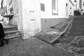
Critique By:
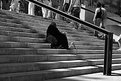
Matej Maceas (K:24381)
9/3/2004 9:56:26 PM
I think you would have to approach the subject from a different angle and compose differently. I can't tell you how to do it exactly, because I'm not familiar with this place and I don't know what your comfort zone in street photography is, but I will mention what I perceive as problems with the existing image.
Almost half of the frame is taken up by empty stairs which do not add much to the photo. All the action is taking place at the top and on the right, but the people present there have mostly been cropped off, and even if you had included their heads, they were all turned away from you, and subsequently from the viewer. Although there are exceptions, people's backs often tend to not be very interesting.
The railing could potentially act as a visual barrier between the figure (your title says it's a woman but this is not clear from the photo) and the other people, but currently it only acts to obstruct the view of those other people; it's too dominant in the frame, but it does not serve any clear purpose. Maybe from a closer and lower position the railing could be used to frame the scene; maybe it would best be avoided completely.
The dark figure seems to have been your main subject (the frame is literally centered around it), but as with the other people in the image, we are effectively facing the person's back. The image does not offer any face/expression to connect with. Additionally, as Ray mentioned, the figure is too dark, most of the garment is without any detail.
|
| Photo By: Ben Johnson
(K:140)
|
|
|
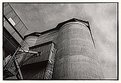
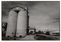
Critique By:
Matej Maceas (K:24381)
9/3/2004 6:06:25 PM
This is my favourite of the three you've uploaded so far. Maybe some burning would help to better define the lower section of the right edge of the silo against the sky.
|
| Photo By: Ray Heath
(K:4559)
|
|
|
Critique By:
Matej Maceas (K:24381)
9/3/2004 6:05:48 PM
They have satellite TV in this church? :-)
|
| Photo By: João Magalhães
(K:2067)
|
|
|
Critique By:
Matej Maceas (K:24381)
9/3/2004 6:05:31 PM
Great shot but the print is too grey, I would suggest a higher grade paper to give it some extra shine.
|
| Photo By: rami rami
(K:2201)
|
|
|
Critique By:
Matej Maceas (K:24381)
9/1/2004 9:32:41 AM
Christian, it was nice to see your work on the front page.
I've been comparing the two versions of this photo. I prefer the shadow details in the colour version, but on the other hand, I agree with Hugo that this one has a much stronger mood. Difficult choice; maybe this version but with more open shadows would be best?
|
| Photo By: Christian Barrette
(K:21125)
|
|
|
Critique By:
Matej Maceas (K:24381)
9/1/2004 9:31:20 AM
Hi Ray, nice printing technique with the plastic sheet, I tried anti-reflex glass once for a similar effect but it was too harsh (at least for that particular image).
The print appears rather dark, judging by the shadows it seems to have been a bright, sunny day so the overall greyness is visually confusing. Did you print it down on purpose or do we have a major monitor-setup difference?
|
| Photo By: Ray Heath
(K:4559)
|
|
|
Critique By:
Matej Maceas (K:24381)
9/1/2004 9:30:55 AM
This idea has been executed so many times, it's difficult to come up with an original variant. My favourite shadow selfportrait is this: http://www.usefilm.com/image/9081.html
|
| Photo By: Ray Heath
(K:4559)
|
|
|
Critique By:
Matej Maceas (K:24381)
9/1/2004 9:28:55 AM
You'll have more control if you shoot in colour mode and then convert the image using the Channel Mixer (or its PSP8 equivalent).
By the way, didn't you shoot with a Digital Rebel?
|
| Photo By: Anthony Gargani
(K:4527)
|
|
|
Critique By:
Matej Maceas (K:24381)
8/30/2004 6:14:23 PM
Quite impressive.
|
| Photo By: Bea Friedli
(K:10189)
|
|
|
Critique By:
Matej Maceas (K:24381)
8/30/2004 6:07:33 PM
Better in terms of retained details, but it suffers from a green cast. You can remove this cast via a Levels layer, individually adjusting the Red, Green and Blue channels' histogram.
|
| Photo By: Effie White
(K:1147)
|
|