|
|
Critique By:
Sammy D (K:628)
5/2/2008 10:54:40 PM
This is an interesting pose, and the lighting is good. However, at 70mm f/2.8, you only have a few inches of sharp focus. In this case, it looks like you used the center focus sensor, getting the buttons on her blouse well focused. Unfortunately, with the short DOF, this caused her eyes to be slightly out of focus.
|
Photo By: Paul Lara
(K:88111)

|
|
|
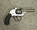
Critique By:
Sammy D (K:628)
4/24/2008 9:37:50 AM
Actually, it is an Iver Johnson revolver in cal. 38 S&W. The owl head grip is one of their trademarks.
Now, on to the photo: It needs to be more evenly lit. This is a tough one, due to the nickel finish and black grips. If you don't have a lightbox to put it in, try putting it on a more pleasing surface, and use a large white surface to reflect light onto it. A large sheet of posterboard will work well. That way, you don't end up with hotspots and underexposed areas.
|
| Photo By: ERNIE BUCHANAN
(K:17909)
|
|
|
Critique By:
Sammy D (K:628)
8/8/2007 6:06:32 PM
I could have just said 'Seattle', and it would be understood as well!
|
| Photo By: Sammy D
(K:628)
|
|
|
Critique By:
Sammy D (K:628)
8/6/2007 9:12:24 PM
I did a small amount of post production to give it a vignette. I felt that without it, the background was a little too busy, and it took your attention away from the subject.
By vignetting the picture, I could show more of the whole setting - wet sidewalk and street with leaves, etc.
|
| Photo By: Sammy D
(K:628)
|
|
|
Critique By:
Sammy D (K:628)
8/6/2007 1:05:25 PM
This is so close to being a very good picture. If you had moved the glass over just a couple of inches past her nose, it would have followed the same angle as her nose, and brought interest to the shot. As it is, it obscures her nose, and takes away from the picture. I really like almost everything else about it.
|
| Photo By: Ina Todorova-Kuneva
(K:743)
|
|
|
Critique By:
Sammy D (K:628)
4/30/2006 7:41:30 AM
An excellent photo, and an excellent use of this lens. Your composition and crop are perfect, as is your focus. The only possible improvement I could ask for would have been to give it slightly less exposure, so you could avoid the blow-out on her face/shoulder. But, as I stated, a truly excellent photo.
|
| Photo By: Pat Fruen
(K:12076)
|
|
|
Critique By:
Sammy D (K:628)
2/5/2006 12:47:16 AM
A nice portrait. The one thing I think you could have done to improve it (IMHO), would be to have put a little more light on the eye hidden under her hair. Maybe use a reflector? I played with it a little, to see what it would look like with more light. What do you think?
|
| Photo By: Luis Alvarez
(K:2038)
|
|
|
Critique By:
Sammy D (K:628)
2/3/2006 9:40:11 PM
Excellent composition and depth of field. I really like the way you captured the water against the out of focus background. What were your camera settings?
|
| Photo By: halit ömer camcı
(K:225)
|
|
|
Critique By:
Sammy D (K:628)
1/19/2006 2:08:54 PM
Very nice composition. The muddy road and bushes on the left add just enough color to be interesting, in contrast with the grey skies and snow on the ground.
|
| Photo By: dincer disbudak
(K:36)
|
|
|
Critique By:
Sammy D (K:628)
1/16/2006 4:24:47 AM
I just discovered your work. EXCELLENT perspective, and use of colors to highlight your model's stark black/goth look.
|
| Photo By: Pat Thielen
(K:300)
|
|
|
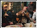
Critique By:
Sammy D (K:628)
1/9/2006 5:48:54 PM
Very nicely done. It's no trick to turn on the filters in Photo Shop, the trick is to match the filters to the photograph. You have done a good job of capturing the mood and sounds of the bar. I can almost smell the drinks.
|
| Photo By: Gil Draper
(K:3194)
|
|
|
Critique By:
Sammy D (K:628)
1/5/2006 12:11:21 PM
I like your composition, your depth of field, and the contrast is perfect for this picture. The only thing I would improve is the blown highlight in the bottom right corner. It is a very nice picture that brought a smile to my face.
|
| Photo By: Ganea Octav
(K:78)
|
|
|
Critique By:
Sammy D (K:628)
1/4/2006 3:25:42 AM
An interesting picture, both for its history, and for the textures and colors it has. I think it would look a little better cropped differently, though. What do you think of this?
|
| Photo By: Guido Steenkamp
(K:183)
|
|
|
Critique By:
Sammy D (K:628)
12/26/2005 2:20:11 AM
Good picture. The noise level at ISO 800 is very low, and the colors are quite bold. It is a very pleasing Christmas holiday photo.
|
| Photo By: Eric Peterson
(K:4419)
|
|
|
Critique By:
Sammy D (K:628)
12/18/2005 4:20:13 AM
Very nice abstract. You have shown good texture and depth of field. It took me a second to recognize it. These days, there will be a lot of people who don't recognize it!
|
| Photo By: Bruce Harper
(K:5305)
|
|
|
Critique By:
Sammy D (K:628)
12/9/2005 9:57:01 AM
I like this very much. The red colors slashing across the picture has a boldness to it, emphasizing the emotions of the subjects.
I know it's beyond the scope of this photo, but just for fun, I played around with it a little. I cloned out the 1/2 person in the bottom left corner.
|
| Photo By: Fatih işçi
(K:62)
|
|
|
Critique By:
Sammy D (K:628)
12/9/2005 6:13:03 AM
Good picture, good colors, good idea! The leaves make a very interesting background for the table.
For something a little different, I would like to see the same table shown smaller, off center to the bottom left of the picture, with much more grass/leaves shown. Just an idea.
|
| Photo By: John Loreaux
(K:86210)
|
|
|
Critique By:
Sammy D (K:628)
12/8/2005 12:49:34 PM
Good composition, colors, and good choise of focus on the hair. It gives the picture a sharp look, while leaving the eye a little softer to look at.
|
| Photo By: Sava Savic
(K:326)
|
|
|
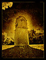
Critique By:
Sammy D (K:628)
12/8/2005 12:42:49 PM
Very good capture, and interesting effects. The dark at the base balances the dark sky, and the tree in the top left corner adds a nice touch. Well done.
|
| Photo By: pan g.
(K:16899)
|
|
|
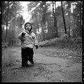
Critique By:
Sammy D (K:628)
12/6/2005 8:43:42 AM
Excellent perspective and composition. I really like the black space in the bottom left of the picture, somewhat balanced by the black doorway on the opposite side. It highlights the child in between, and builds the picture in the vertical pose.
|
| Photo By: ol an
(K:-248)
|
|
|
Critique By:
Sammy D (K:628)
12/5/2005 6:47:40 PM
Very, very well done. You really nailed the feeling you get, standing on the platform at the falls. I have shot this same vantage point a number of times, and it is more difficult than is seems to have the picture convey the raw power felt by being so close.
|
| Photo By: Martin Paul
(K:140)
|
|
|
Critique By:
Sammy D (K:628)
12/5/2005 6:06:03 PM
Good composition. You have kept the highlights - often difficult not to blow out with digital. I like the depth of field you chose.
I'm always interested in the photographer's choice of lenses and settings. Any chance of updating your shutter and aperature info?
|
| Photo By: Ash
(K:9427)
|
|
|
Critique By:
Sammy D (K:628)
11/29/2005 3:05:09 PM
Wonderful capture. The whole scene looks mythical/mystical. The colors are great, as is the focus. It is the leaves that really make the picture.
Without being obvious, it is a good example of the "rule of thirds", with the large/close leaves in the bottom third, the more distant leaves in the middle, and the tree line on the top.
|
| Photo By: Kursat Oner
(K:1580)
|
|
|
Critique By:
Sammy D (K:628)
11/29/2005 2:49:27 PM
Great portrait! Wonderful focus, crop, and composition. It speaks volumes.
|
| Photo By: Dushan B. Hadnadjev
(K:366)
|
|
|
Critique By:
Sammy D (K:628)
11/29/2005 2:45:46 PM
Interesting lighting, and good composition. I like the hand in the hair.
|
| Photo By: Salvador Sabater
(K:63)
|
|
|
Critique By:
Sammy D (K:628)
11/29/2005 2:40:49 PM
Good composition and DOF. I like the low camera angle.
|
| Photo By: Radek Boczek
(K:223)
|
|
|
Critique By:
Sammy D (K:628)
11/29/2005 11:40:29 AM
Very good composition and tones. I really like the way you chose to end the stairs out of the frame on the left. It makes a great abstract.
|
| Photo By: George Black
(K:102014)
|
|
|
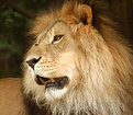
Critique By:
Sammy D (K:628)
8/11/2005 9:17:29 PM
Thank you. There was no fill flash. He was about 50 yards (~meters) away, on a bright, cloudy day. I could not ask for better lighting conditions. I was using a Sigma 135-400mm lens I had just bought, and I'm happy to say, it is a VERY sharp lens.
Sammy.
|
| Photo By: Sammy D
(K:628)
|
|
|
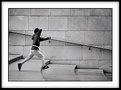
Critique By:
Sammy D (K:628)
8/10/2005 9:12:18 AM
Great capture! You've locked him in place, hanging in the air. Very nice composition and lighting.
|
| Photo By: kike Calvo
(K:11291)
|
|
|
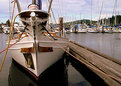
Critique By:
Sammy D (K:628)
8/10/2005 9:08:54 AM
Fun shot with good perspective. I like the way the masts from the other boats slant slightly away from the boat in front.
|
| Photo By: Dr. Pratim Datta
(K:474)
|
|