|
|
Critique By:
Tommy Næss (K:90)
3/30/2008 11:39:35 AM
Thank you for comments!
|
| Photo By: Tommy Næss
(K:90)
|
|
|
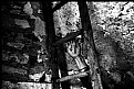
Critique By:
Tommy Næss (K:90)
1/11/2007 8:06:48 PM
Nice b/w tones. The composition is effective. Spooky.
|
Photo By: Pablo Dylan
(K:63918)

|
|
|
Critique By:
Tommy Næss (K:90)
8/4/2005 5:04:05 PM
Tanks for youre comments! Yes, I sure agree that a focal point would have made the picture visually more interesting.
|
| Photo By: Tommy Næss
(K:90)
|
|
|
Critique By:
Tommy Næss (K:90)
8/4/2005 5:04:02 PM
Thanks for youre comments! Yes, I sure agree that a focal point would have made the picture visually more interesting.
|
| Photo By: Tommy Næss
(K:90)
|
|
|
Critique By:
Tommy Næss (K:90)
3/31/2005 10:10:27 PM
Thanks for your comments Pat and Arwa!
|
| Photo By: Tommy Næss
(K:90)
|
|
|
Critique By:
Tommy Næss (K:90)
3/8/2005 8:29:05 PM
This is in my eyes a nice composition with an effective perspective. The colors are typical EIR; and I like it. Home processing C41 isn't for beginners - I hav never tried it myself. I use a lab for processing film...:-)) In my opinion this is one of the best IR-pictures you have here on your portofolio - many of the others seems a little bit to unsharp for me - I don't know if it is caused by the scanning, focusing or...? Anyway, it's funny and inspirating to experiment.
|
| Photo By: David Mongeau-Petitpas
(K:2068)
|
|
|
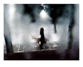
Critique By:
Tommy Næss (K:90)
3/6/2005 7:07:01 PM
A nice demonstration of melancholy int he afternoon rain. The title makes me think and try to interpret ypor meanings - and thats a strenght in this picture. Your focus on the girl and her dog is fine. The unsharpness and reflections in the window glass makes the picture a bit abstract. I like it.
|
| Photo By: Judita Sendak
(K:600)
|
|
|
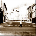
Critique By:
Tommy Næss (K:90)
3/6/2005 2:50:59 AM
A nice shot. The grey-tones are good, and the mood a little bit melancholich; I like that. The only thing I maybe miss is a person, an animal or some kind of living creature, it's a little bit "empty".
|
| Photo By: Raul Garcia
(K:670)
|
|
|
Critique By:
Tommy Næss (K:90)
3/6/2005 2:39:37 AM
Thanks for your comments!
Raul: No I have'nt done anything special with my camera. I have used 3 different IR-films - Kodak HIE b/w, Kodak EIR color slides, and this one; Ilford SFX 200 - and all films have gone ok with the camera. The filters I have used is this Hoya R72 and a B+W 0-41 red-orange one. The reason why you supposely have read that the camera "cannot" use ir-films is the cameras infrared mechanism for pulling forward the film. But I have not had this problem - only on the Kodak HIE I have sometimes seen a small light damage alongside small parts of the outer edge. In practical use its no problem. I have experimented a bit, and it's funny...you should sure give it a try if you like experimenting!
|
| Photo By: Tommy Næss
(K:90)
|
|
|
Critique By:
Tommy Næss (K:90)
3/4/2005 9:37:32 PM
The feeling of depth and perspective besides the color contrasts is exellent here. A very nice and technically well done job.
|
| Photo By: Dave K
(K:-171)
|
|
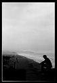
|
Critique By:
Tommy Næss (K:90)
3/1/2005 12:35:50 PM
A monumetal shot and perspective. Exellent balance between the silhouette in the foreground and the large grade of depth-feeling. The format makes this picture.
|
| Photo By: danilo parra
(K:549)
|
|
|
Critique By:
Tommy Næss (K:90)
3/1/2005 12:32:21 PM
Nice experiemental composition. The "big" unsharp hands in the foreground makes this picture. The technical quality could have been better, but the perspective makes it all in all a nice shot.
|
| Photo By: Jarrod Bell
(K:58)
|
|