|
|
Critique By:
Reza Fakhrai (K:3014)
5/6/2005 3:49:41 AM
Awesome lighting and I really love the character that the subject brings to the table (pun intended). Such a little picture for such a little subject.
|
| Photo By: Elizabeth LaPorte
(K:3)
|
|
|
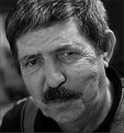
Critique By:
Reza Fakhrai (K:3014)
5/6/2005 3:48:34 AM
I really like your b&w tones and choice of lighting. I would prefer either exactly half the face to be showing or the entire face.
|
| Photo By: Ken Tinley
(K:1856)
|
|
|
Critique By:
Reza Fakhrai (K:3014)
5/6/2005 3:46:45 AM
I could see the movement you're referring to. Interesting.
|
Photo By: Joe Johnson
(K:8529)

|
|
|
Critique By:
Reza Fakhrai (K:3014)
5/6/2005 3:45:46 AM
Cool photo. As always, I enjoy your perspective and composition here. Your catch on the lighting was excellent as the ray of light makes just one more line for the eye to follow.
|
| Photo By: Len Webster
(K:25714)
|
|
|
Critique By:
Reza Fakhrai (K:3014)
5/6/2005 3:44:50 AM
Wow! Great photo...makes me reminisce to the care-free days. Your sepia tones are excellent as well.
|
| Photo By: Todd Carroll
(K:-278)
|
|
|
Critique By:
Reza Fakhrai (K:3014)
5/6/2005 3:44:04 AM
Excellent expansive view you've captured, especially under the circumstances. You've gotten some very brilliant yellows, and the hills are fantastic. There is a lot of depth here.
|
| Photo By: Marc Robin
(K:3385)
|
|
|
Critique By:
Reza Fakhrai (K:3014)
5/6/2005 3:42:44 AM
I'll have to second Lea's opinion. I do, however, really enjoy your perspective on this. Nicely done.
|
| Photo By: D W
(K:2560)
|
|
|
Critique By:
Reza Fakhrai (K:3014)
5/6/2005 3:41:29 AM
It would be nice to know a few things about the scene we're looking at. I'm intrigued because it is very active...but what for?
|
| Photo By: D W
(K:2560)
|
|
|
Critique By:
Reza Fakhrai (K:3014)
5/6/2005 3:40:50 AM
haha! Very humorous photo. I love your use of composition in this...it makes the huge bird seem a tad belittled by his/her surroundings.
|
| Photo By: Ken Tinley
(K:1856)
|
|
|
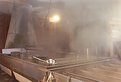
Critique By:
Reza Fakhrai (K:3014)
5/6/2005 3:39:55 AM
Nice industrial photo. I'm enjoying this series because it's shedding some light on a process that I didn't know much about.
|
| Photo By: Bruce W. Clark
(K:1100)
|
|
|
Critique By:
Reza Fakhrai (K:3014)
5/6/2005 3:39:25 AM
There are some very intriguing aspects of this photo; most notably is the resounding red theme and the very natural expressions on these out-of-the-ordinary girls. Did you intend for the focus to be off the girl facing us? It could be seen as different (which is cool) or it could be seen as a mistake because she is the only one facing the viewer.
|
| Photo By: Wayne Harridge
(K:18292)
|
|
|
Critique By:
Reza Fakhrai (K:3014)
5/6/2005 3:37:52 AM
Cool photo! I love the perspective and all the different lines. All is complemented by a good choice of lighting and good colors.
|
| Photo By: A.T. Sarazin
(K:1336)
|
|
|
Critique By:
Reza Fakhrai (K:3014)
5/6/2005 3:35:20 AM
Nice (un)intentional framing of the head. We all have helmet hair problems so I won't hold it against you. I might prefer the cropping to exclude the woman on the left and put you off center. Just a suggestion. Thanks for sharing.
|
| Photo By: Marc Robin
(K:3385)
|
|
|
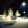
Critique By:
Reza Fakhrai (K:3014)
5/6/2005 3:34:03 AM
An empty shopping cart, that's what I like to see! Your perspective is fantastic as well as the composition and partially overexposed lighting.
|
| Photo By: Scott Marceau
(K:126)
|
|
|
Critique By:
Reza Fakhrai (K:3014)
5/6/2005 3:32:18 AM
Thanks for your kind words Richard. As for the 70-300G, I have to say that I've never had a problem with the clarity or anything of the sort; my main gripe with it is that one almost always needs a tripod because it is so shaky. I think as long as I'm on the budget I am presently, the 70-300G will suffice until I can afford a VR. Thanks for looking.
|
| Photo By: Reza Fakhrai
(K:3014)
|
|
|
Critique By:
Reza Fakhrai (K:3014)
5/5/2005 8:09:01 PM
You posted this for critique right? Then, at least appreciate critique for what it is.
|
| Photo By: D W
(K:2560)
|
|
|
Critique By:
Reza Fakhrai (K:3014)
5/5/2005 12:22:44 AM
Nice clarity and contrast of colors. The billboards are quite distracting, but I suppose they are in there for a reason.
|
| Photo By: Michael Holm
(K:7931)
|
|
|
Critique By:
Reza Fakhrai (K:3014)
5/5/2005 12:21:26 AM
This is really cool! It's worth messing around with and cropping the bottom and leaving 95% of negative space. Most excellent photo!
|
| Photo By: Daniel Alexandrescu
(K:1249)
|
|
|
Critique By:
Reza Fakhrai (K:3014)
5/5/2005 12:20:05 AM
Very beautiful sky. It looks as though everything was well-contemplated so I'm not sure how you intend to denounce a very competent photo.
|
| Photo By: Stefano Bramato
(K:601)
|
|
|
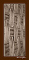
Critique By:
Reza Fakhrai (K:3014)
5/5/2005 12:19:01 AM
Most unusual subject, at least what the 'A' resides on. Cool abstract.
|
| Photo By: D W
(K:2560)
|
|
|
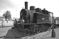
Critique By:
Reza Fakhrai (K:3014)
5/5/2005 12:18:24 AM
I like the concept and the uniqueness of the subject but I think that the b&w tones are a little washed out. I would recommend some levels/curves/saturation adjustment in PS to tone it down, get some detail from the sky, and accentuate the metallic tone of the train.
|
| Photo By: Sebàs
(K:192)
|
|
|
Critique By:
Reza Fakhrai (K:3014)
5/5/2005 12:17:12 AM
I enjoy this photo a lot mainly because it makes me wonder how such a thing applies to everyday life in general. Of course, it's complemented nicely by Billy's humor.
|
| Photo By: A.T. Sarazin
(K:1336)
|
|
|
Critique By:
Reza Fakhrai (K:3014)
5/4/2005 10:24:18 PM
In my opinion, I think some things could be done with the exposure.
|
| Photo By: D W
(K:2560)
|
|
|
Critique By:
Reza Fakhrai (K:3014)
5/4/2005 10:10:19 PM
The classic vicious-looking but innocent kitty! Nicely done.
|
| Photo By: Barry Kapke
(K:55)
|
|
|
Critique By:
Reza Fakhrai (K:3014)
5/4/2005 10:06:33 PM
This is an awesome mini-series. The depth of color is fantastic in this one, though I might prefer it a tiny bit brighter. Nice job.
|
| Photo By: Stephen Morgan
(K:585)
|
|
|
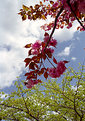
Critique By:
Reza Fakhrai (K:3014)
5/4/2005 10:05:43 PM
You caught a beautiful aspect of spring. I like the colors, but I do agree that some fill flash would have been most effective to bring out the flowers. Nice concept.
|
| Photo By: Stephen Morgan
(K:585)
|
|
|
Critique By:
Reza Fakhrai (K:3014)
5/4/2005 7:12:48 PM
Very beautiful use of DoF and your signature shade of sepia. You are a very diverse photographer.
|
| Photo By: Laurie Gould
(K:11942)
|
|
|
Critique By:
Reza Fakhrai (K:3014)
5/4/2005 7:11:04 PM
I'd love to see some expansion on this photo, as to its meaning and its title. Nice colors...they definately stand out!
|
| Photo By: Bill Baer
(K:212)
|
|
|
Critique By:
Reza Fakhrai (K:3014)
5/4/2005 7:10:13 PM
You have a uniquely modern portfolio and this is no exception. Good eye for detail.
|
| Photo By: Bill Baer
(K:212)
|
|
|
Critique By:
Reza Fakhrai (K:3014)
5/4/2005 7:08:50 PM
Wonderful portrait. the tones are so fantastic.
|
| Photo By: Alex Avilov
(K:634)
|
|